Widgets container appearance properties
The Container Appearance Properties section contains the properties for the widget container’s layout and allows you to customize the widget container’s appearance, widget title properties, and provides options to enable/disable widget exporting options.
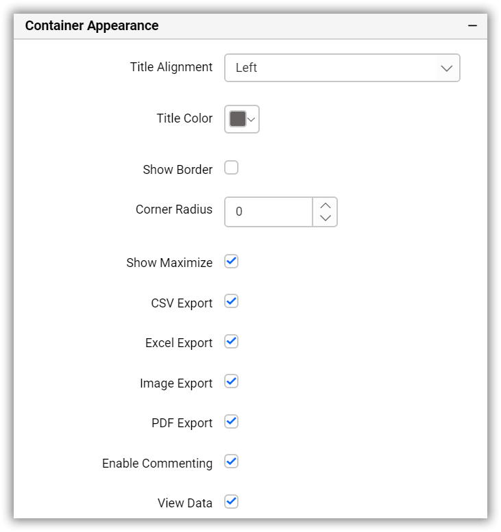
Container layout properties
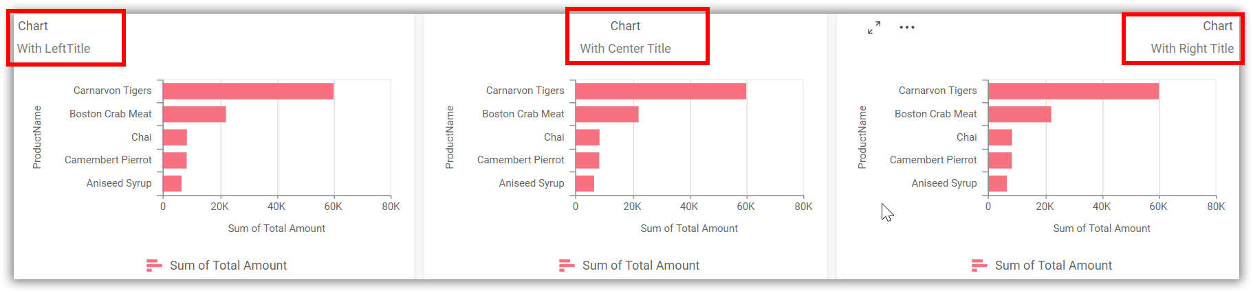
Title alignment
This allows you to handle the alignment of the widget title to either left, center, or right.
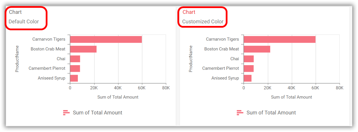
Title color
This allows you to apply text color to the widget title.
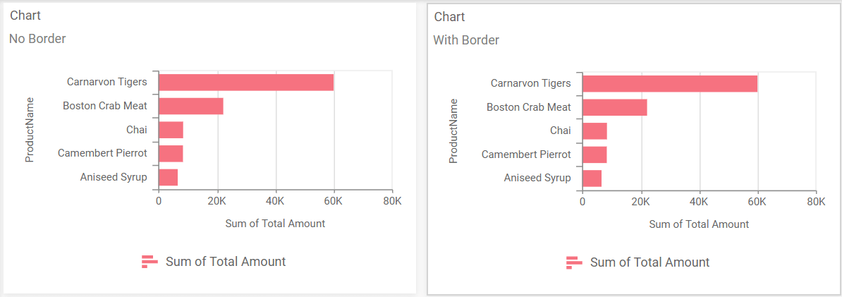
Show border
This allows you to toggle the visibility of the border surrounding the widget.
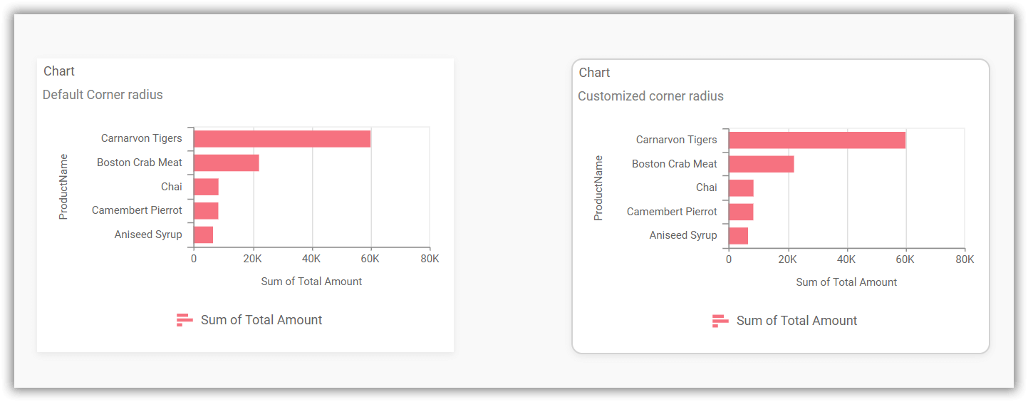
Corner radius
This allows you to apply the specified radius to the widget corners. The value can be between 0 and 100.
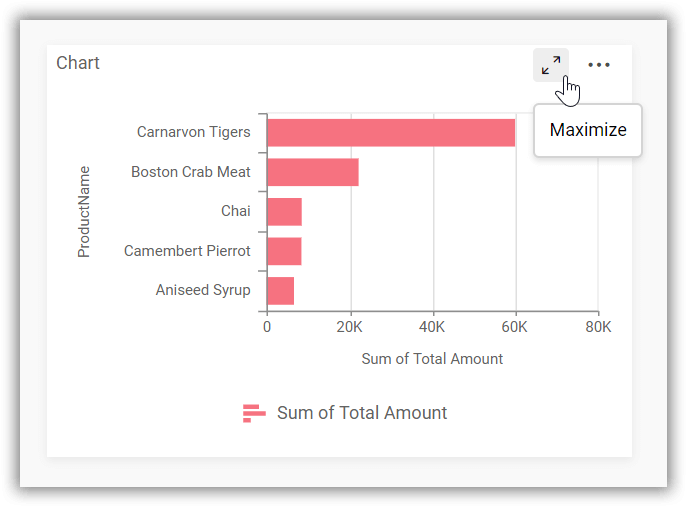
Show maximize
This allows you to enable or disable the maximized mode of the widget. The visibility of the maximize icon in the widget header will be defined based on this setting.
Clicking this icon in the viewer will show the maximized view of the widget.
Exporting options
CSV export
This option allows you to enable or disable the CSV export feature for the widget. Enabling this feature will allow you to export the summarized data of the widget view in CSV format.
For more details on CSV export, please click here.
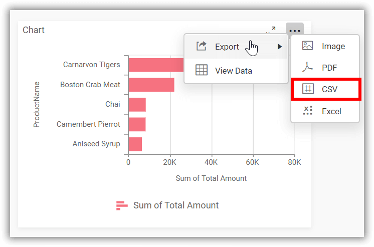
Excel export
This option allows you to enable or disable the Excel export feature for the widget. Enabling this feature will allow you to export the summarized data of the widget view in (.xlsx or .xls) format.
For more details on Excel export, please click here.
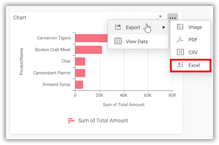
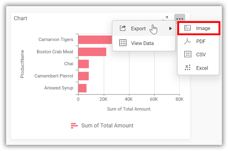
Image export
This option allows you to enable or disable the image export feature for the widget. Enabling this feature will allow you to export the view of the widget in image format (.jpg), (.png), or (.bmp).
For more details on Image export, please click here.
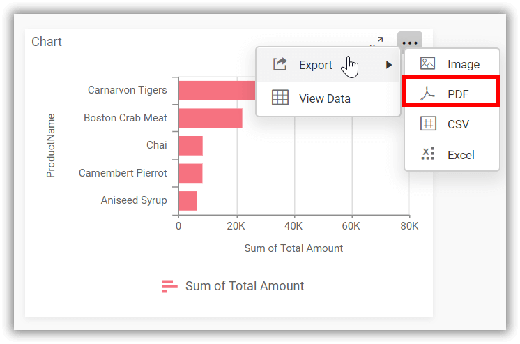
PDF export
This option allows you to enable or disable the PDF export feature for the widget. Enabling this feature will allow you to export the view of the widget in PDF format (.pdf).
For more details on PDF export, please click here.
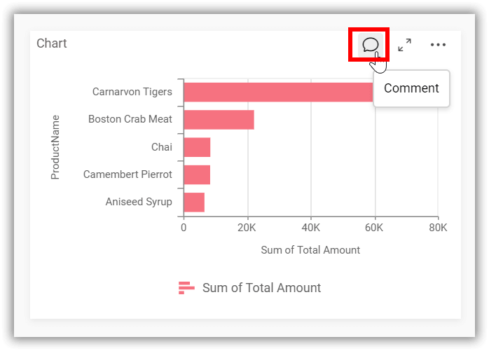
Enable commenting
This option allows you to enable or disable comments for the dashboard widget.
For more details on the commenting option, please click on the Commenting Widget.
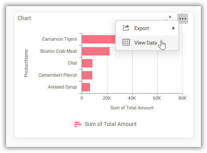
View data
This option allows you to visualize the raw data associated with a widget at runtime.
To learn more about viewing the underlying widget data, please refer to the view data documentation.
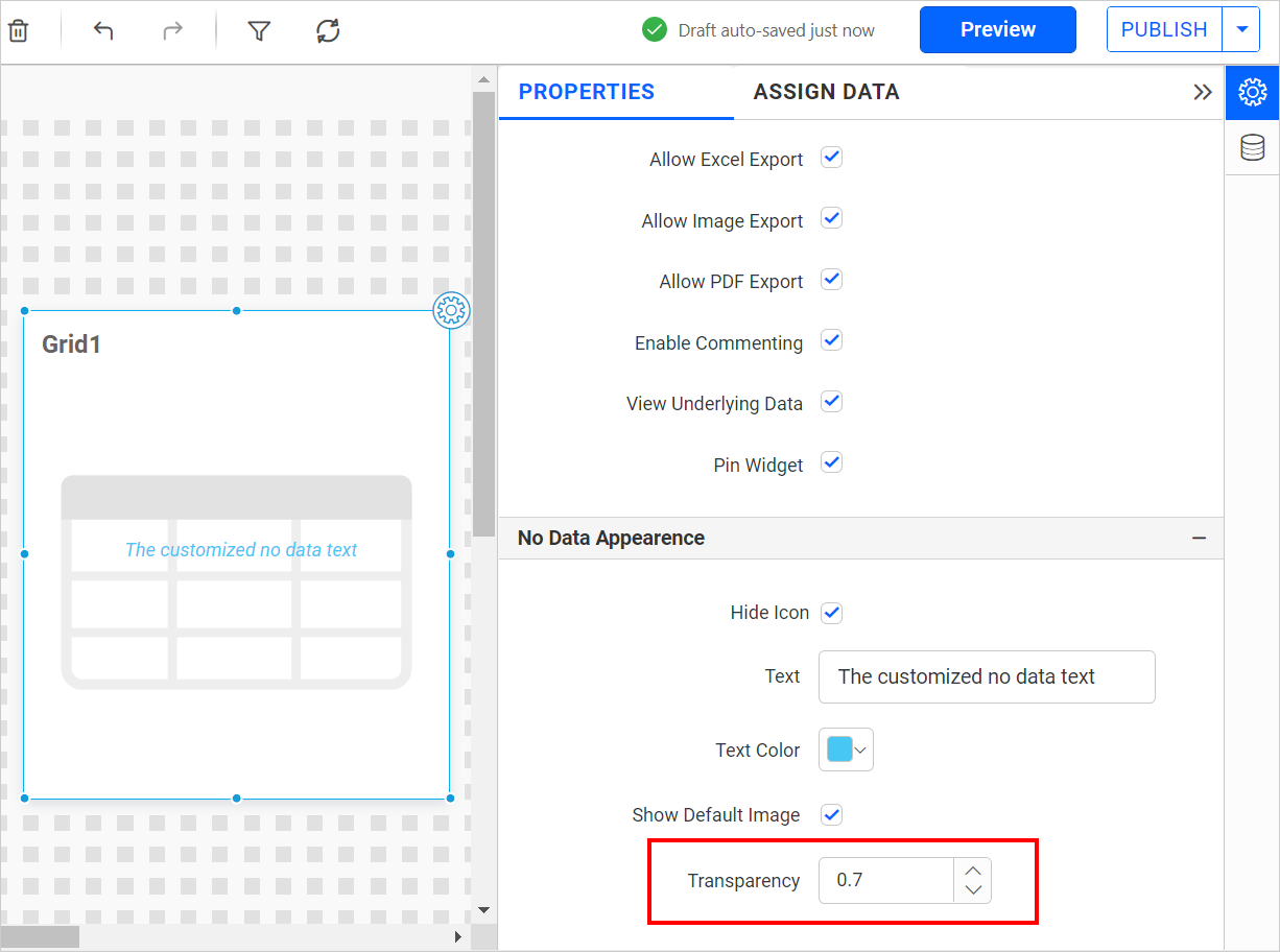
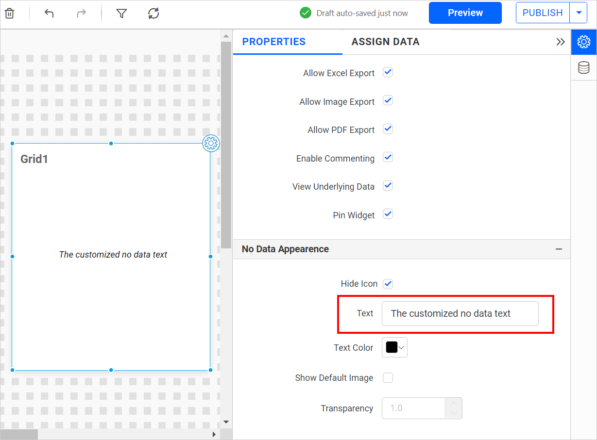
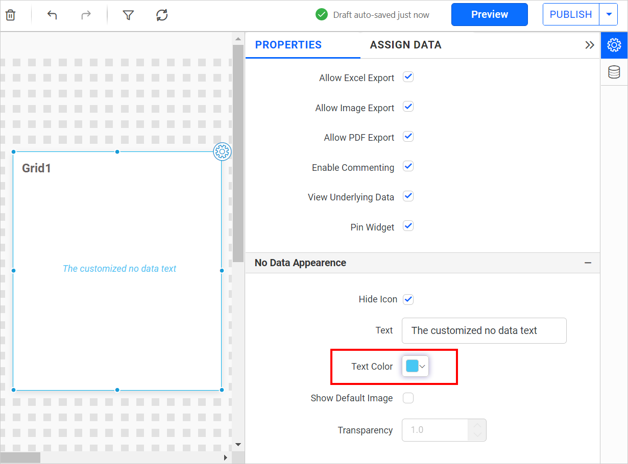
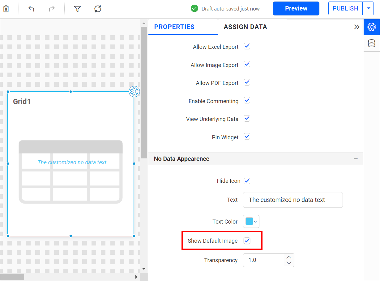
Widgets No data appearance properties
The No Data Appearance Properties section contains properties for displaying messages when no data is received from the database in widgets. It allows you to customize the no data container alert message and text color, and provides options to enable/disable the visibility of the alert icon.

Hide icon
This property allows you to toggle the visibility of the no data alert icon in the widget.

Text
This property allows you to customize the no data alert message for the widget.
Text Color
This property allows you to apply Text color to the widget alert message.
Show Default image
This option allows you to toggle the visibility of the default image for the widget.
Transparency
This option allows you to apply transparency to the default image for the widget.