Range Slider
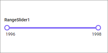
The Range Slider enables you to filter based on a value or date range set through sliders. To configure a range slider, a minimum requirement of 1 column is needed.
How to configure table data to range slider?
The following procedure explains the data configuration of the Range Slider.
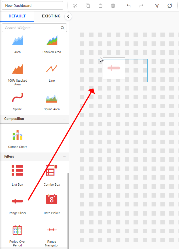
- Drag and drop the
Range Slidercontrol icon from the toolbox into the design panel. You can find the control by searching in the toolbox.
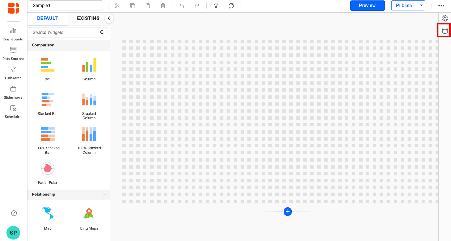
- Click the
Data Sourcebutton in the configuration panel.
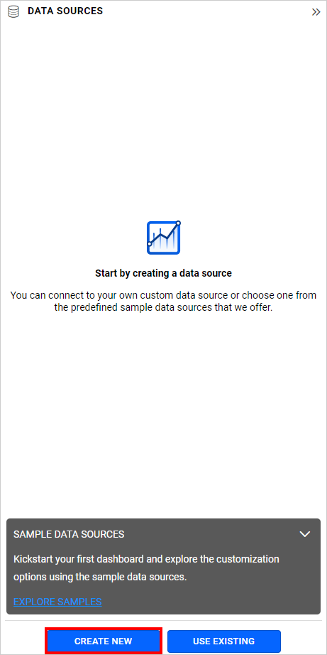
- Click the
CREATE NEWbutton to launch a new connection from the connection type panel.
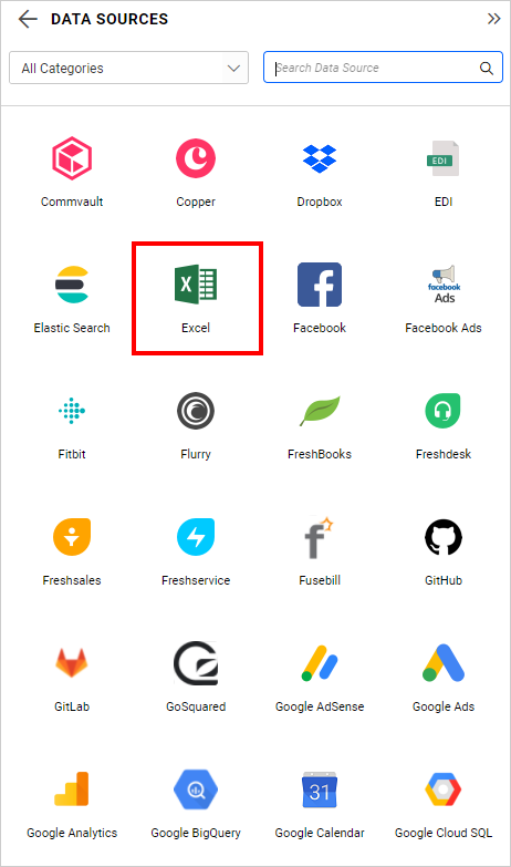
- In the connection type panel, click any one (Here, the
Microsoft ExcelConnection type is selected for demonstration) of the listed connection type buttons shown.
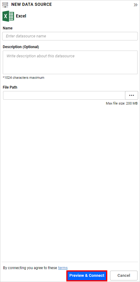
- In the
NEW DATA SOURCEconfiguration panel, fill the connection type and related details. Click theConnectbutton.
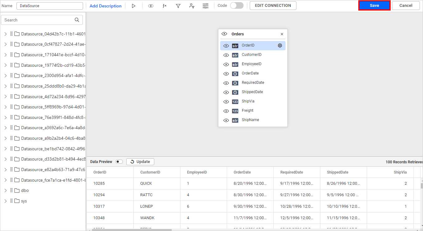
- Drag your preferred table or view from the left pane from the data design view, click the
Savebutton.
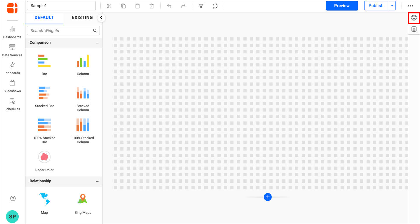
- Click the
Propertiesbutton in the configuration panel, the property pane opens. Now, switch to theASSIGN DATAtab.
- The data tab will be opened with available measures and dimensions from the connected data source.
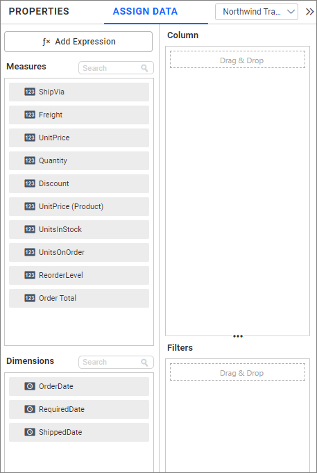
- Bind columns through drag and drop elements from the sections to the
Columnssection.
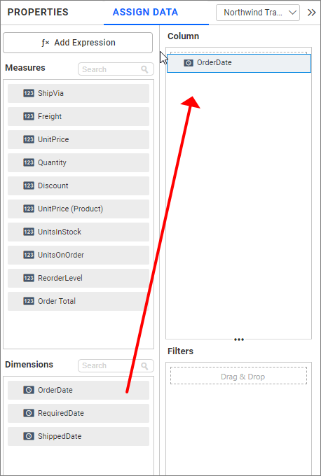
Here is an illustration,
How to format range slider?
You can format the Range Slider for better illustration of the view that you require, through the settings available in the Properties tab.
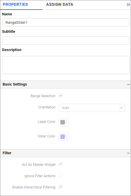
General Settings
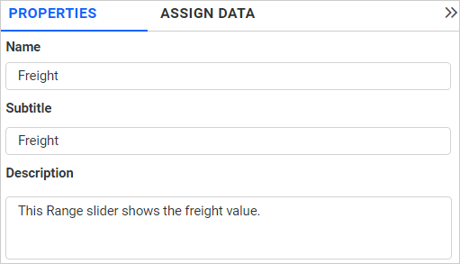
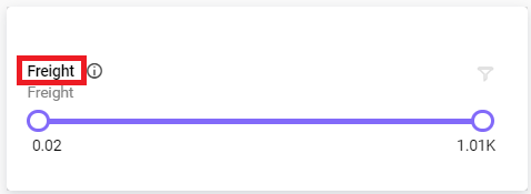
Name
This allows you to set the title for this range slider widget.
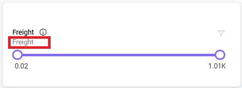
Subtitle
This allows you to set the subtitle for this range slider widget.
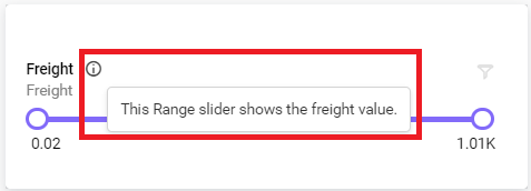
Description
This allows you to set a brief explanation about this range slider widget.
Basic Settings
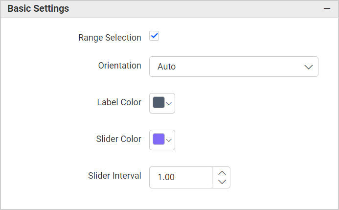
Range Selection
Single value can be bounded if you disable the Range Selection option.
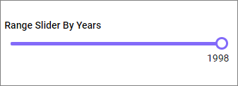
Single – Single value can be bounded, if you disable the Range Selection option.
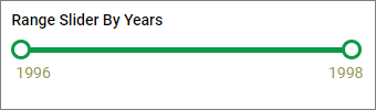
Range Slider with Single Pointer
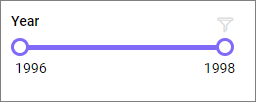
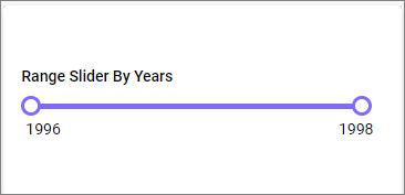
Range – A range (two values) can be bounded if you enable the Range Selection option.
Range Slider with Range Pointer
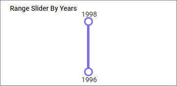
Orientation
This allows you to toggle the orientation type of Vertical Orientation and Horizontal Orientation.
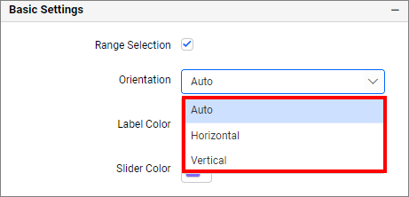
Orientation will be set based on the widget resolutions in the Auto mode.
Range Slider with Vertical Orientation
Range Slider with Horizontal Orientation
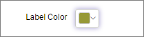
Label Color
This allows you to customize the label color.
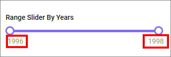
Slider Color
This allows you to customize the slider color.

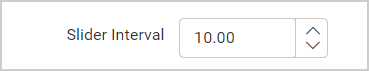
Slider Interval
This allows you to modify the incremental step of the slider. When the slider is adjusted, it shifts based on the new interval of the slider.
Filter
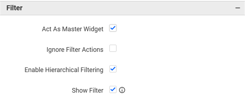
Act as Master Widget
This option allows you to define the range slider widget as a master widget so that its filter action can be recognized by other widgets in the dashboard.
Ignore Filter Actions
This option allows you to specify that the range slider widget should not respond to filter actions applied on other widgets in the dashboard.
Enable Hierarchical Filtering
Using this option, you can enable or disable the hierarchical top N filtering. While applying Top N filter with multiple dimension columns, the data returned can be customized based on whether the filtering needs to be done as flat or based on the hierarchy of dimension columns added.
When the Enable Hierarchical Filtering is enabled, the Top N will be applied for each individual column separately based on the number set for each column.
Show Filter
This feature allows you to toggle the visibility of the Filter icon for the range slider widget when the Act as Master Widget option is enabled.
Container Appearance
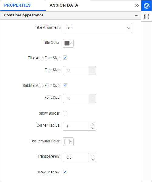
Title Alignment
This setting allows you to adjust the alignment of the widget title to be left, center, or right.
Title Color
You can apply a specific text color to the widget title using this option.
Title Auto Font Size
If Auto Font Size is enabled, the font size of the title will automatically adjust if the screen resolution varies.
Font Size
This setting allows you to specify the font size for the widget title if the Title Auto Font Size is disabled. The value can be between 10 and 44.
Subtitle Auto Font Size
Similar to the title, enabling Auto Font Size for the subtitle will adjust the font size automatically based on screen resolution.
Font Size
This setting allows you to specify the font size for the subtitle if the Subtitle Auto Font Size is disabled. The value can be between 10 and 32.
Show Border
You can toggle the visibility of the border surrounding the widget using this option.
Corner Radius
This setting allows you to specify the radius for the widget corners if the Show Border is enabled. The value can be between 0 and 100.
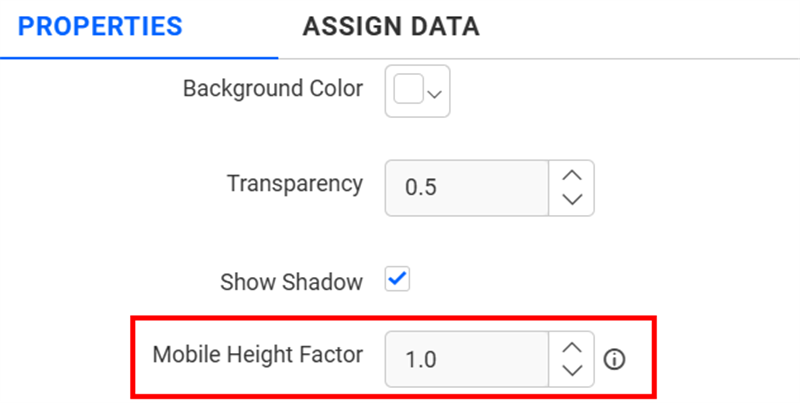
Background Color
Set the background color for the range slider widget using this option.
Transparency
This property allows you to specify the transparency for the background color.
Show Shadow
Toggle the visibility of the shadow surrounding the widget with this option.
Mobile Height Factor
This option allows you to resize widgets specifically for mobile view.
Container actions
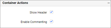
Show Header
This allows you to enable or disable the widget title of the range slider widget.
Enable Comments
Choose to enable or disable comments for the dashboard widget. For more details, please refer to the Commenting Widget.