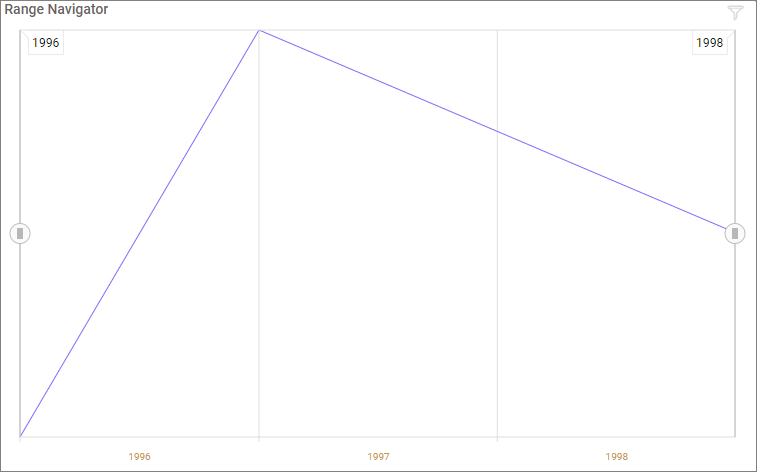
Range Navigator
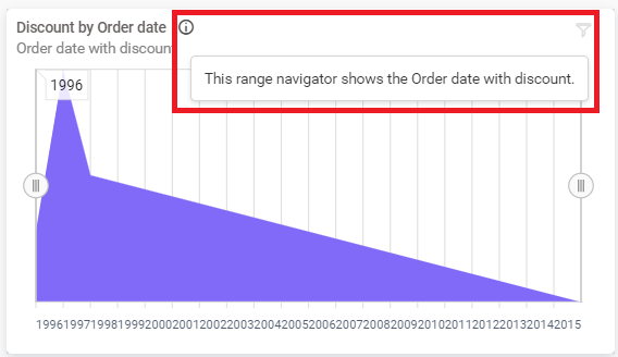
The Range navigator control provides an effective interface for selecting a smaller range from a large collection. It is commonly used to filter the date range for which the data is visualized.
How to configure table data to range navigator?
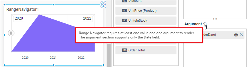
To configure the range navigator, a minimum requirement of a value and column is needed.
The following procedure explains the data configuration of the Range Navigator:
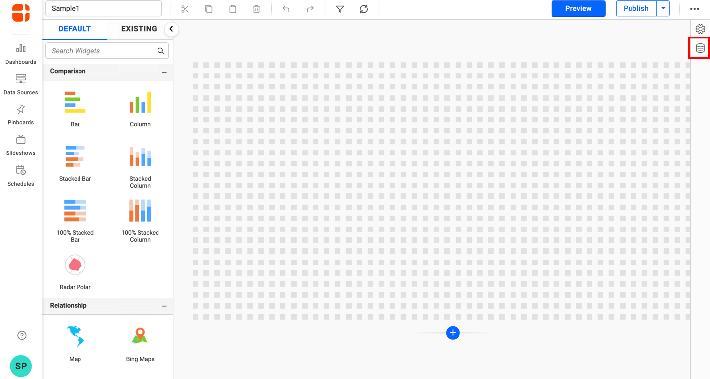
- Click the
Data Sourcebutton in the configuration panel.
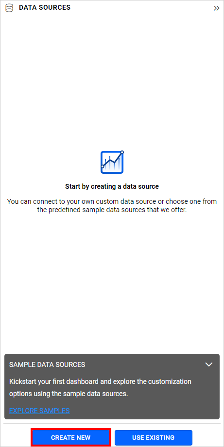
- Click the
CREATE NEWbutton to launch a new connection from the connection type panel.
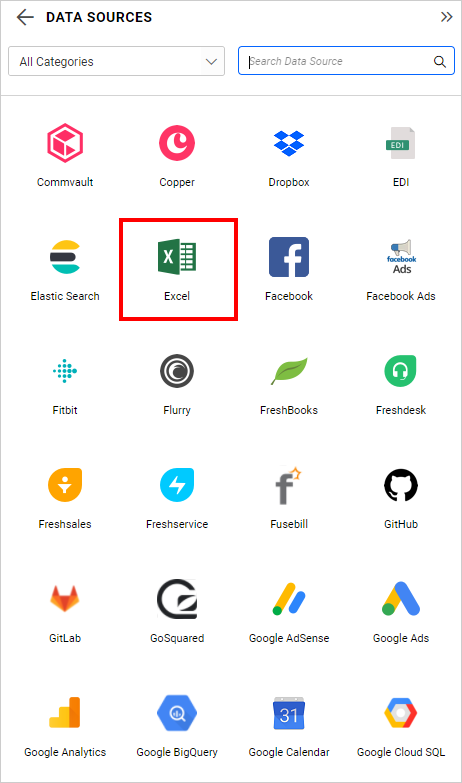
- In the connection type panel, click any one of the listed connection type buttons (Here, the
Microsoft ExcelConnection type is selected for demonstration).
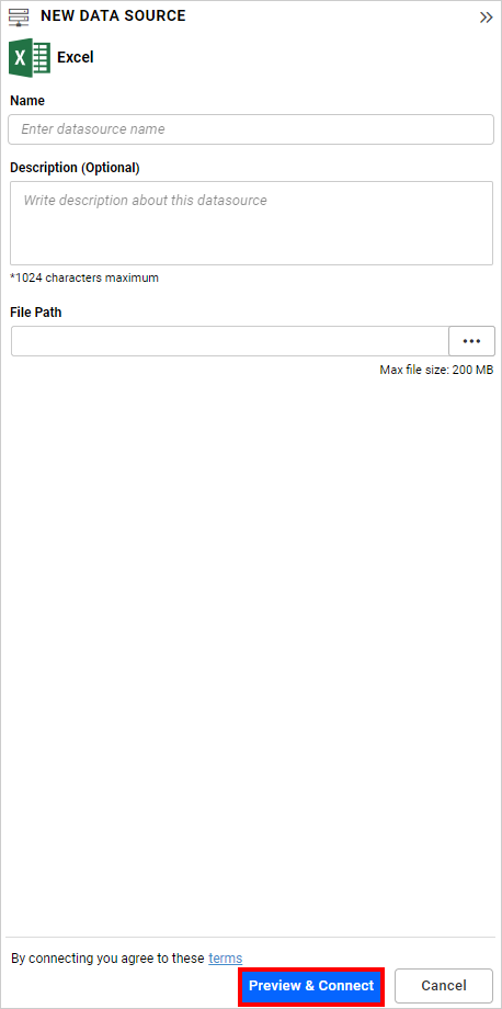
- In the
NEW DATA SOURCEconfiguration panel, fill in the connection type and related details. Click theConnectbutton.
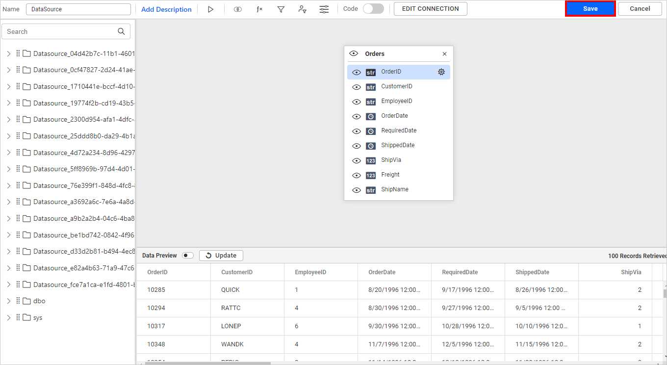
- Drag your preferred table or view from the left panel in the data design view, then click the
Savebutton.
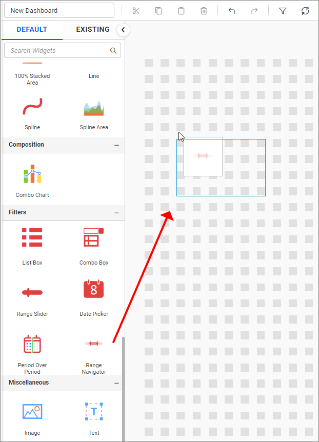
- Drag and drop the
Range Navigatorcontrol icon from the toolbox into the design panel. You can find the control by searching in the toolbox.
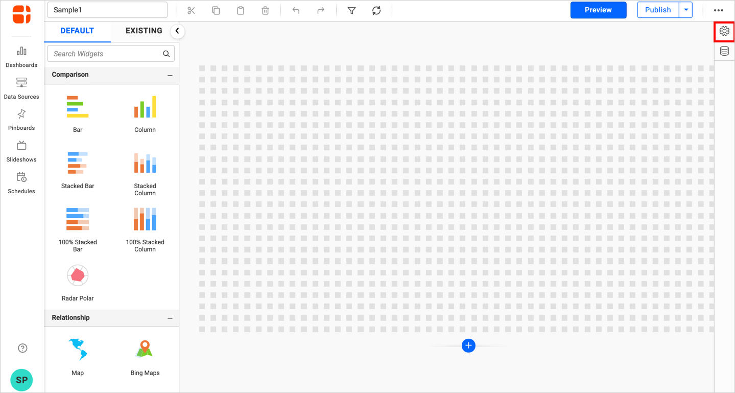
- Click the
Propertiesbutton in the configuration panel, and the property panel opens. Now, switch to theASSIGN DATAtab.
- The data tab will open with available measures and dimensions from the connected data source.
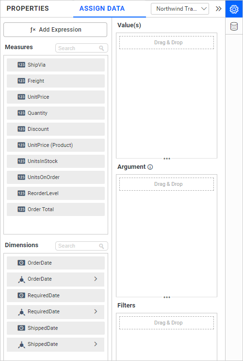
Adding value
Bind a column through drag and drop elements from the Measures section to the Value.
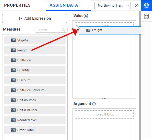
You can add more than one Measure into Value.
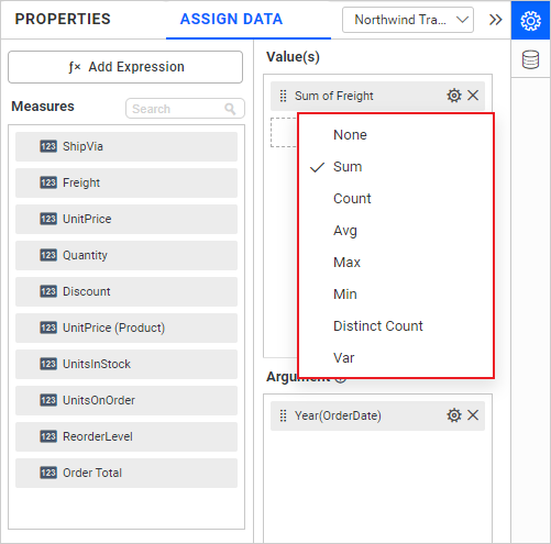
Click the Settings option to change the required summary type from the available summary types shown in the Settings.
Drag and drop elements from the Dimensions or Measures field into the Argument section.
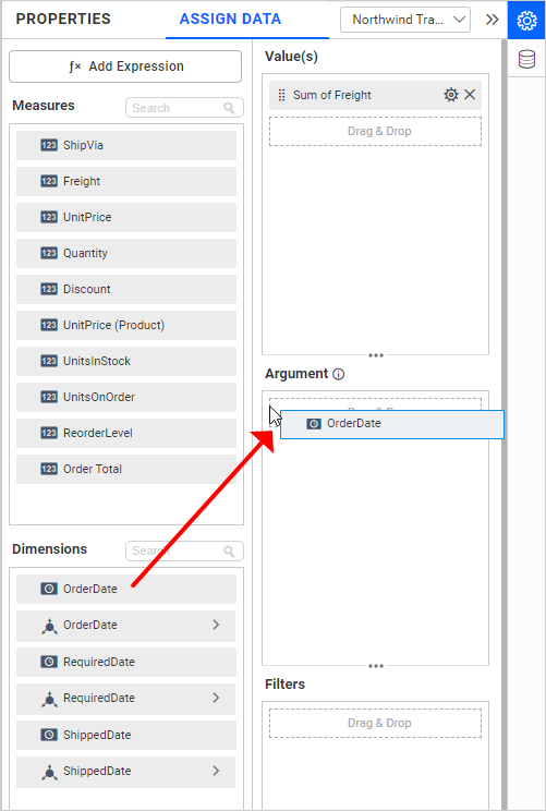
The Dimensions section is available only with date fields, and the icon in the Argument section denotes the same.
Click the Settings option to change the required date format. You can also set the Relative Date Filter.
The Settings icon is not applicable for Measure values.
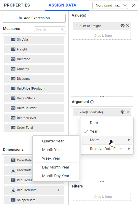
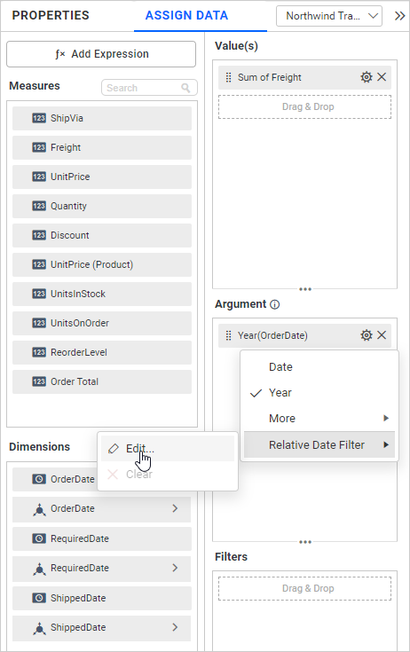
Select the Relative Date Filter in the dropdown menu and click the Edit option to set the relative date.
The following window will open.
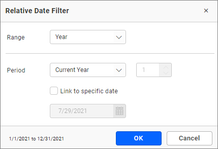
In that window, you can set the Range and Period option. You can also set a Specific date by enabling the Link to a specific date and clicking the OK button.
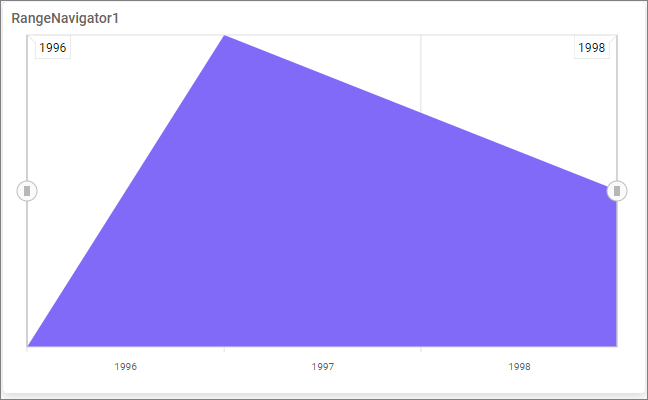
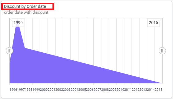
Here is an illustration.
How to format Range Navigator?
You can format the Range Navigator for better illustration of the view that you require through the settings available in the Properties tab.
General Settings
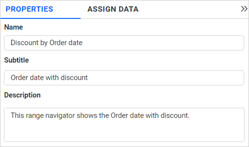
Name
This allows you to set the title for this range navigator widget.
Subtitle
This allows you to set the subtitle for this range navigator widget.
Description
This allows you to set a brief explanation about this range navigator widget.
Color Settings
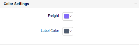
This allows you to customize Range chart series color.
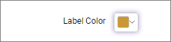
Label Color
This allows you to customize the label color.
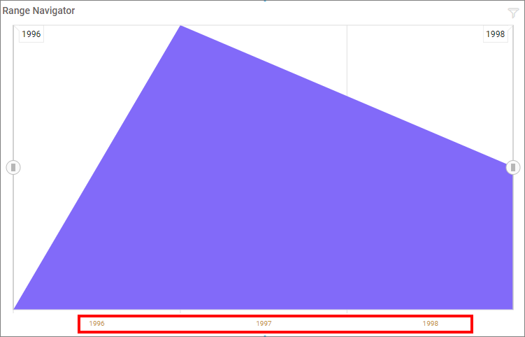
Axis Type Settings
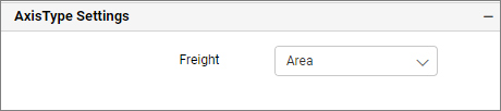
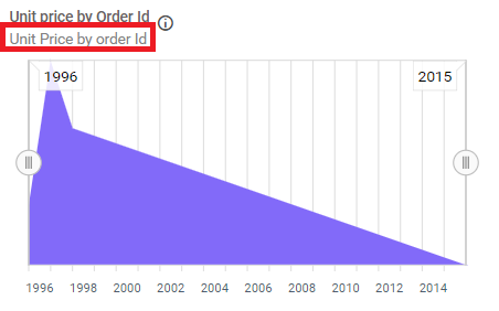
You can change the range chart type as Area, Line, or Step Line by dropdown.
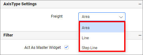
Here is an illustration.
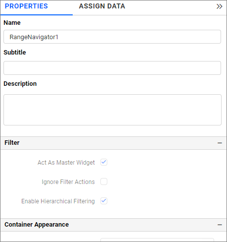
Filter
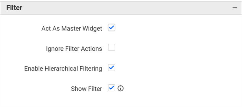
Act as Master Widget
This allows you to define this range navigator widget as a master widget so that its filter action can be made to listen by other widgets in the dashboard.
Ignore Filter Actions
This allows you to define this range navigator widget to ignore responding to the filter actions applied to other widgets on a dashboard.
Hierarchical Filter
Through this option, you can enable/disable hierarchical top N filtering. When applying the Top N filter with multiple dimension columns, the data returned can be customized based on whether the filtering needs to be done as flat or based on the hierarchy of dimension columns added.
When the Hierarchical Filter option is enabled, the Top N will be applied for each individual column separately based on the number set for each column.
Show Filter
This feature allows you to toggle the visibility of the Filter icon for the range navigator widget when the Act as Master Widget option is enabled.
Container Appearance
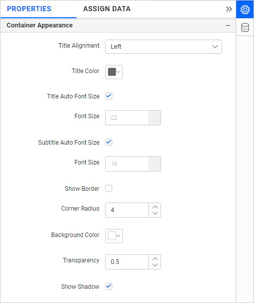
Title Alignment
This allows you to handle the alignment of the widget title to either left, center, or right.
Title Color
This allows you to apply the text color to the widget title.
Title Auto Font Size
On enabling Auto Font Size, the font size of the title will be adjusted automatically if the resolution of the screen varies.
Font Size
This allows you to apply the specified size of the font to the widget title if the Title Auto Font Size is disabled. The value can be between 10 and 44.
Subtitle Auto Font Size
On enabling Auto Font Size, the font size of the subtitle will be adjusted automatically if the resolution of the screen varies.
Font Size
This allows you to apply the specified size of the font to the widget title if the Subtitle Auto Font Size is disabled. The value can be between 10 and 32.
Show Border
This allows you to toggle the visibility of the border surrounding the widget.
Corner Radius
This allows you to apply the specified radius to the widget corners if the Show Border is enabled. The value can be between 0 and 100.
Background Color
This allows you to set the background color of the range navigator widget.
Transparency
This property allows you to specify the transparency for the background color.
Show Shadow
This allows you to toggle the visibility of the shadow surrounding the widget.
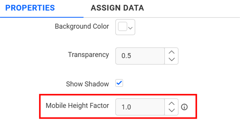
Mobile Height Factor
This option allows you to resize widgets specifically for mobile view.
Container actions
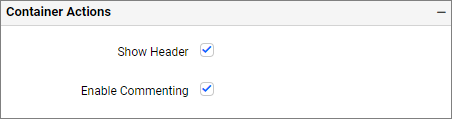
Show Header
This allows you to enable or disable the widget title of the range navigator widget.
Enable Comments
This allows you to enable or disable comments for the dashboard widget. For more details, refer to the Commenting Widget.