Configuring Pivot Grid
The pivot grid allows you to display summarized data in a cross-tabular format, meaning it is organized in rows and columns.
Cross Tab Configuration
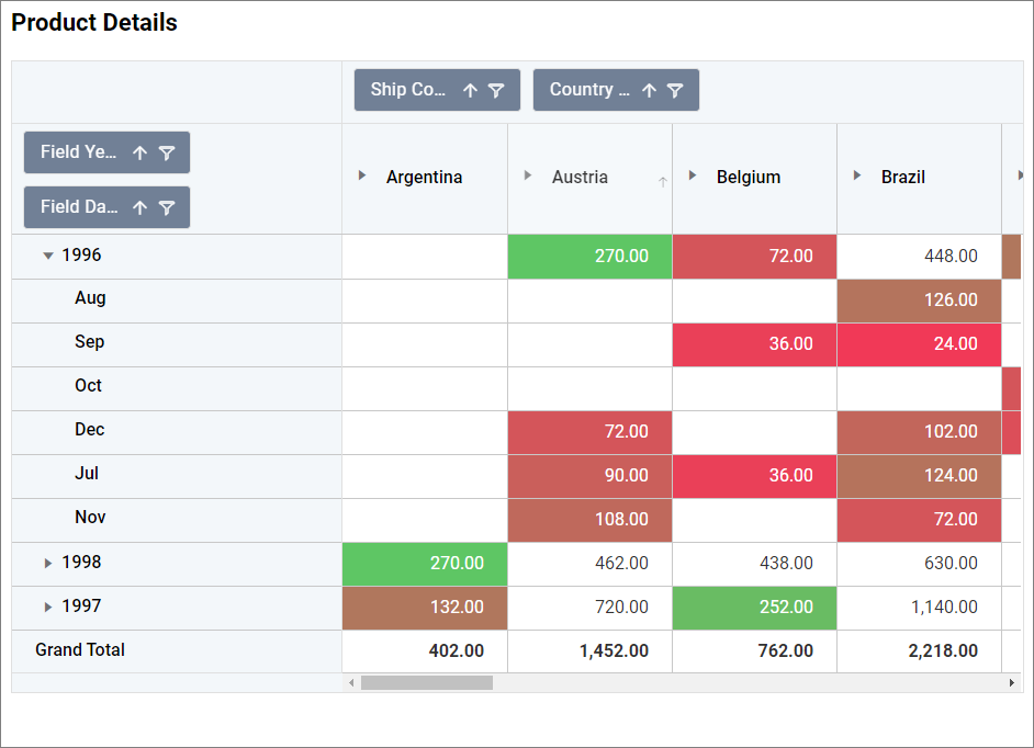
A cross-tab layout is a powerful way to visualize data intersections, providing a detailed breakdown of how different data dimensions interact. In a Pivot Grid, you can configure cross-tabs by defining rows and columns based on different data dimensions, creating a grid-like structure that summarizes data across multiple axes.
How to configure table data to pivot grid?
NOTE: Before adding the Pivot grid widget to the design layout, make sure to create the data source. You can refer to this section to learn how to create a new data source.
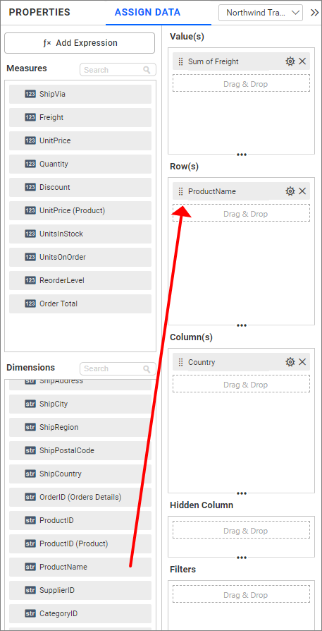
A pivot grid needs a minimum of 1 value, 1 row, and 1 column element to display proper pivot table details. The measure or expression field that you would like to analyze can be dropped into the Value(s) field. The dimension that you would like to categorize the measure based on row and column can be dropped into the Row(s) and Column(s) fields.
The following steps explain how to configure the data for a Pivot grid:
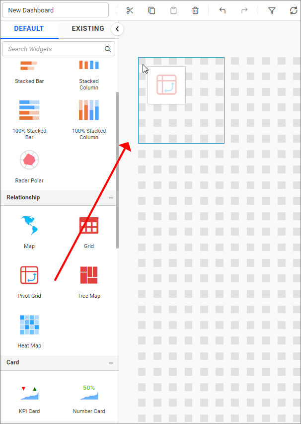
- Drag and drop the pivot grid widget onto a canvas and resize it to your required size.
- Click the
Propertiesicon in the Configuration panel to open the Property pane.
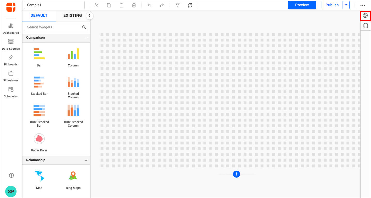
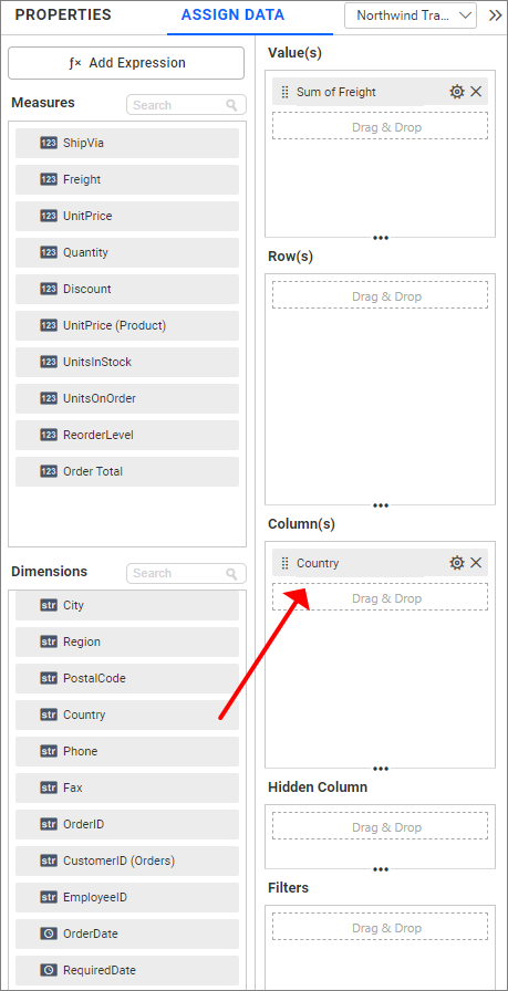
- In the property pane, switch to the
ASSIGN DATAtab from thePROPERTIES,to assign data to the pivot grid data fields.
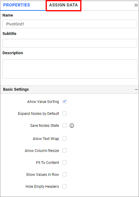
- The
ASSIGN DATAtab will be opened with available measures and dimensions from the connected data source. It also contains theValue(s),Row(s), andColumn(s)fields as mentioned earlier.
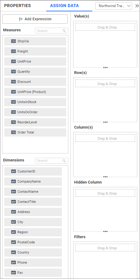
Adding data to Value(s) field
You can add more than one Measure into the Value(s) field by dragging and dropping the required measures.
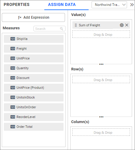
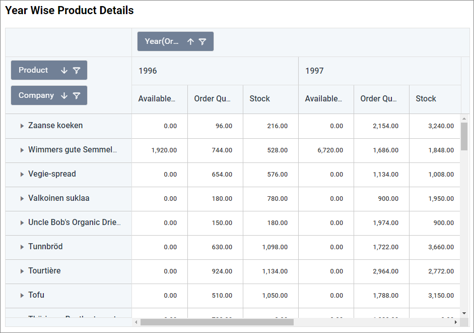
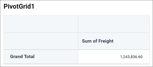
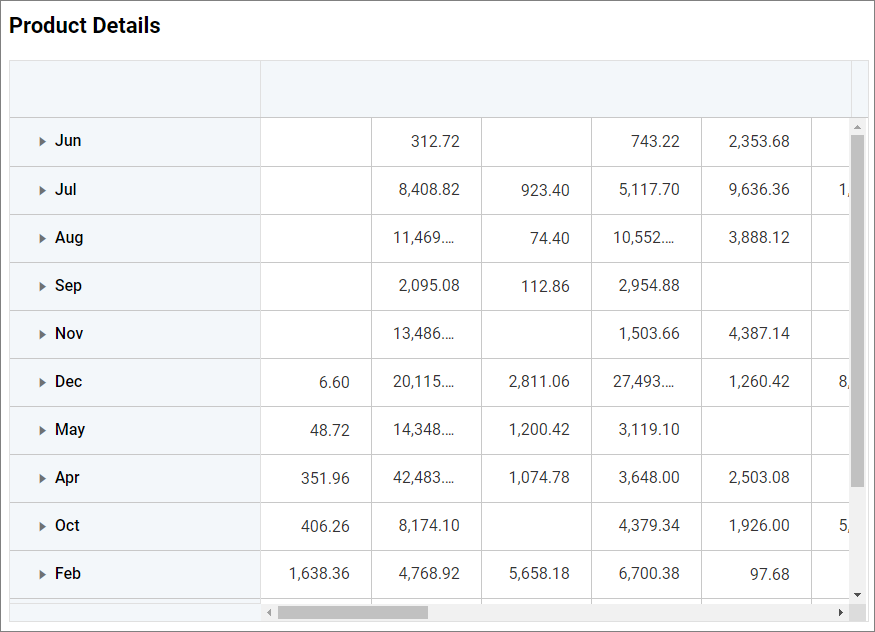
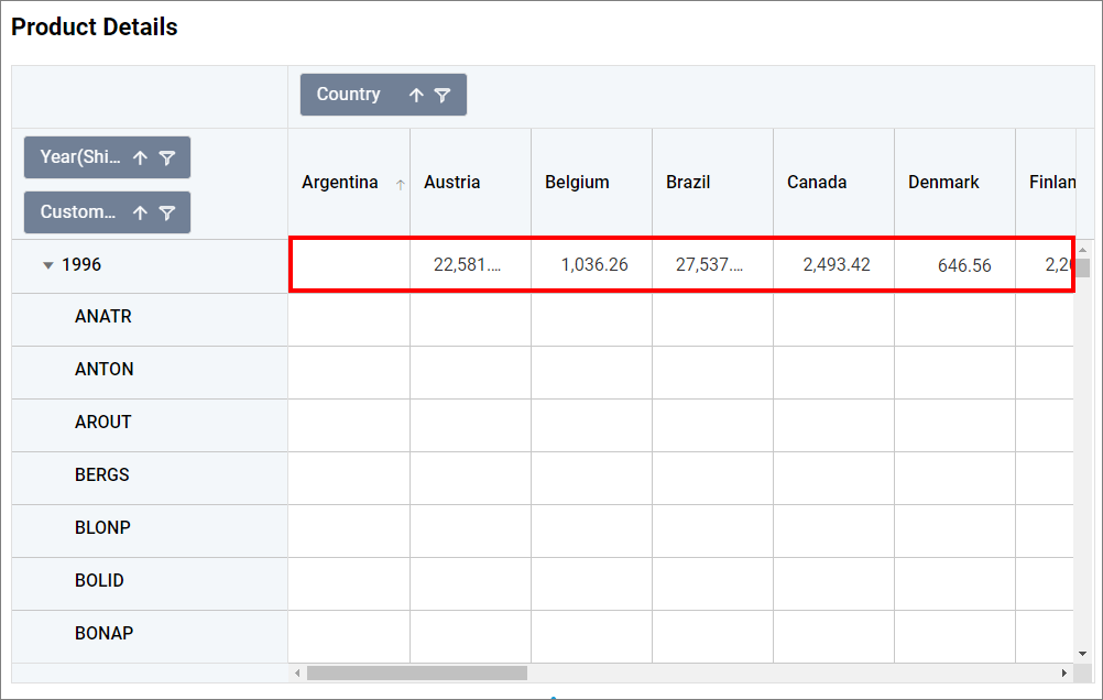
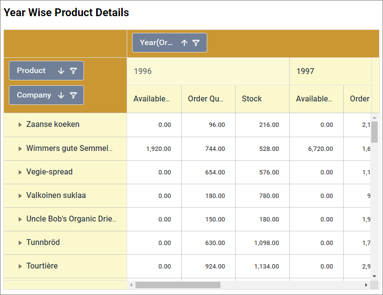
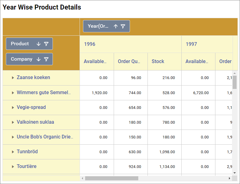
Now the pivot grid will be rendered like this for a single data.
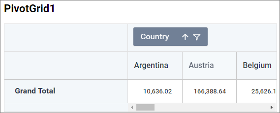
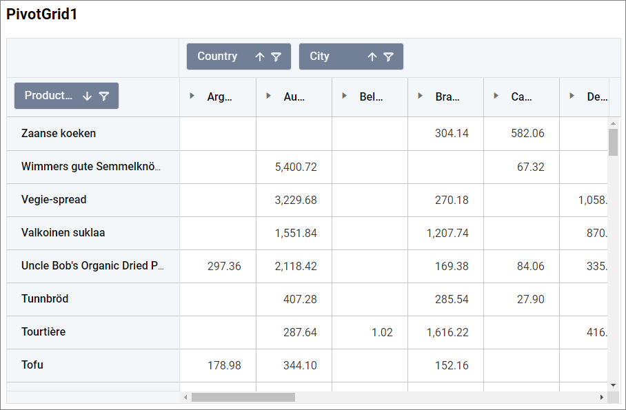
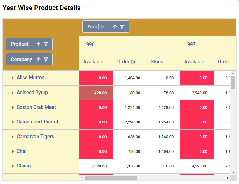
Pivot grid will be rendered like this, if more than one data bind to Value(s)
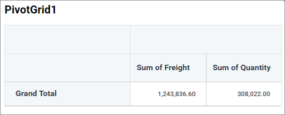
If more than one data is added to Value(s) field and then grid column is separated based on the number of data attached to Value(s) field, as shown in above image.
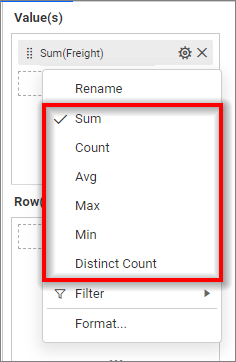
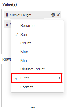
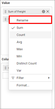
Click the Settings option to change the name using the Rename option and the required summary type from the available summary types shown in Settings.
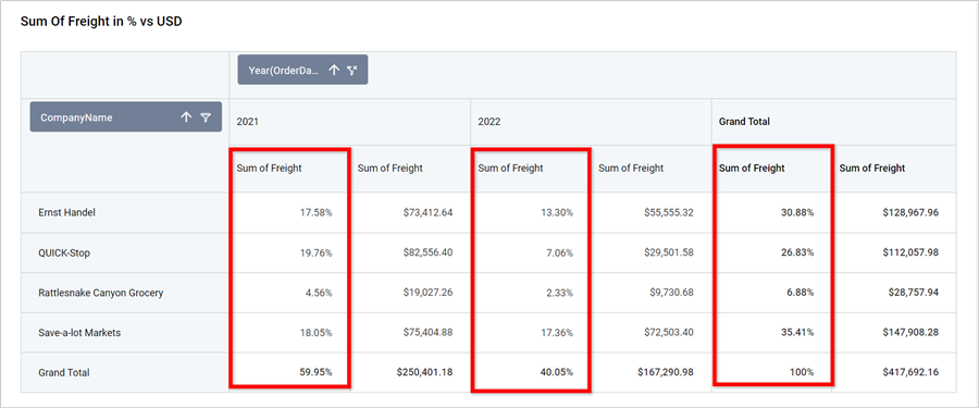
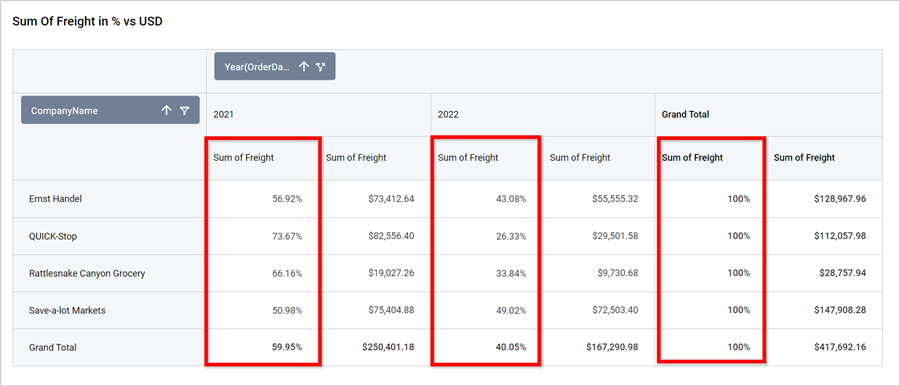
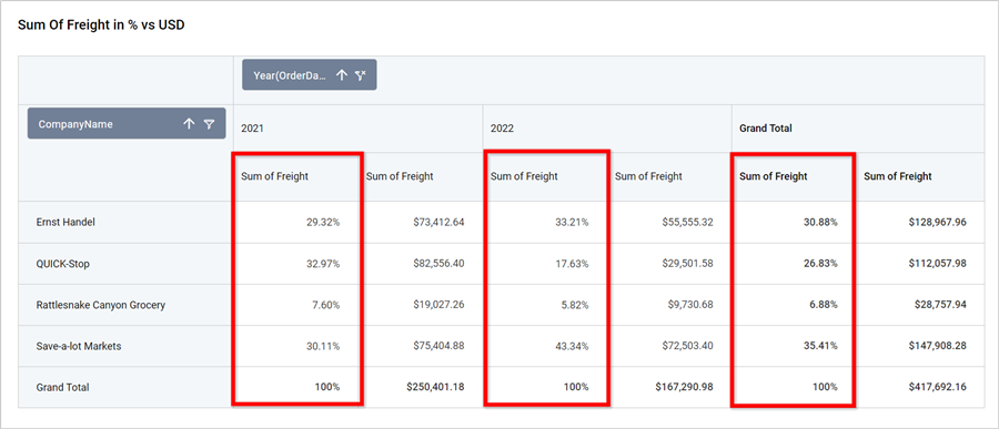
Show Value As Percentage
Depending on the Summary Type, you can convert the individual values to a percentage based on the grand total using the Show Value As option.
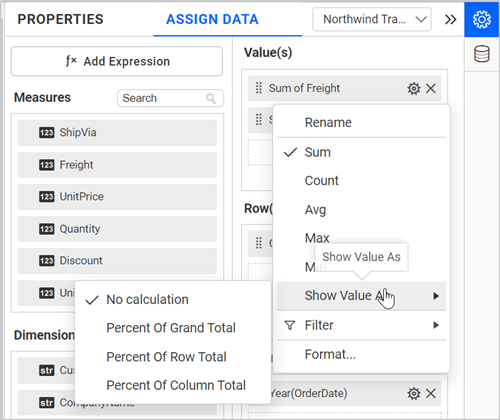
No Calculation
The No Calculation option is used to retrieve the actual value.
Percentage Of Grand Total
To change the Show Value As type to Percent Of Grand Total, it converts the individual value to a percentage based on the row and column grand total.
Percentage Of Row Total
To change the Show Value As type to Percent Of Row Total, it converts the individual value to a percentage based on the row grand total.
Percentage Of Column Total
To change the Show Value As type to Percent Of Column Total, it converts the individual value to a percentage based on the column grand total.
NOTE: Aggregated expressions and the Average summary types are not applicable for the
Show Value Asoption.
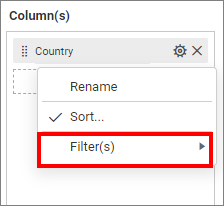
Filtering data
You can filter the data to be displayed in the pivot grid by using filters. For more details, refer to the filter.
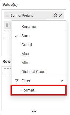
Formatting data
You can format the data to be displayed in the pivot grid by using the format option. For more details, refer to the measure format
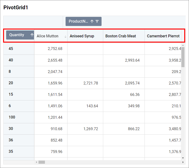
You can add more than one column from the Dimensions field into the Value(s) field.
Adding Column(s)
Adding a single data to Value(s) and Column(s)
You can change the Settings.
Renaming fields
The configured field names can be edited by using the Rename option provided in the settings menu.
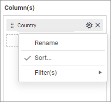
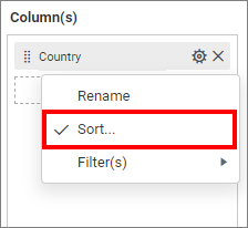
Sorting data
You can sort the dimension data using the Sort option under the Settings menu list. To apply sorting for the data, refer to Sort.
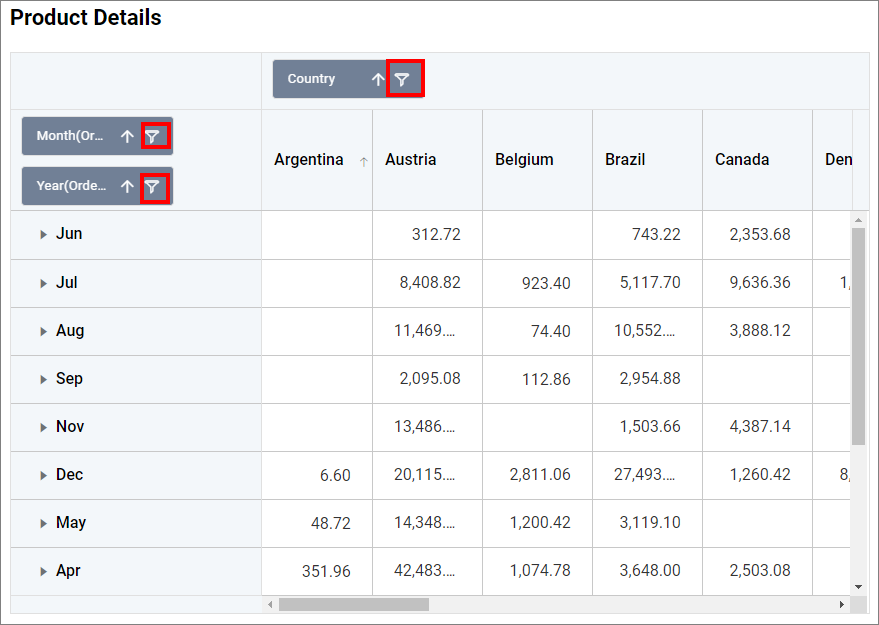
Filtering data
You can apply filters by selecting the filter in settings. For more details, refer to the filter.
Similarly, you can add the Measures and Expressions into the column(s) field.
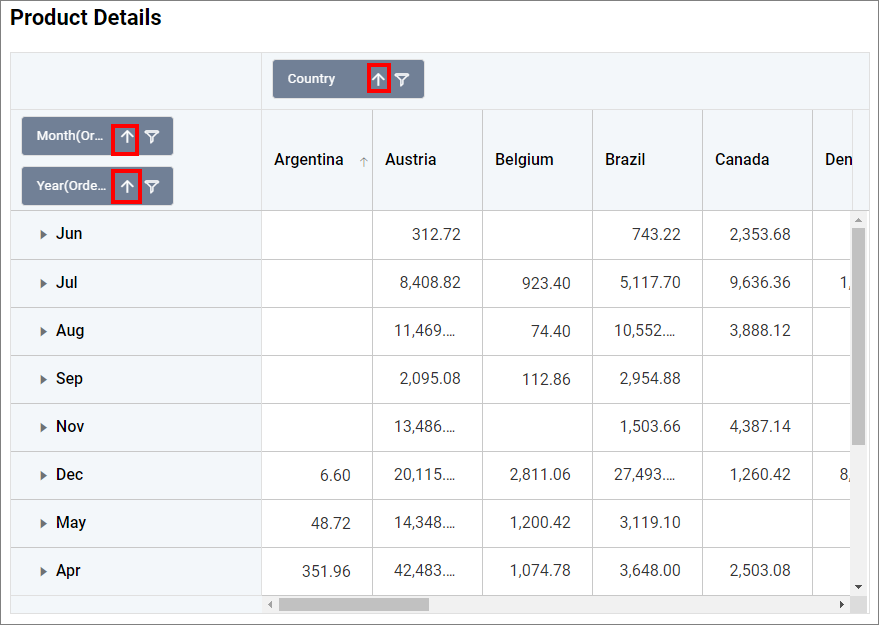
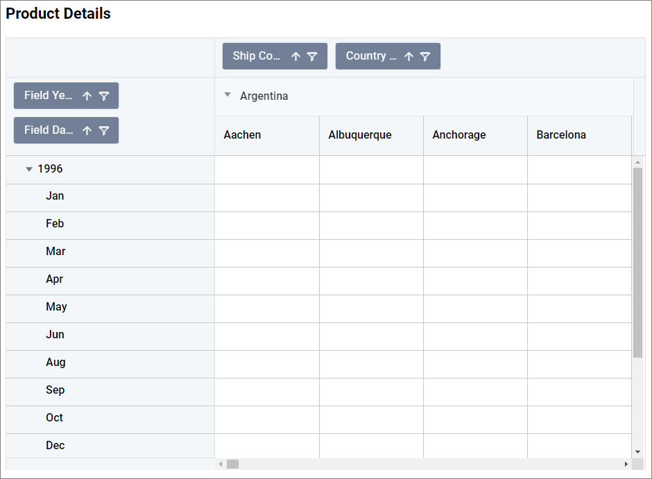
Adding Row(s)
You can drag and drop the Measure or Dimension into the Row(s) field.
You can apply filter and sort options for the rows field if required.
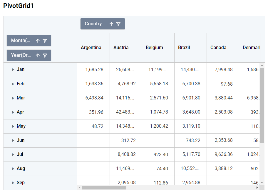
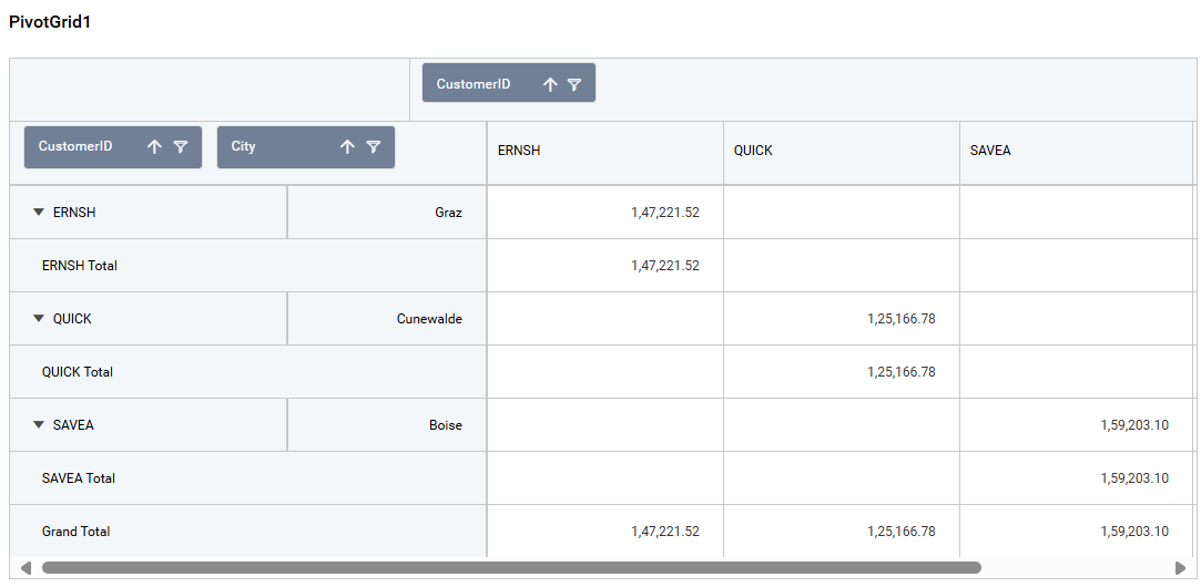
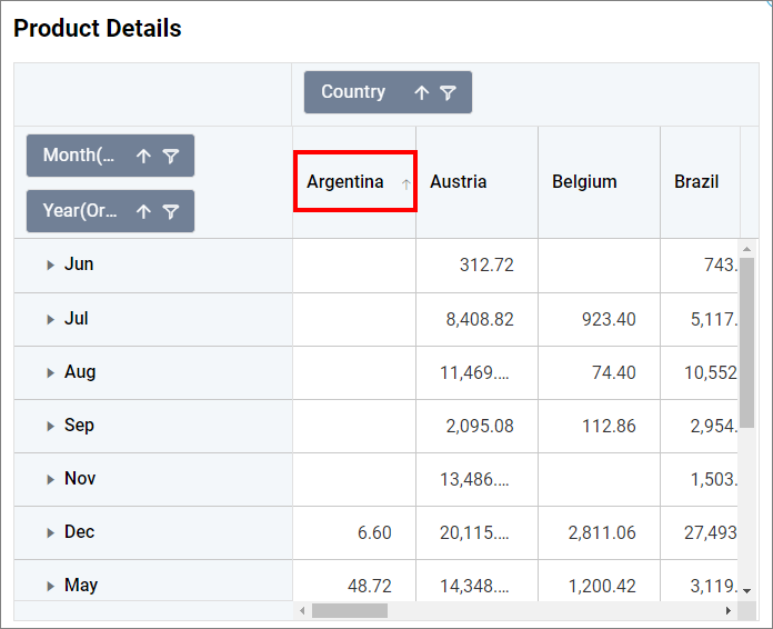
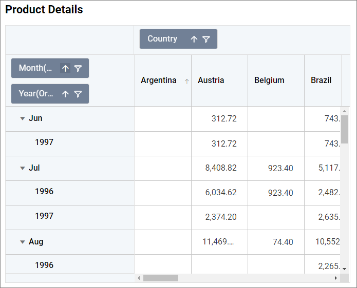
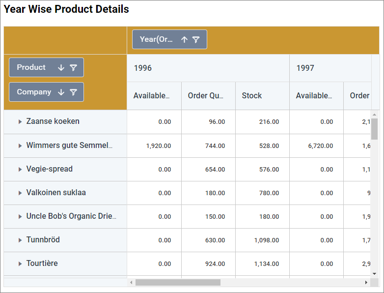
Adding Multiple Column(s)
If more than one data is added to the Column(s) field, then the arrow icon or node is prepended to each cell of the column header. A new tree view list will be opened when the arrow icon is clicked.
Adding Multiple data to Column(s) with single Value(s) and Row(s).
Adding Multiple Row(s)
If more than one data is added to the Row(s) field, then the arrow icon or node is prepended to each cell of the row header. A new tree view list will be opened when the arrow icon is clicked.
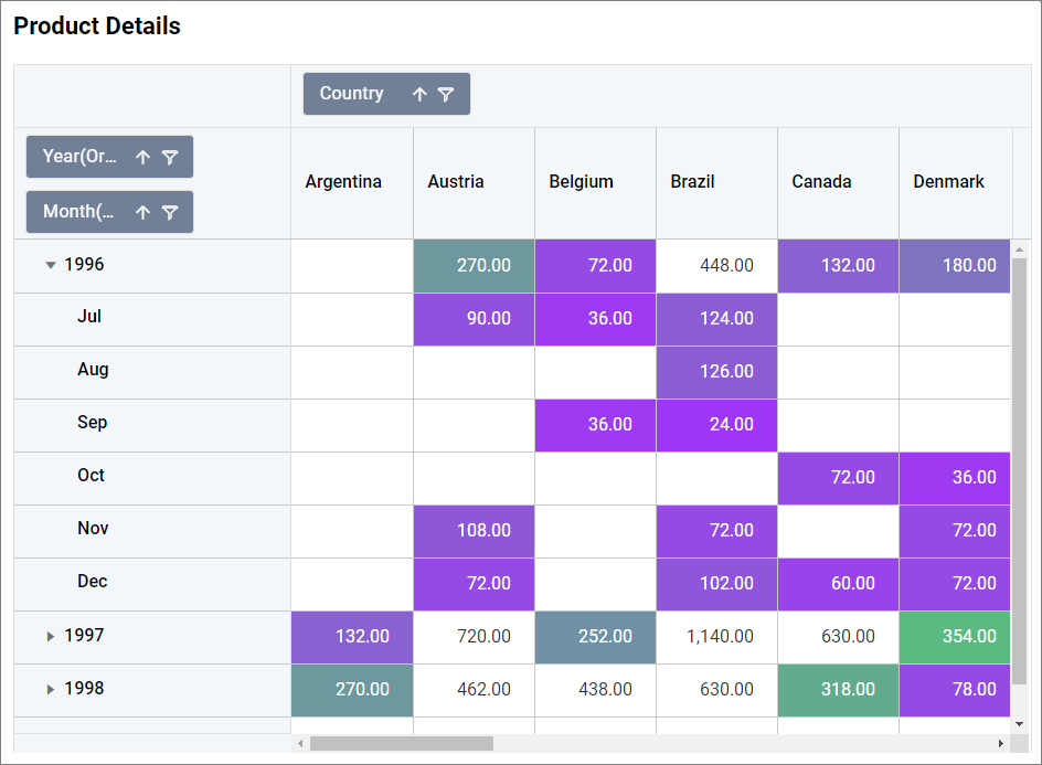
Adding Multiple data to Row(s) with single Value(s) and Column(s).
Hidden column section
You can drag and drop the elements to Hidden Columns if required. Based on the hidden column elements, the values will be shown.
Tooltip section
You can configure the tooltip section to showcase additional information in the widget’s tooltip without affecting the visualization. Refer to this section for more details on configuring the tooltip fields.
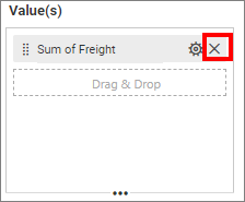
Removing Data from Field
To remove the added data from fields, click the highlighted cross icon.
Important
Data Limit
- Currently, the pivot grid has a limitation of up to 50,000 records.
How to format pivot grid?
The pivot grid can be formatted to improve the view by using the settings available in the Properties tab.
Follow the steps below to format the pivot grid:
-
Drag and drop the pivot grid onto the canvas and resize it to the desired size.
-
Click on the Settings icon and configure the data from the
ASSIGN DATAtab as mentioned in the previous section, then switch back to thePROPERTIEStab.
The property window will be opened.
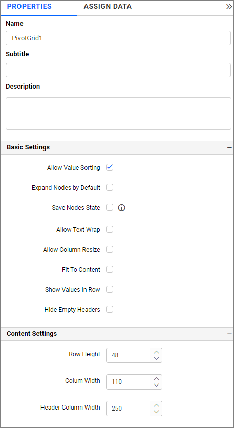
You will see a list of properties available for the widget with their default values.
General Settings
The properties in this section allow you to give a name, subtitle, and description for the pivot grid.
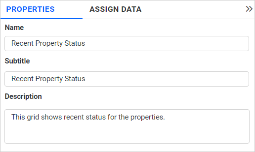
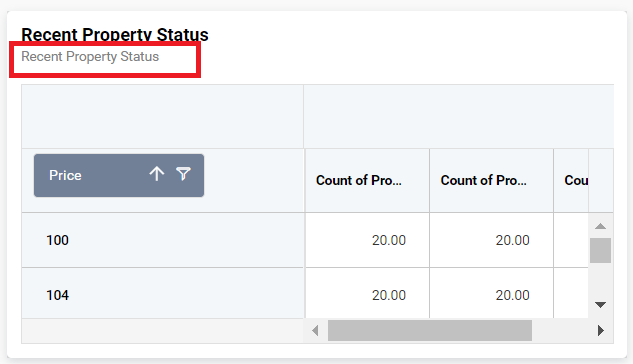
Name
This property allows you to set a title for the pivot grid widget.
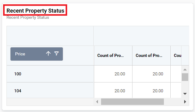
Subtitle
This property allows you to set a subtitle for the pivot grid widget.
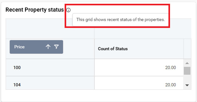
Description
This property allows you to provide a brief explanation about the pivot grid widget.
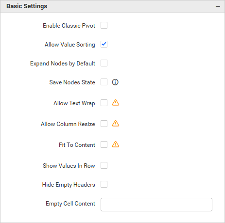
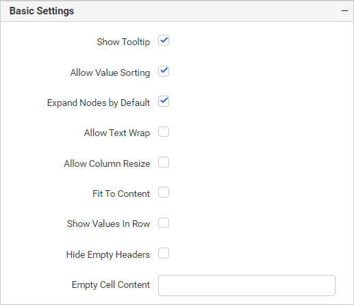
Basic Settings
The Basic Settings section contains general properties for the pivot grid, including value sorting, collapsing and expanding node states, saving the state of nodes, and text wrapping.
Enable Classic Pivot
The classic layout in the Pivot widget offers a structured, tabular presentation of data, improving both readability and usability. In this layout, fields in the row axis are displayed side by side in separate columns, making data interpretation and analysis easier.
This option allows you to switch the pivot grid from Compact to Tabular layout.
NOTE: Enabling the
Enable Clasic Pivotproperty will disable theAllow Text Wrap,Allow Column ResizeandFit To Contentproperty in the basic settings.
Allow Value Sorting
If we click the column header, the value field get sorted as ascending or descending when the property Allow Value Sorting is enabled.
Expand Nodes by Default
If this property’s checkbox is checked, the nodes will be expanded by default.
By enabling the Expand nodes property, the Save Nodes state property will be hidden.
Save Nodes State
This property restores the expanded and collapsed state of nodes even after reloading the dashboard.
Allow Text Wrap
By default, long texts get trimmed in pivot grid. But if the property Allow Text Wrap is enabled, then it displays a wrapped text instead of a trimmed one.
NOTE: Enabling the
Allow Text Wrapproperty will disable theRow Heightproperty in the content settings.
Allow Column Resize
You can resize the pivot grid by dragging the vertical lines of the pivot grid control.
Fit To Content
This property automatically adjusts the column widths in the pivot grid based on the length of the content in each column.
NOTE: Enabling this property will disable the Column Width and Header Column Width properties.
Note: The
Virtualizationdynamically loads the given data when you scroll down the pivot grid. If any one of these properties (Fit to content, allow text wrap, and allow column resize) is enabled, then thevirtualizationis disabled. Also, we do not recommend using these properties (Fit to content, allow text wrap, and allow column resize) when dealing with a large number of records.
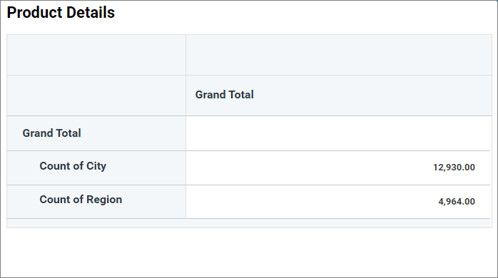
Show Values in Rows
This property displays the values in rows.
Hide Empty Headers
Enabling this option allows you to hide null or empty headers in the pivot grid table.
In the following image, the column headers have (Null) values in data.
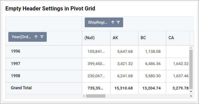
By enabling this option, the (Null) header column gets hidden.
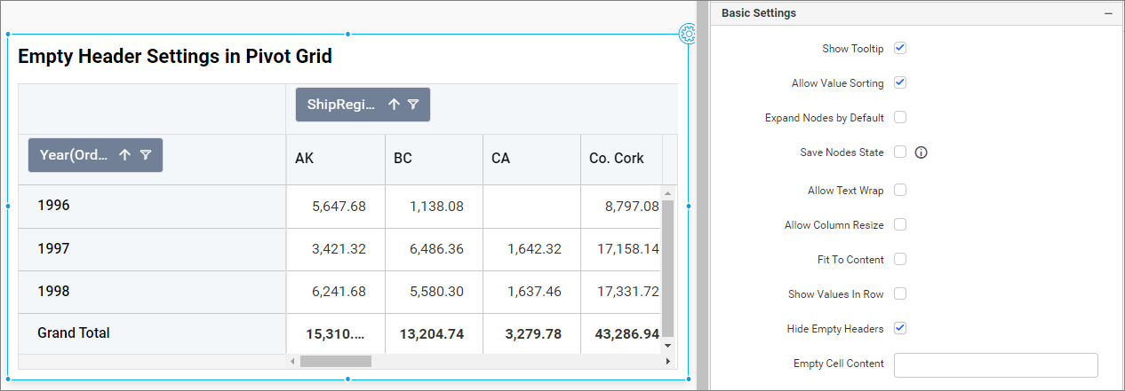
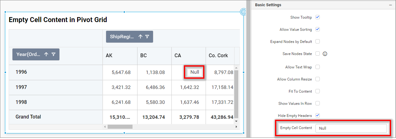
Empty Cell Content
This option allows you to set a value for empty cells in the pivot grid.
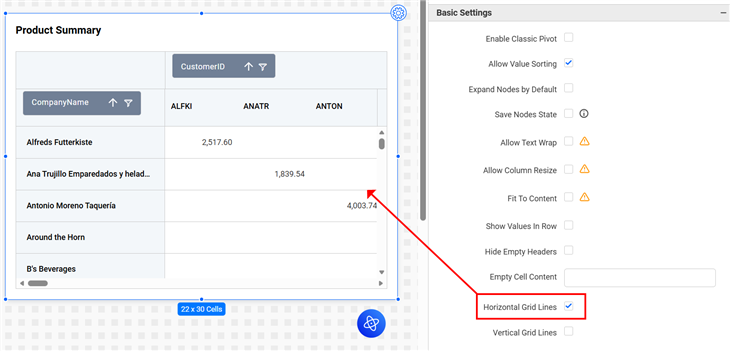
Horizontal Grid Lines
Use this option to enable or disable horizontal grid lines in the Pivot Grid control.
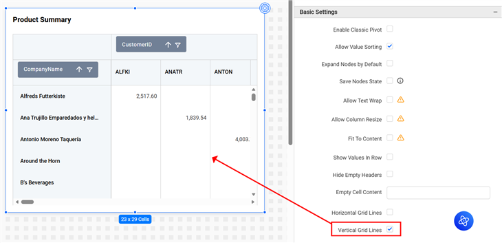
Vertical Grid Lines
Use this option to enable or disable vertical grid lines in the Pivot Grid control.
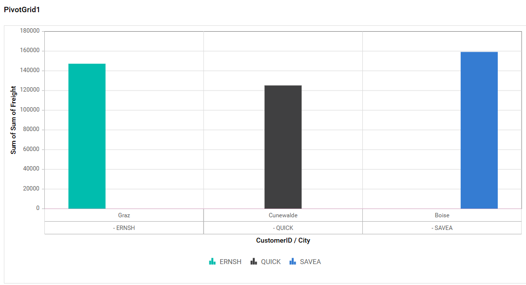
Pivot Chart Settings
This section allows you to switch to pivot chart from pivot grid.
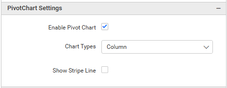
In pivot grid widget, pivot chart would act as an additional visualization component with its basic and important characteristics like drill down and drill up, series customization, axis customization, legend customization, export, print, and tooltip. Its main purpose is to show the pivot data in graphical format.
Enable Pivot Charts
Enabling this option allows you to view Pivot Charts or Pivot Table in the visualization.
Charts types
-
Column: Displays data as vertical bars, making it easy to compare different values across categories.
-
Bar: Similar to column charts but with horizontal bars, useful for displaying comparative data.
-
Line: Uses points connected by lines to display trends over time or categories.
-
Area: Similar to line charts, but the area below the line is filled to emphasize magnitude.
-
Spline: A smooth line that connects data points, ideal for showing data trends smoothly.
-
Spline Area: Combines the smooth curves of a spline chart with the filled area of an area chart, highlighting both trends and magnitude.
-
Stacking Column: Displays data in vertical bars stacked on top of each other, making it easy to compare the total and individual contributions across categories.
-
Stacking Area: Similar to area charts but with multiple data series stacked, showing how each contributes to the total over time or categories.
-
Stacking Bar: Like stacking column charts but with horizontal bars, useful for comparing parts of a whole across different categories.
-
Bubble: Uses bubbles of varying sizes to represent data values in a scatter plot format, ideal for visualizing relationships between three variables.
-
Scatter: Plots individual data points on a Cartesian plane, useful for identifying correlations or distributions between two variables.
-
100% Stacking Column: Similar to stacking column charts, but each stack is normalized to 100%, emphasizing the percentage contribution of each series.
-
100% Stacking Bar: Like 100% stacking column charts but with horizontal bars, showing relative percentage contributions across categories.
-
100% Stacking Area: Displays the percentage contribution of each data series over time or categories, with areas stacked to total 100%.
-
Polar: Plots data in a circular graph using angles and radii, suitable for showing cyclic patterns or directional data.
-
Radar: Displays multivariate data in a circular layout with axes starting from the same point, ideal for comparing multiple variables.
-
Pie: Represents data as slices of a circle, showing the proportion of each category relative to the whole.
-
Doughnut: Similar to pie charts but with a blank center, allowing for additional labeling or aesthetics.
-
Funnel: Visualizes data in progressively decreasing segments, often used to represent stages in a process like sales or conversions.
-
Pyramid: Similar to funnel charts but shaped like a pyramid, useful for hierarchical or layered data representation.
Show Stripe Line
The stripe line feature highlights a specific range on the chart for better data visualization and analysis.
-
Start Value of StripeLine: Defines where the stripe line starts on the y-axis (e.g., 5000).
-
End Value of StripeLine: Defines where the stripe line ends on the y-axis (e.g., 5200).
-
Stripe Line Color: Allows customization of the stripe line’s color for better visual distinction.
-
Stripe Line Text: Lets you add descriptive text to the stripe line, providing context or additional information.
Tooltip Settings
The Tooltip Settings section allows you to customize the appearance and behavior of tooltips in widget visualizations.
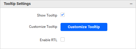
Show Tooltip
This option allows you to toggle the visibility of the tooltip in the pivot grid.
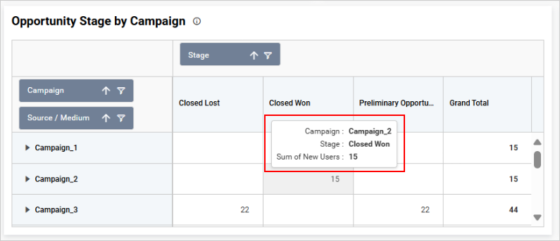
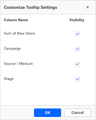
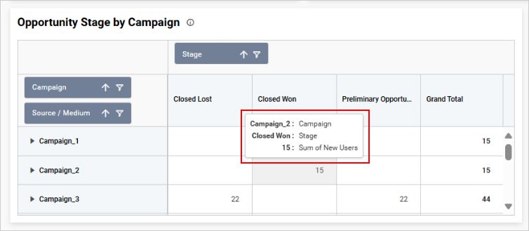
Customize Tooltip
This option allows you to customize the columns that are visible in the pivot grid tooltip.
Enable RTL
This option allows you to display fields and their data from right to left.
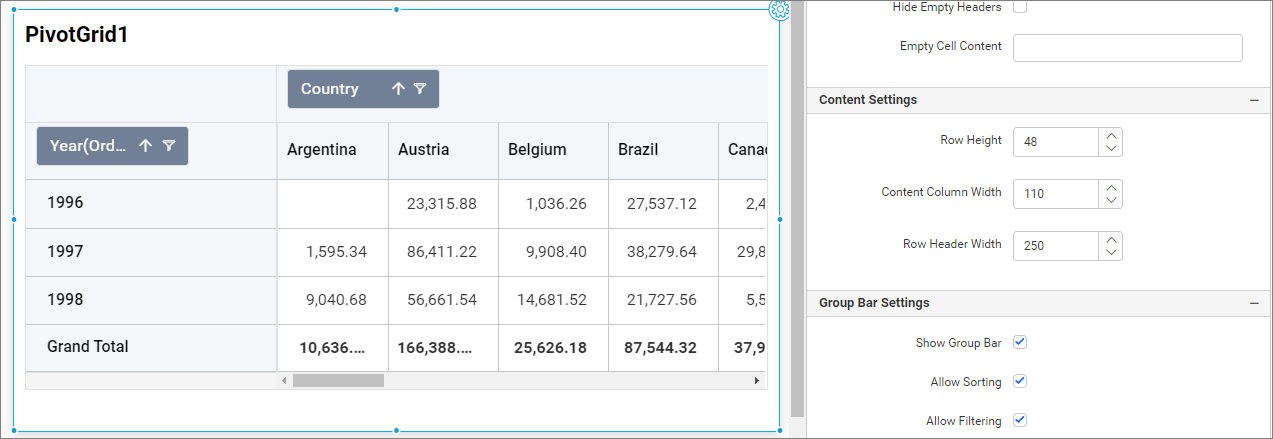
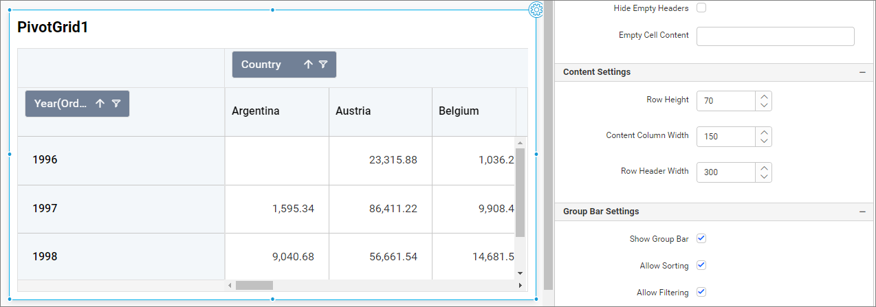
Content Settings
This section allows you to customize the height and width of the pivot grid cells.
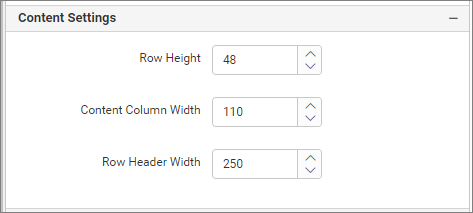
Row Height
This option allows you to customize the height of content rows in the pivot grid.
Content Column Width
This option allows you to customize the width of the content columns.
Row Header Width
This option allows you to customize the width of the row headers (first column) in the pivot grid.
Pivot grid with default values.
Pivot grid with customized values.
Group Bar Settings
This section contains properties related to the group bar (row and column headers), including show or hide, sorting, and filtering properties.
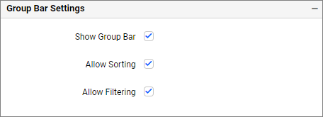
Show Group Bar
If this property’s checkbox is unchecked, the group bar (row and column headers) will be disabled. Checking this property will display the group bar.
Allow Sorting
Allow Sorting allows user to enable and disable sorting property for group bar.
Allow Filtering
Allow Filtering enables users to enable or disable the Filtering property for the group bar.
Grand Total Settings
This section contains the show and hide properties for grand and subtotals of rows and columns.
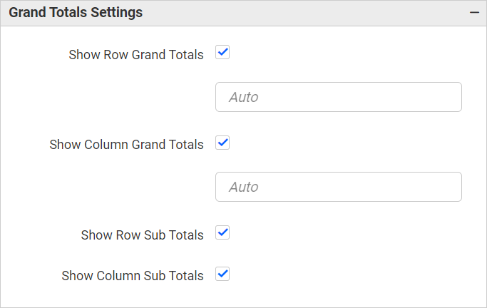
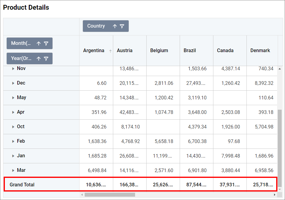
Show Row Grand Totals
This property allows users to show or hide the row’s grand total. If this property is unchecked, the row’s grand total in the image below will be disabled.
Show Row Grand Totals Text
This property allows users to modify the text for row grand totals. The default text displayed for row grand totals is Grand Total. When you change the text value in the row grand totals text box, the changes will be reflected in the row grand totals, as shown in the following image.
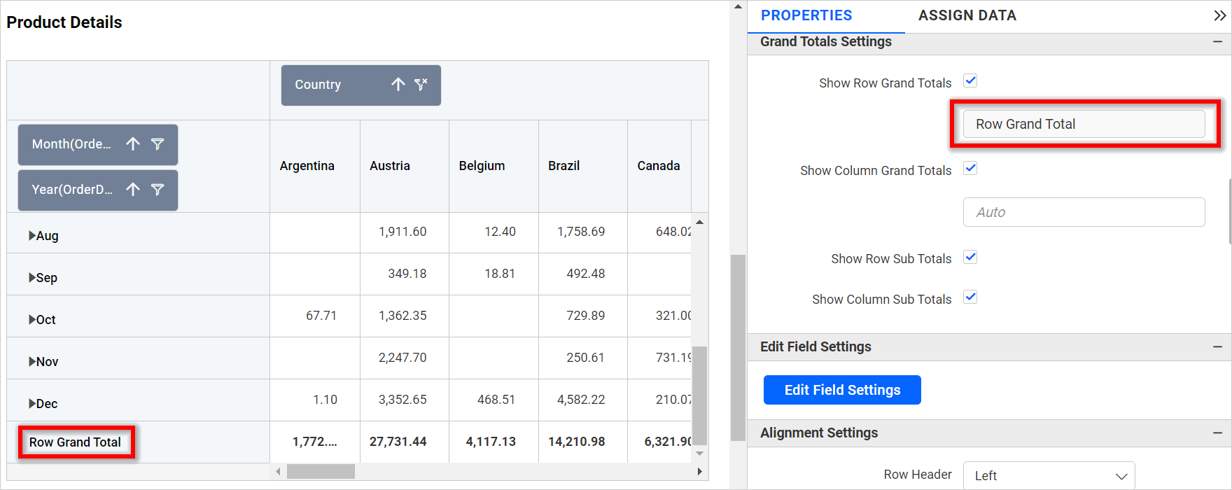
NOTE: The row grand totals text box is set to
Autoby default, which uses the localizedGrand Totaltext from the locale file for display. This allows us to modify the row grand totals text in multiple pivot grids simultaneously using localized text and localization.
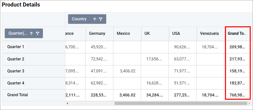
Show Column Grand Totals
This property allows users to show or hide the column’s grand total. If this property is unchecked, the column’s grand total in the image below will be disabled.
Show Column Grand Totals Text
This property allows users to modify the text for column grand totals. The default text displayed for column grand totals is Grand Total. When you change the text value in the column grand total text box, the changes will be reflected in the column grand total, as shown in the following image.
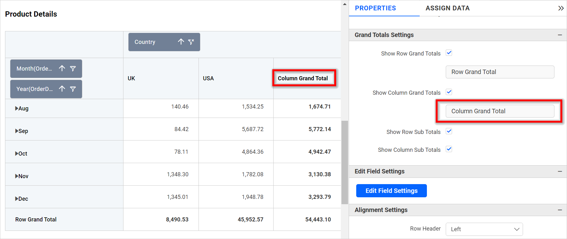
NOTE: The column grand totals text box is set to
Autoby default, which uses the localizedGrand Totaltext from the locale file for display. This allows us to modify the column grand totals text in multiple pivot grids simultaneously using localized text and localization.
Show Row Sub Totals
This property allows users to show or hide the row’s subtotals. The image below is an example of a disabled subtotal for the row.
Show Column Sub Totals
This property allows users to show or hide the column’s subtotals. The image below is an example of a disabled subtotal for the column.
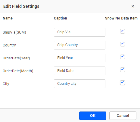
Edit Field Settings
You can edit the field settings.
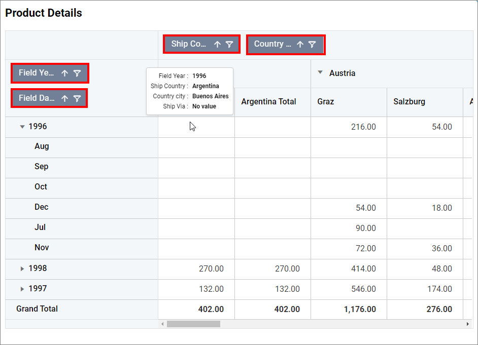
Show No Data Item
The Show No Data Item feature displays the empty data cell of the selected Name from the Edit Field Settings. For example, if the Show No Data Item for ShipCity is checked, it will display all the empty data points as empty cells, similar to the image below.
In the above image, all cities except Campinas have empty data, so they are displayed as empty cells.
Alignment Settings
This option allows you to align the Column header, Row header, and Values to either the left, right, or center.
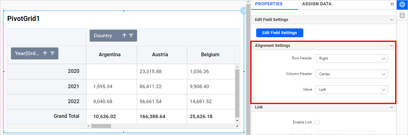
Row Header - You can align the row header to the left, center, or right. The default is left.
Column Header - You can align the column header to the left, center, or right. The default is left.
Value - You can align the Value cells to the left, center, or right. The default is right.
Formatting
This section explains how to format the pivot grid cells.
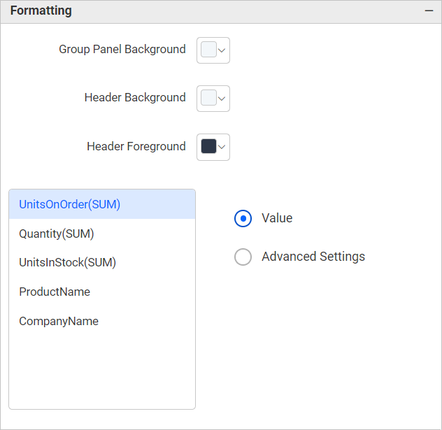
Group panel background color
This allows you to select the color for the group panel’s background. The default value is #e9e9e9.
Header background color
This allows you to select the color for the header row’s background. The default value is #eeeeee.
Header foreground color
This allows you to select the color for the header row’s foreground. The default value is #333333.
Include Sub Total Cells
This property allows you to control whether formatting rules (including conditional color rules from the Advanced settings) are applied to subtotal or sub-value cells in the pivot grid. When enabled, the formatting rules that would normally apply to primary values are also applied to intermediate subtotal rows and columns.
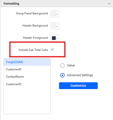
- Default:
false(disabled). - When disabled: Formatting rules apply only to the primary value cells.
- When enabled: Gradient and Rule-based formatting will also color subtotal cells and sub-values visible at subtotal level.
Column representation
You can define the column value represented as simple text or condition-based formatted text. This lists the columns added to the pivot grid widget.
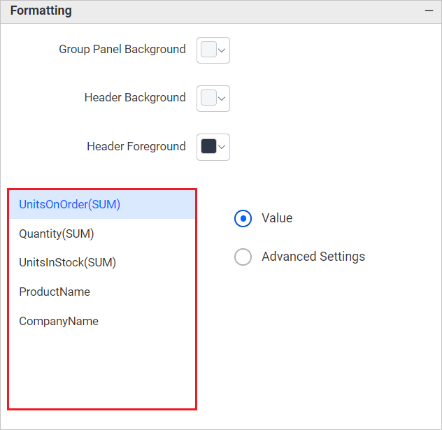
Value
Select value as the display type to represent the column values as they are.
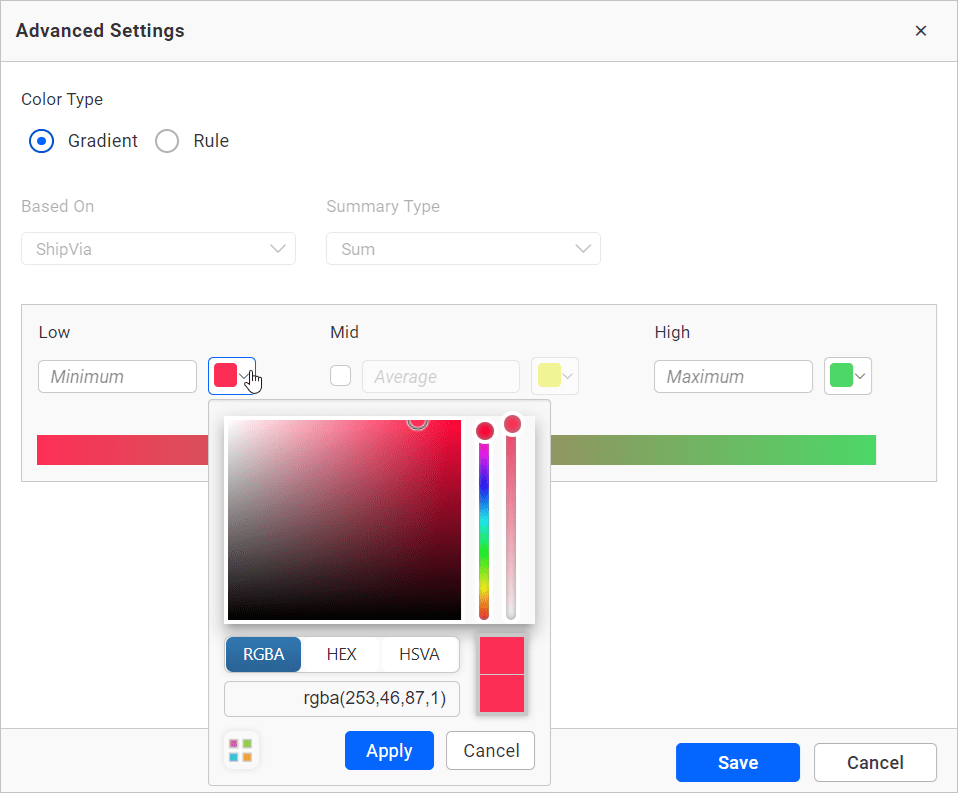
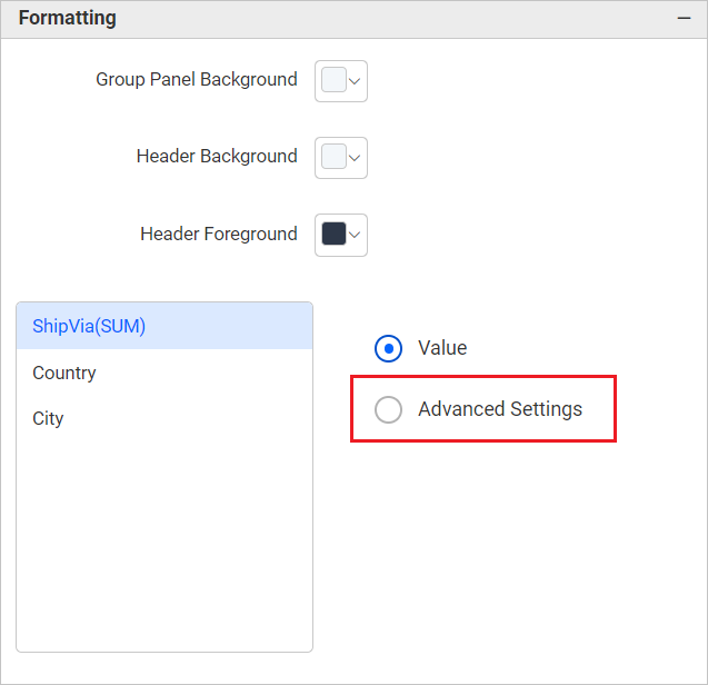
Advanced settings
Select Advanced settings to configure conditions and apply color to the cells based on those conditions. Click here for more details.
Pivot Grid as Heatmap
Using advanced settings option, you can customize the pivot grid as a heatmap.
How to configure pivot grid as a heatmap
- In the
propertiespanel, under theFormattingsection, select the field name configured in the value, then click theAdvanced Settingsradio button.
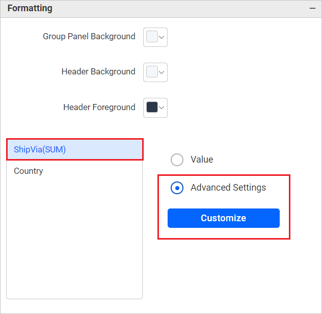
- Click the
Customizebutton to open theAdvanced Settings.
- Customize the colors according to your needs and click the
Savebutton.
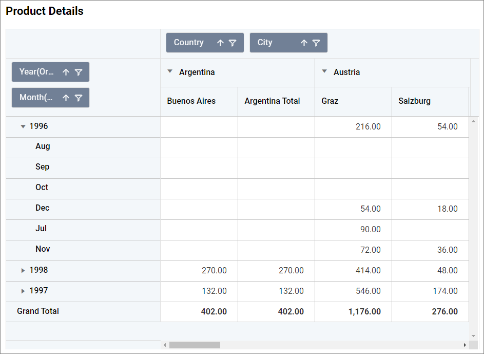
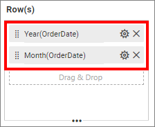
Pivot Grid Datetime Hierarchy Fields
You can achieve this by applying date formatting to the configured fields.
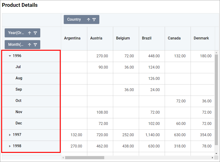
How to do pivot grid datetime hierarchy
- configure the date fields as follows,
- Click the settings menu icon and select the date format based on the hierarchy.
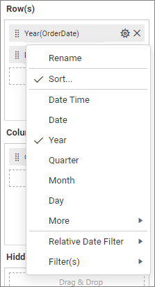
- Repeat the same steps for the remaining fields.
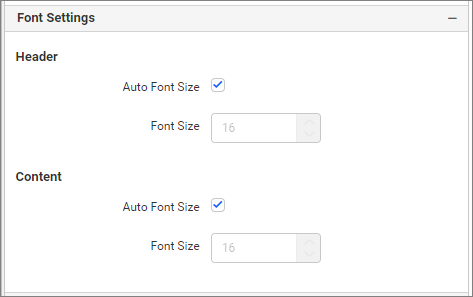
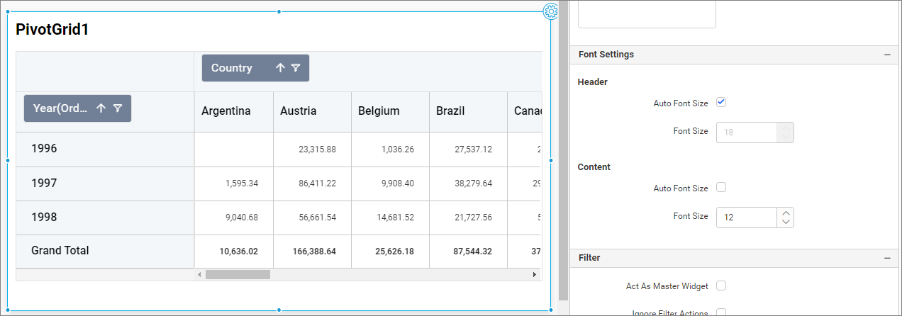
Font settings
This section allows you to customize the height and width of the pivot grid content.
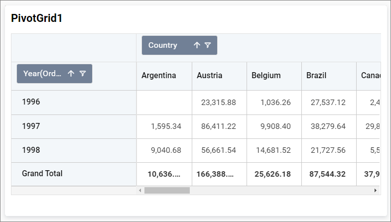
Pivot grid with auto font-size.
Header
Auto Font Size and Font Size
By default, the auto font size property is enabled, so the font size of the headers will be rendered based on the resolution. If this property is unchecked, the font size of the header can be customized.
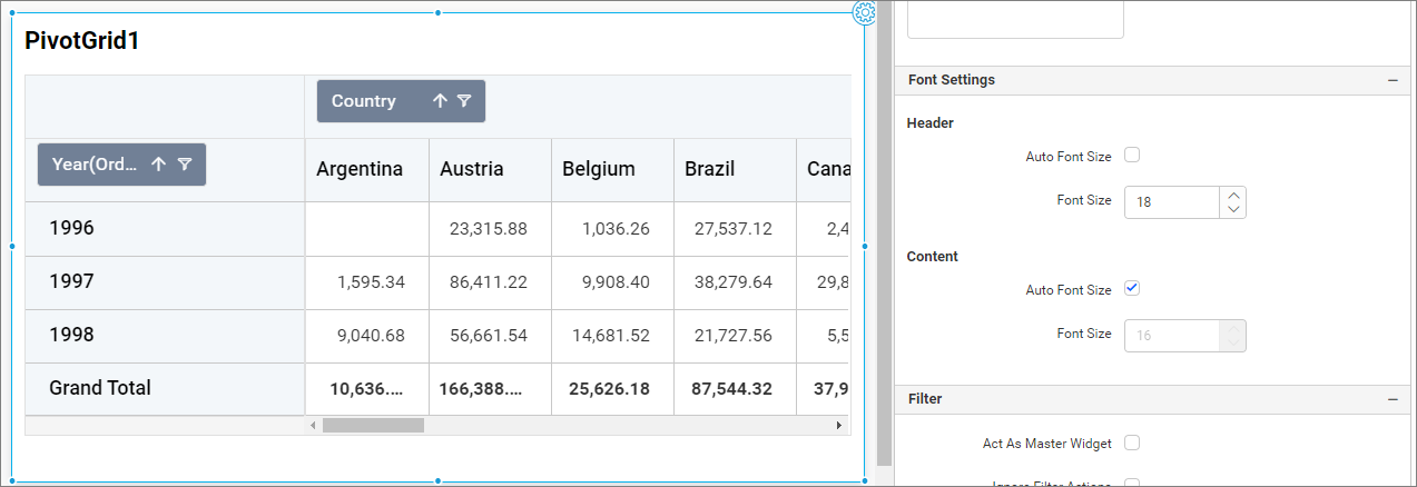
Content
Auto Font Size and Font Size
By default, the auto font size property is enabled, so the font size of the pivot grid content elements will be calculated based on the resolution. If this property is unchecked, the font size can be customized.
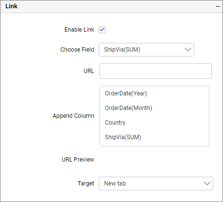
Link
To configure the linking to a URL or dashboard with the widget through its settings, refer to Linking for more details.
Filter
Filter allows you to apply filtering based on data field.
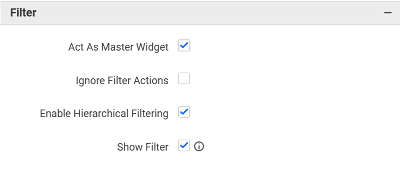
Act as Master Widget
This allows you to define this pivot grid widget as a master widget, so its filter action can be listened to by other widgets in the dashboard.
Ignore Filter Actions
This allows you to define this pivot grid widget to ignore responding to the filter actions applied on other widgets in the dashboard.
Hierarchical Filter
Through this option, you can enable/disable hierarchical top N filtering. While applying Top N filter with multiple dimension columns, the data returned can be customized based on whether the filtering needs to be done as flat or based on the hierarchy of dimension columns added.
When the Hierarchical Filter option is enabled, the Top N will be applied to each individual column separately based on the number set for each column.
Show Filter
This feature allows you to toggle the visibility of the Filter icon for the pivot grid widget when the Act as Master Widget option is enabled.
How to apply advanced settings in pivot grid
If you have the requirement to highlight data based on certain conditions, you can enable the advanced settings option.
How to enable advanced settings
- In the
propertiespane, under theFormattingsection, click theAdvanced Settingsradio button.
- This will open the
Advanced Settingsdialog.

-
Select the
modeand enter the conditions as required, then click theSavebutton to apply. -
Now, the widget visualization will be updated based on the conditions.
Refer to the following sections for detailed steps on using the Gradient and Rule modes.
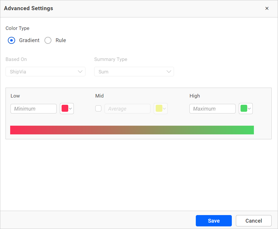
Gradient mode
You can customize the background color of the pivot grid cells using the gradient-based advanced settings. This is the default mode.
Based on field
The configured value fields. The “Based on Field” option cannot be changed in the advanced settings dialog.
Summary type
The summary type of the configured value field.
Low, mid, and high values
You can define your range by entering the low, mid, and high values.
NOTE: This is optional, if no value is entered, the ranges will be auto-calculated based on the minimum and maximum values from the data source.
Rule based condition mode
This allows you to customize the cell colors and value font style of the pivot grid cells based on one or more numerical/text conditions.
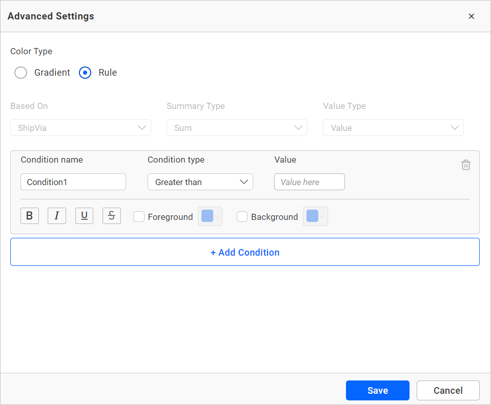
Condition name
You can assign a meaningful name to the applied conditions.
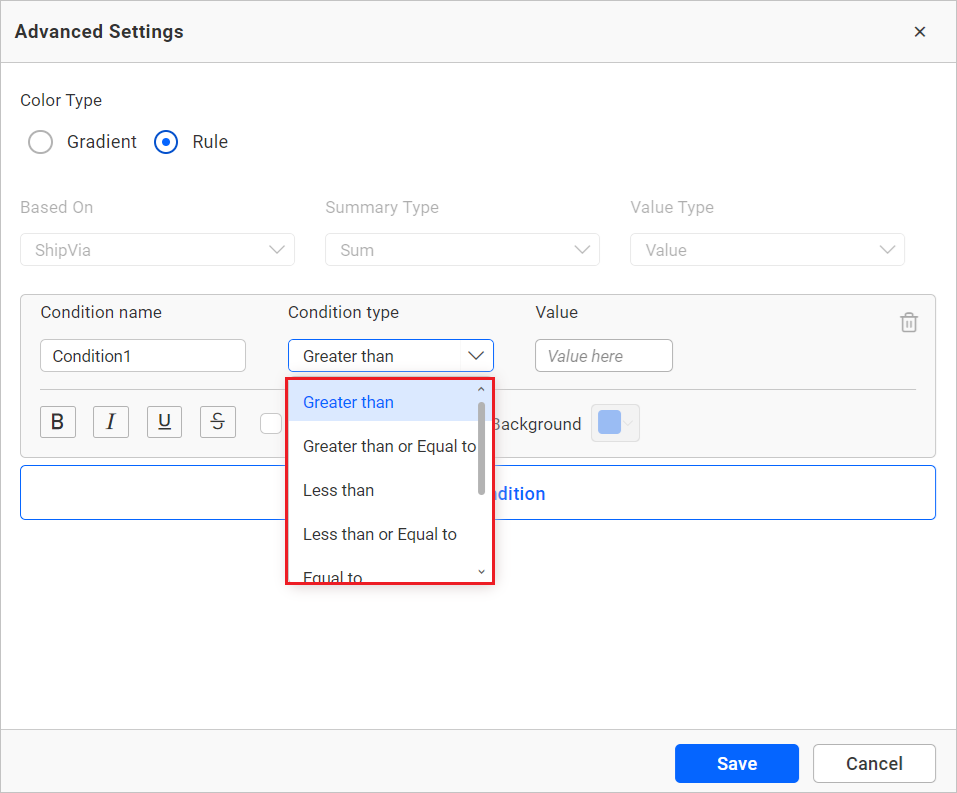
Condition type
Choose the condition for the measure field from the highlighted conditions.
Value
You can specify the condition value.
Foreground
This option allows you to define the foreground color of the pivot grid cell for this condition.
Background
Allows you to define the pivot grid cell background for this condition.
Font style
This option allows you to choose the font style for the title (Bold, Italic, Underline, and Superscript).
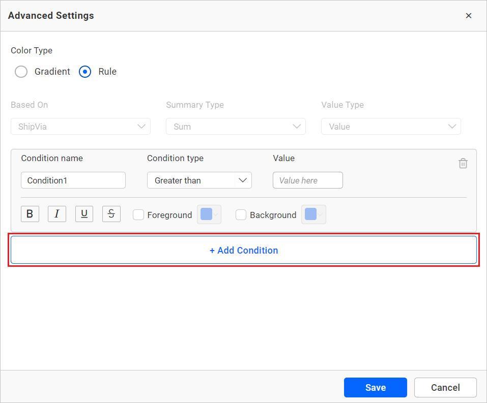
Add condition
Click on Add Condition to specify a new condition.
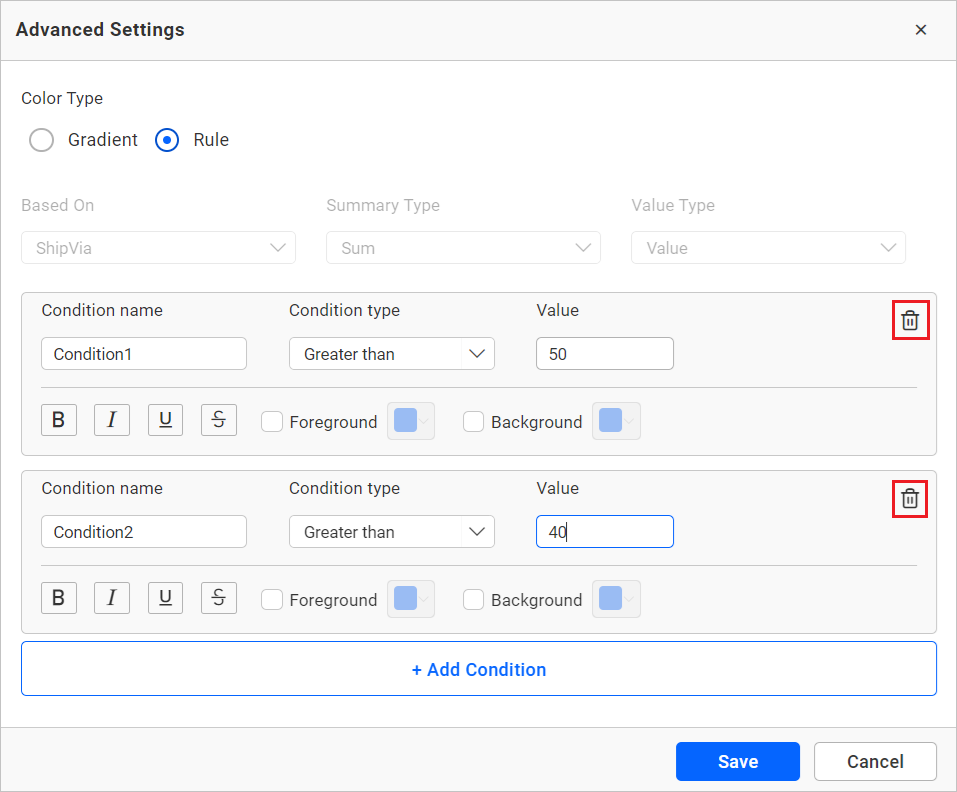
Delete condition
Click on the delete button to remove the existing condition.
Container appearance
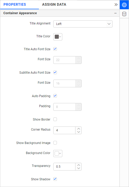
Title alignment
This option allows you to align the widget title to the left, center, or right.
Title color
This option allows you to apply a specific text color to the widget title.
Title Auto Font Size
When enabled, the font size of the title will automatically adjust if the screen resolution varies.
Font Size
This option allows you to apply a specific font size to the widget title if the Title Auto Font Size is disabled. The value can range between 10 and 44.
Subtitle Auto Font Size
When enabled, the font size of the subtitle will automatically adjust if the screen resolution varies.
Font Size
This option allows you to apply a specific font size to the widget subtitle if the Subtitle Auto Font Size is disabled. The value can range between 10 and 32.
Auto Padding
When enabled, the padding of the widget container will automatically adjust if the size of the widget varies.
Padding
This option allows you to customize the padding of the widget container if the Auto Padding is disabled. The value can be between 0 and 25.
Show Border
This option allows you to toggle the visibility of the border surrounding the widget.
Corner Radius
This option allows you to apply a specific radius to the widget corners if the Show Border is enabled. The value can range between 0 and 100.
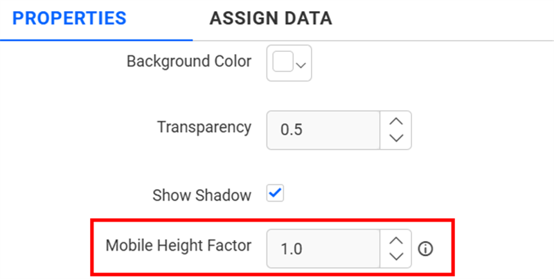
Transparency
You can adjust the transparency from 0 to 1.
Show Shadow
This option allows you to toggle the visibility of the shadow surrounding the widget.
Mobile Height Factor
This option allows you to resize widgets specifically for mobile view.
Container actions
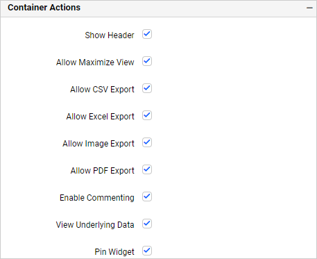
Show header
This option allows you to enable or disable the widget title of the pivot grid.
Allow maximize view
This option allows you to enable or disable the maximized mode of the pivot grid. The visibility of the maximize icon in the widget header will be determined based on the setting in the viewer.
Allow CSV export
This allows you to enable or disable the CSV export option for the pivot grid. Enabling this allows you to export the summarized data of the widget view to CSV format in the viewer.
Allow Excel export
This allows you to enable or disable the Excel export option for the pivot grid. Enabling this allows you to export the summarized data of the widget view to (.xlsx or .xls) format in the viewer.
Allow image export
This allows you to enable or disable the image export option for the pivot grid. Enabling this allows you to export the view of the widget to image format (.jpg), (.png), or (.bmp) in the viewer.
Allow PDF export
This allows you to enable or disable the PDF export option for the pivot grid. Enabling this allows you to export the view of the widget to pdf format in the viewer.
Enable comments
This allows you to enable or disable comment for the dashboard widget. For more details, refer to this refer to the following link: Dashboard Widget Comments.
Allow Viewing of underlying data
This allows you to visualize the raw data associated with a widget at runtime.
Pin widget
This option allows you to pin the widget.
Related links
Blog Post – 7 Unique Features of Pivot Table