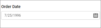
Date Picker
Date Picker enables you to filter based on a single date or a range of date selections.
How to configure table data to date picker?
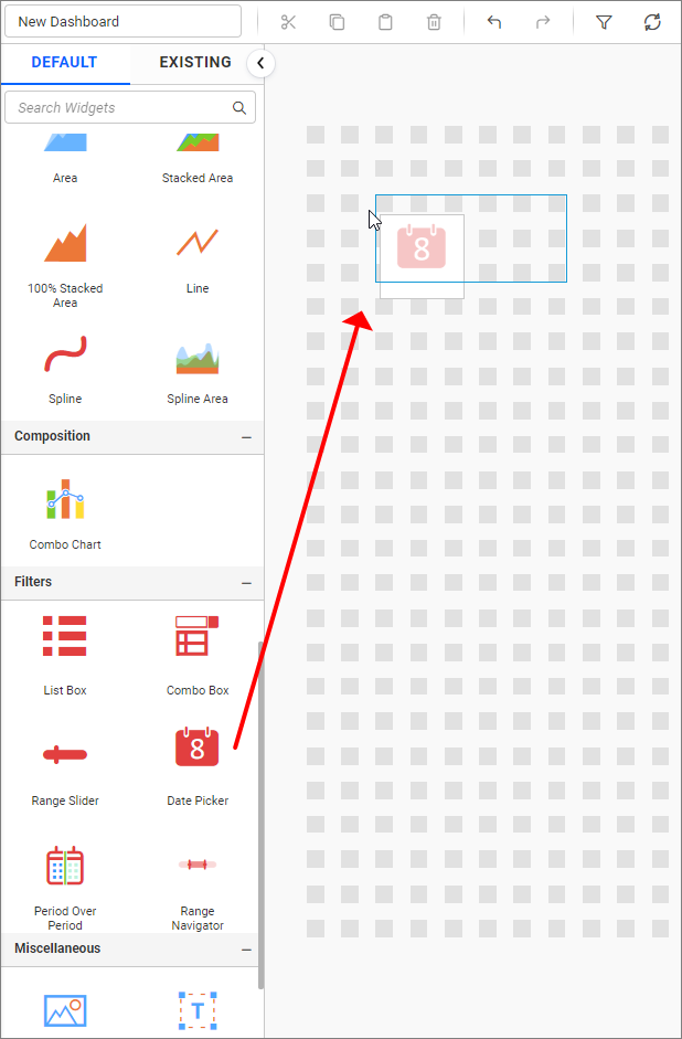
The following steps explain how to configure table data to the date picker:
- Drag and drop the
Date Pickerfrom the toolbox on the left into the design canvas and resize it to your required size.
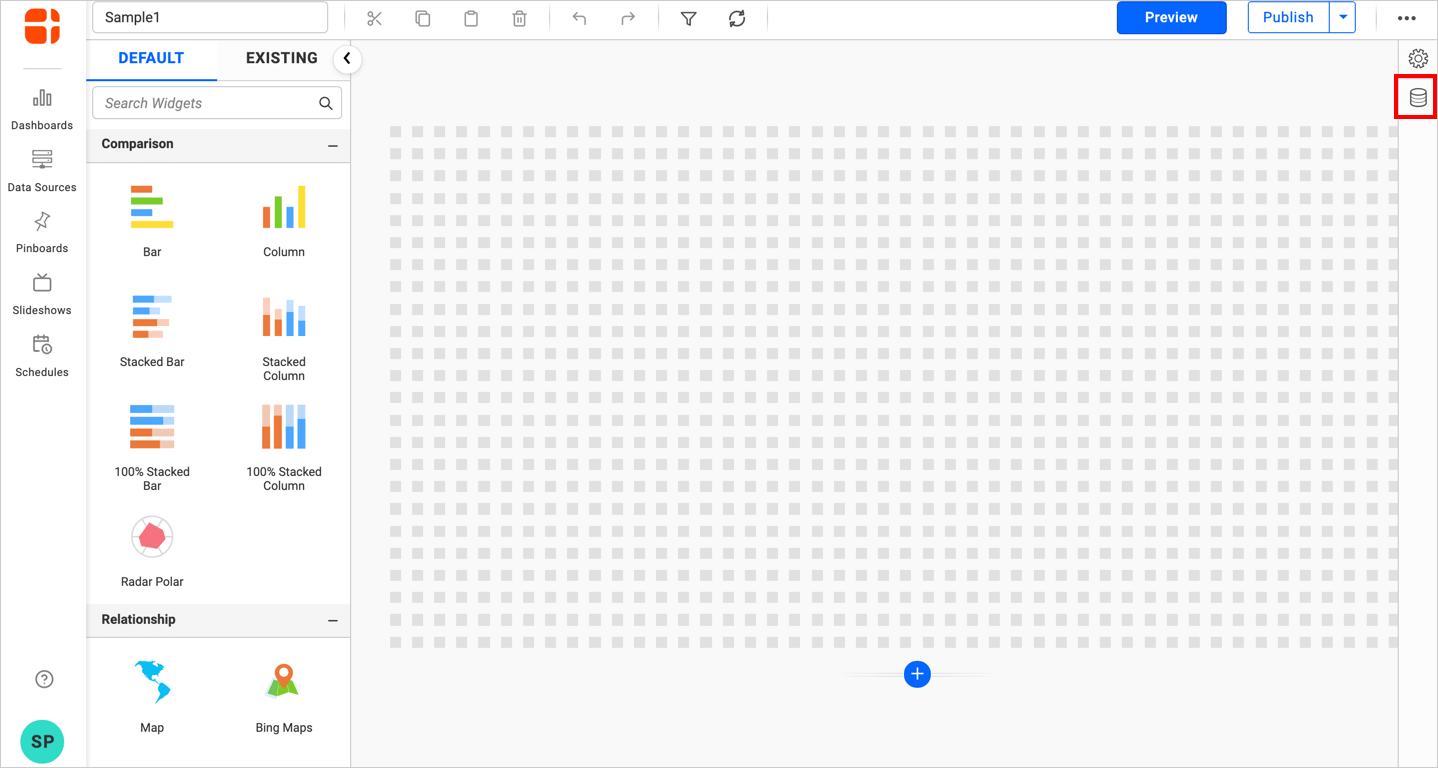
- Click the
Data Sourcebutton in the configuration panel.
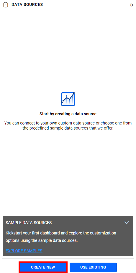
- Click the
CREATE NEWbutton to launch a new connection from the connection type panel.
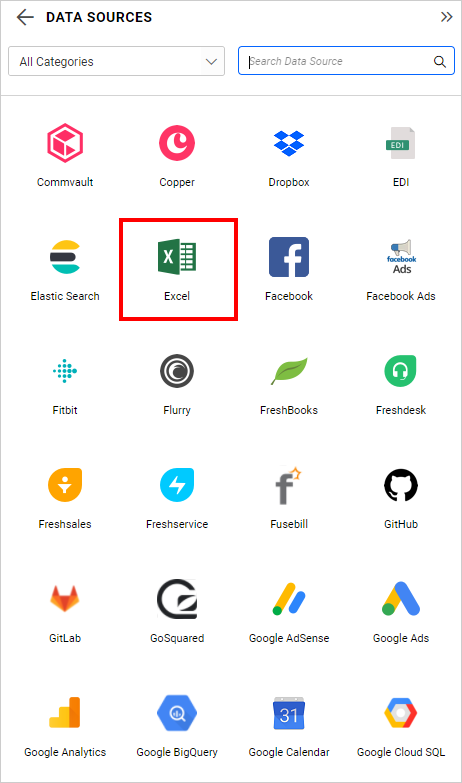
- In the connection type panel, click on any one (in this case, the
Microsoft ExcelConnection type is selected for demonstration) of the listed connection type buttons.
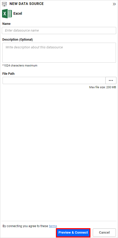
- In the
NEW DATA SOURCEconfiguration panel, fill in the connection type and related details. Click theConnectbutton.
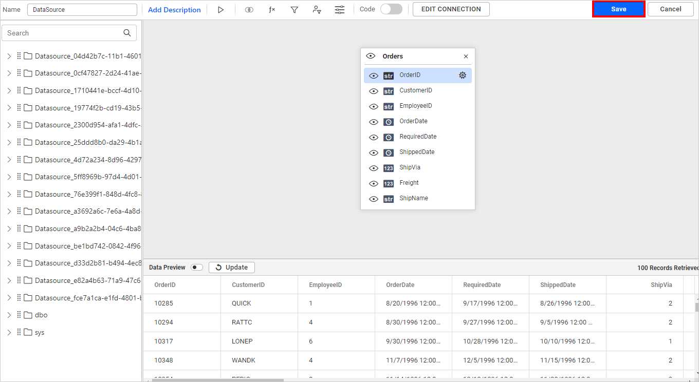
- Drag your preferred table or view from the left pane in the data design view, then click the
Savebutton.
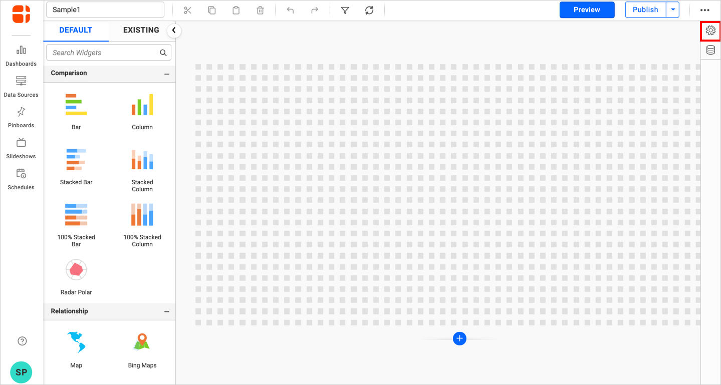
- Click the
Propertiesbutton in the configuration panel to open the property pane. Now, switch to theASSIGN DATAtab.
- The data tab will open with available measures and dimensions from the connected data source.
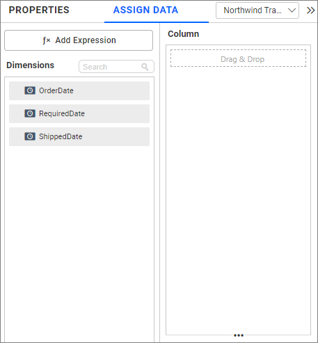
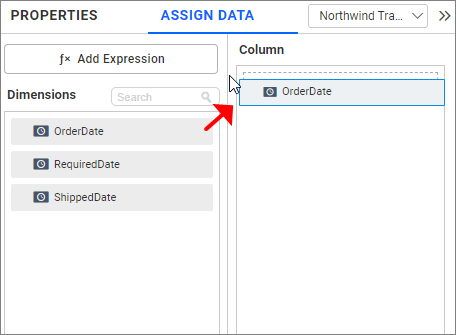
- Drag and drop a date field from
Dimensionsinto theColumnssection.
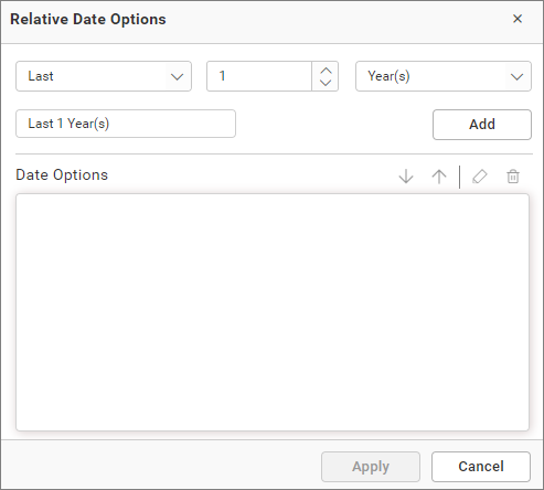
How to configure relative dates to DatePicker?
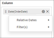
Switch to the Properties pane and set the Selection Type as Range. Then switch back to the Data pane and click the Settings icon in the dropped date column. Select Relative Dates... from the drop-down menu.
In the launched Relative Date Options window, configure the relative date and click Add. Repeat this process until the required set of relative dates are added.
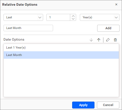
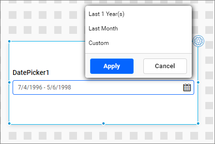
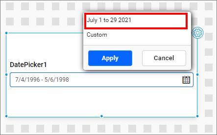
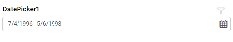
You can see the added relative dates in the DatePicker as follows.
Show Custom Option
This option allows you to show or hide the custom option when relative dates are configured.
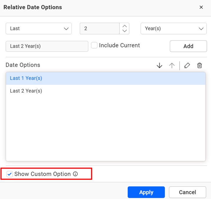
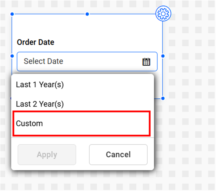
For example, In the Date Picker widget, the OrderDate field is bound and configured with relative date options such as Last 1 year and Last 2 years. By default, the Show Custom Option setting is enabled, so the custom date selector is visible. If you disable this setting, the custom date selector will no longer appear in the Date Picker.
How to configure custom relative dates to the DatePicker?
Switch to the Properties pane and set the Selection Type as Range, and then switch back to the Data pane; Click the Settings icon in the dropped date column and select Relative Dates... in the drop-down menu.
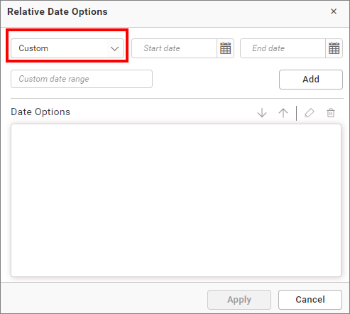
In the launched Relative Date Options window, select the Custom option from the drop-down list.
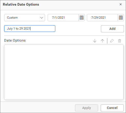
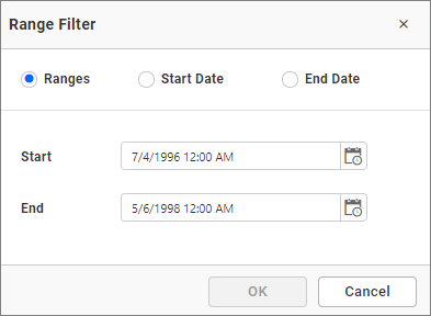
Choose the start and end dates you want to set as a custom range, give a name to the custom range, and then click Add. Repeat this process until the required set of custom relative dates are added.
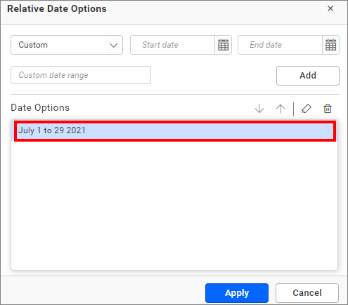
You can see the added custom relative dates in the DatePicker as follows.
Filtering data
You can filter the data by using the Filter option.
How to format date picker?
You can format the Date Picker for a better illustration of the view that you require through the settings available in the Properties tab.
General Settings
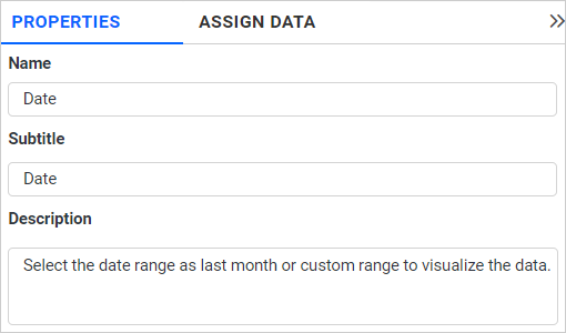
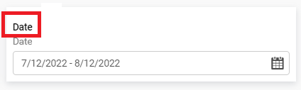
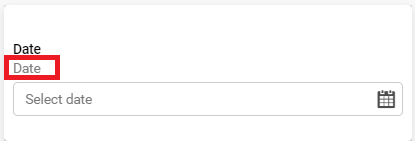
Name
This allows you to set the title for this date picker widget.
Subtitle
This allows you to set the subtitle for this date picker widget.
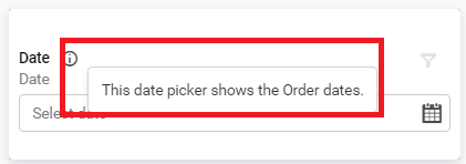
Description
This allows you to set a brief explanation about this date picker widget.
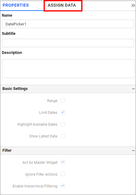
Basic Settings
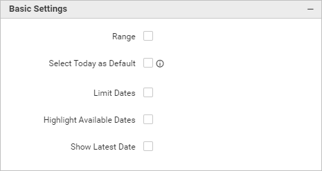
Range
This allows you to toggle the selection type of Range.
Single – Single date can be bounded if you disable the Range selection option.
Range – A range of dates (two dates) can be bounded if you enable the Range selection option.
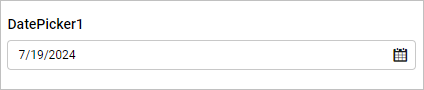
Select Today as Default
This allows you to set today’s date as default selection in Date Picker, enabling users to quickly proceed with analyses on the current date.
Enabling the “Select Today as Default” option will hide the “Range” option, as the former is intended for choosing a single date, which “Today” represents and functions as a Relative Date Filter.
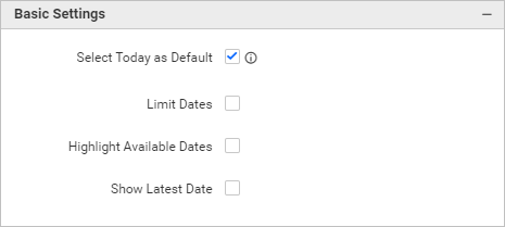
Highlight Available Dates
This allows you to enable the highlighting of available dates in the date picker.
Limit Dates
This allows you to display only the limited dates (dates in the data source) in the date picker. By enabling this option, you can select the dates available in the data source.
If you disable the Limit Dates option, there is no limit for the date range.
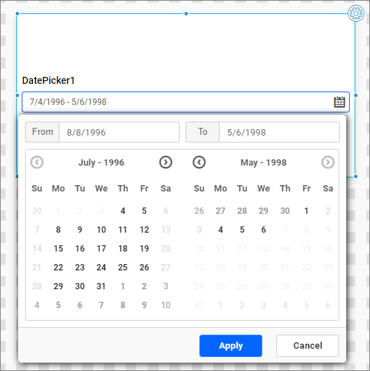
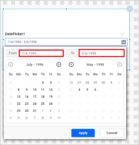
Fixed Calendar Selection
If you enable the Range option, the Fixed Calendar Selection will be shown.
This allows you to select a date (start or end) without discarding your previous selection.
And you can only select a start date from the left calendar and the end date from the right calendar.
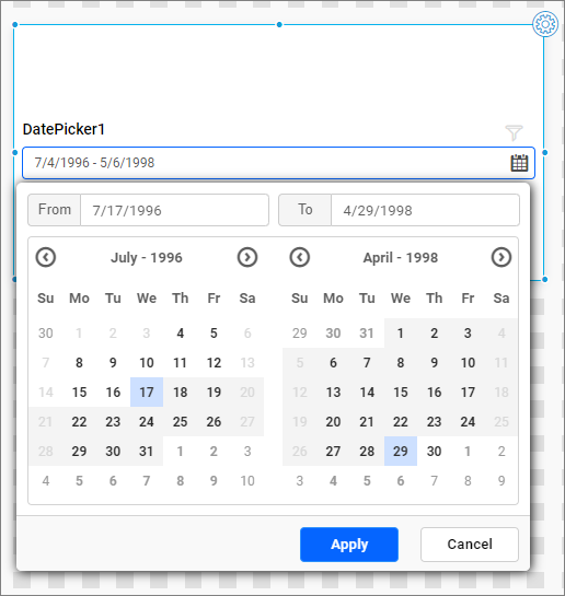
Show Latest Date
The Show Latest Date property shows the latest date in the data source when you open the date picker popup.
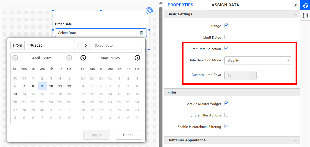
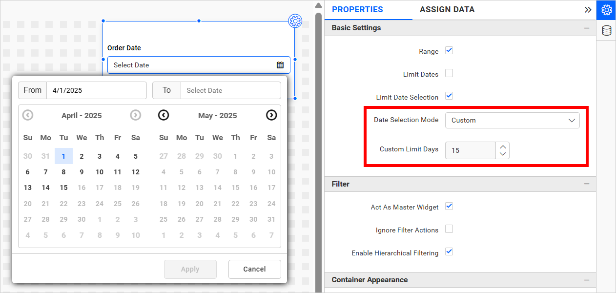
Limit Date Selection
If you enable the Range option, the Limit Date Selection will be shown.
Activating Limit Date Selection displays the following additional settings:
- Date Selection Mode
- Custom Limit Days
NOTE: The
Custom Limit Daysnumeric textbox is enabled only when the Custom option is selected from theDate Selection Mode dropdown.
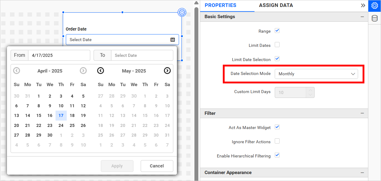
The Date Selection Mode has three options as follows,
- Weekly - Allows selection of dates within the week of the selected start date.
- Monthly - Allows selection of dates within the month of the selected start date.
- Custom - Allows selection of a custom range of days based on the number specified in the
Custom Limit Daystextbox.
Show Latest Date As Default
Selecting this option automatically sets the latest date as the default value in the date picker widget. This feature is useful for filtering dashboards based on the most recent date available in the data source.
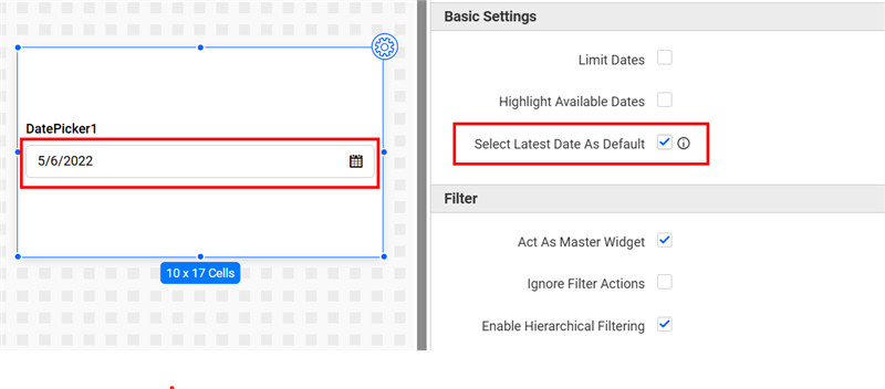
Note: This option is applicable only for List-type dashboard parameters with a Single date selection. It is not available for Range date selections. For more details about dashboard parameter, refer to this link.
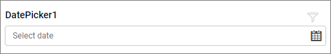
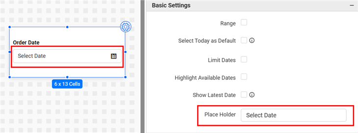
Place Holder
The Placeholder property of a date picker provides context for the user’s input. By default, the placeholder text in the date picker is set to Select Date.
Filter
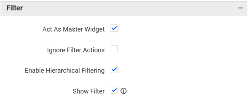
Act as Master Widget
This allows you to define this date picker widget as a master widget so that its filter action can be made to listen by other widgets in the dashboard.
Ignore Filter Actions
This allows you to define this date picker widget to ignore responding to the filter actions applied on other widgets in the dashboard.
Enable Hierarchical Filtering
Using this option, you can enable or disable hierarchical top N filtering. While applying the Top N filter with multiple dimension columns, the data returned can be customized based on whether the filtering needs to be done as flat or based on the hierarchy of dimension columns added.
When the Enable Hierarchical Filtering is enabled, the Top N will be applied for each individual column separately based on the number set for each column.
Show Filter
This feature allows you to toggle the visibility of the Filter icon for the date picker widget when the Act as Master Widget option is enabled.
Container Appearance
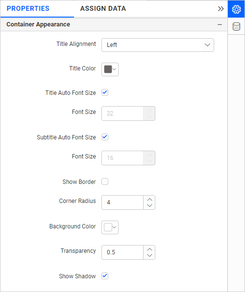
Title Alignment
This allows you to handle the alignment of the widget title to either left, center, or right.
Title Color
This allows you to apply the text color to the widget title.
Title Auto Font Size
When Auto Font Size is enabled, the font size of the title will be adjusted automatically if the resolution of the screen varies.
Font Size
This allows you to apply the specified size of the font to the widget title if the Title Auto Font Size is disabled. The value can be between 10 and 44.
Subtitle Auto Font Size
When Auto Font Size is enabled, the font size of the subtitle will be adjusted automatically if the resolution of the screen varies.
Font Size
This allows you to apply the specified size of the font to the widget title if the Subtitle Auto Font Size is disabled. The value can be between 10 and 32.
Show Border
This allows you to toggle the visibility of the border surrounding the widget.
Corner Radius
This allows you to apply the specified radius to the widget corners if Show Border is enabled. The value can be between 0 and 100.
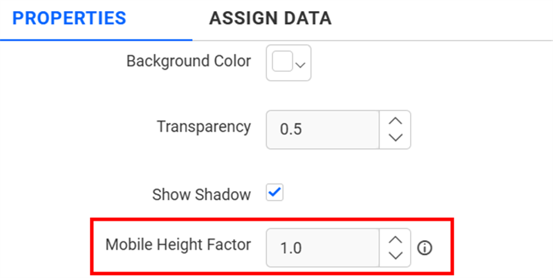
Background Color
This allows you to set the background color to the date picker widget.
Transparency
This property allows you to specify the transparency for the background color.
Show Shadow
This allows you to toggle the visibility of the shadow surrounding the widget.
Mobile Height Factor
This option allows you to resize widgets specifically for mobile view.
Container actions
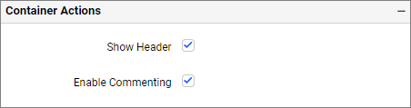
Show Header
This allows you to enable or disable the widget title of the date picker widget.
Enable Comments
This allows you to enable or disable comments for the dashboard widget. For more details, refer to the Commenting Widget.