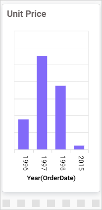
Column Chart
A column chart allows you to compare values for a set of unordered items across categories using vertical bars that are arranged horizontally.
How to configure the table data to column chart
A Column chart requires at least one value element and one column element in order to be displayed. The measure column or expression column that you want to analyze can be placed in the values block. The dimension column that you want to use to categorize the measure column can be placed in the columns block. If you want to categorize based on a series column, then the corresponding dimension column can also be placed in the rows block. These blocks are combined in the Data pane.
The following steps explains the data configuration of column chart:
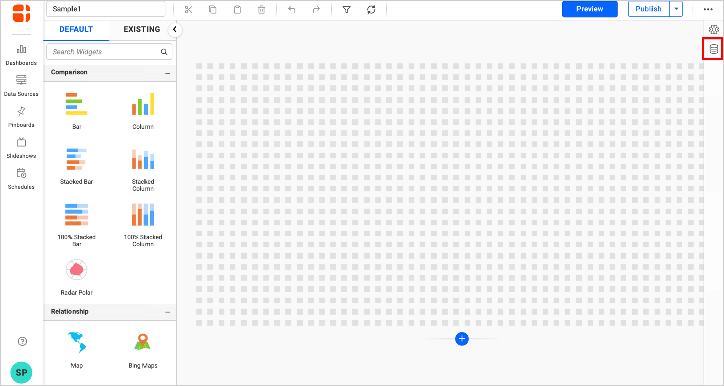
- Drag and drop the icon for the
column chart controlfrom the toolbox into the design panel. You can locate the control in the toolbox by searching for it.
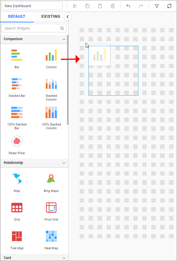
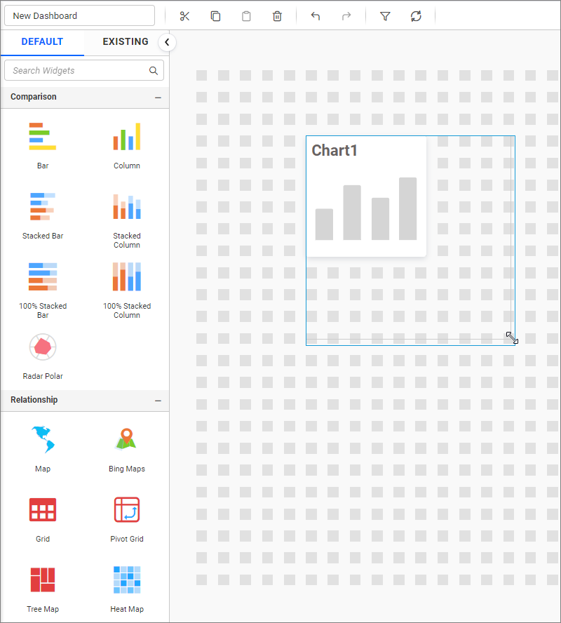
- Please resize the widget as necessary.
- Click the
Data Sourcebutton in the configuration panel.
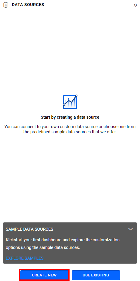
- Click the
CREATE NEWbutton to initiate a new connection from the connection type panel.
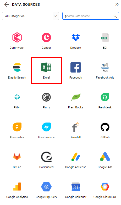
- In the connection type panel, click on any one of the listed connection type buttons. (Here, the
Microsoft Excelconnection type is selected for demonstration.)
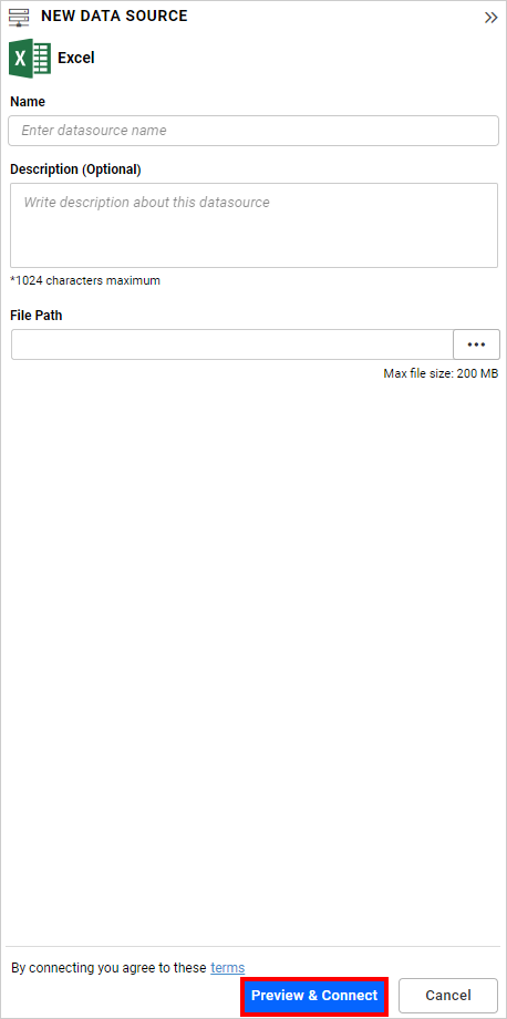
- In the
NEW DATA SOURCEconfiguration panel, fill in the connection type and related details. Then, click thePreview & Connectbutton.
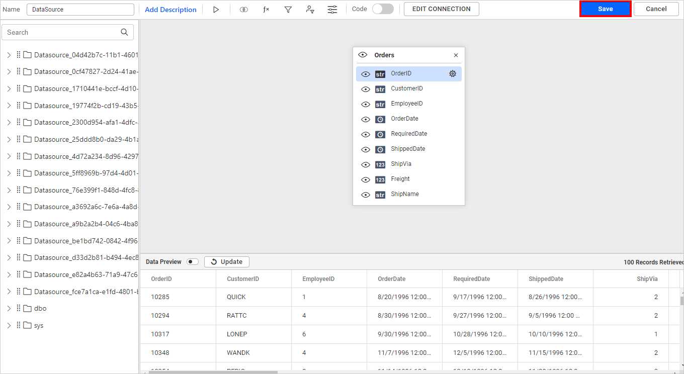
- Please drag and drop your preferred table or view from the left pane in the data design view, and then click the
Savebutton.
- Please click the
Properties iconin the configuration panel.
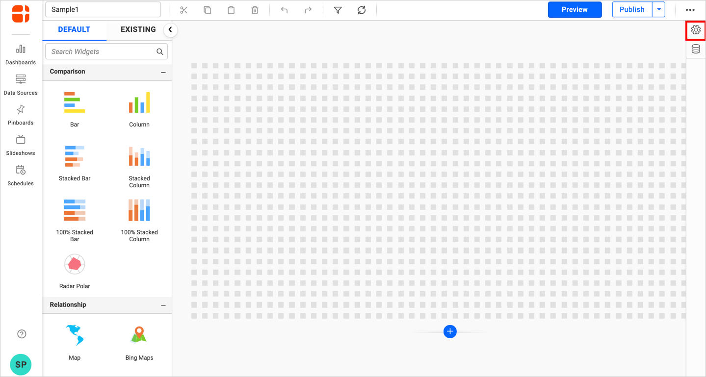
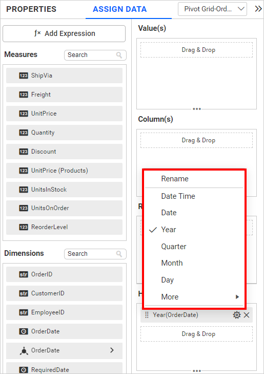
- The
propertiespanel of the widget will be displayed as shown in the screenshot below.
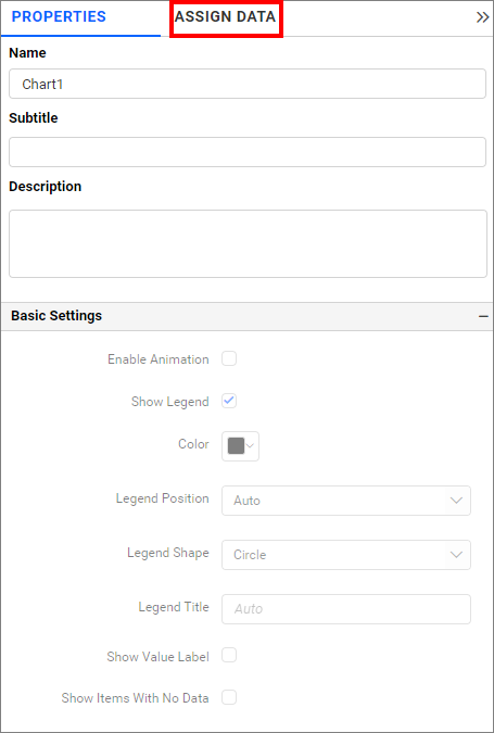
- Now, switch to the
ASSIGN DATAtab.
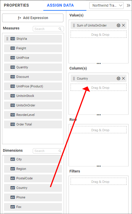
- The
ASSIGN DATAtab will be opened with the available columns from the connected data source.
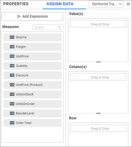
Adding fields to Value(s)
To bind a column, drag and drop the element from the sections to the values section.
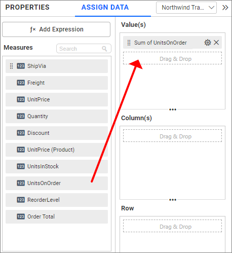
IMPORTANT:
- The field added in this section will act as a measure value.
- This section is mandatory for the widget visualization, and an unlimited number of fields can be configured in it.
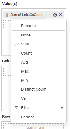
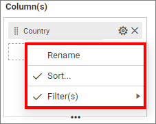
Settings menu options
You can filter and format the data displayed in the widget from the options in the settings menu. To open the settings menu, click the settings icon.
The following screenshots show the various options in the settings menu, which are based on the type of field configured in the type section.
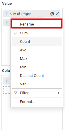
Renaming fields
The field names that have been configured can be edited by utilizing the Rename option which is available in the settings menu.
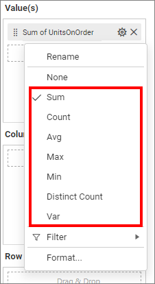
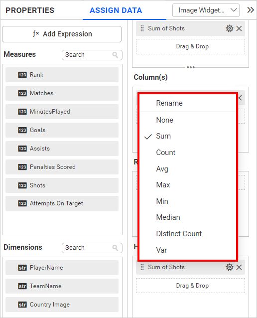
Changing the aggregation type
You can change the aggregation type of the measure section from the settings menu, as shown in the following screenshot. Please refer to this section for more details.
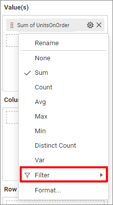
Filtering data
You can change the values by selecting the Filter option and using Filters. For more details, refer to the Measure filter and dimension filter.
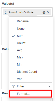
Measure formatting
You can format the elements by selecting the Format option. For more details, please refer to the measure format.
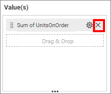
Removing the fields
To remove the added value fields, click on the highlighted button.
Adding fields to Column(s)
Please drag and drop the elements from the sections into the columns.
IMPORTANT:
- The field added in this section will function as a dimension value.
- It is an optional section, and adding more than one value will enable drill down.
Settings
You are able to change the settings.
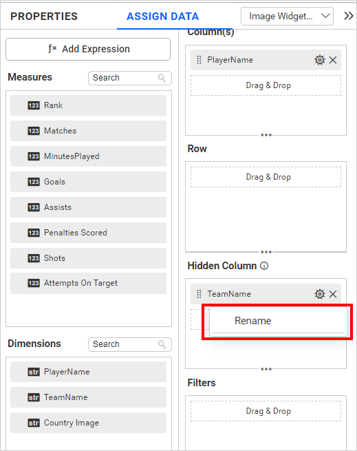
Renaming fields
The field names that have been configured can be edited by using the Rename option provided in the settings menu.
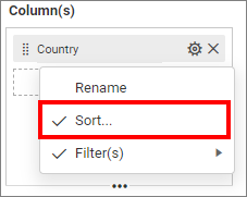
Sorting
You can sort the dimension data using the Sort option in the Settings menu. To apply sorting to the data, refer to the Sort.
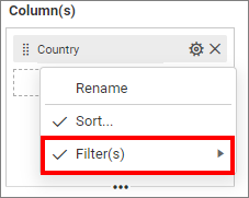
Filtering data
You can apply a filter by selecting the Filter(s) option in the settings. For more details, refer to the filter.
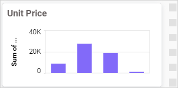
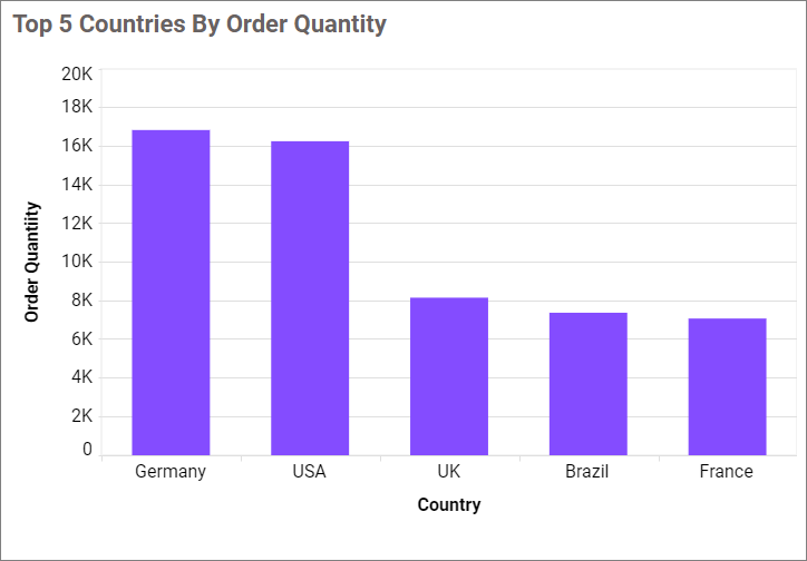
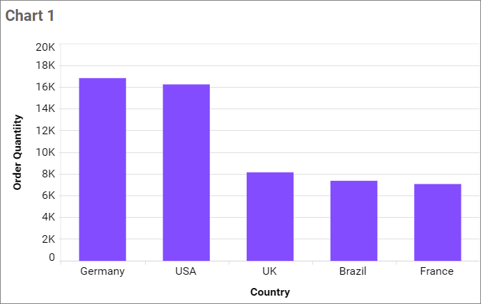
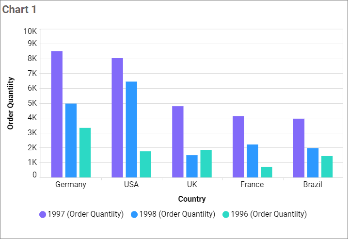
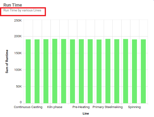
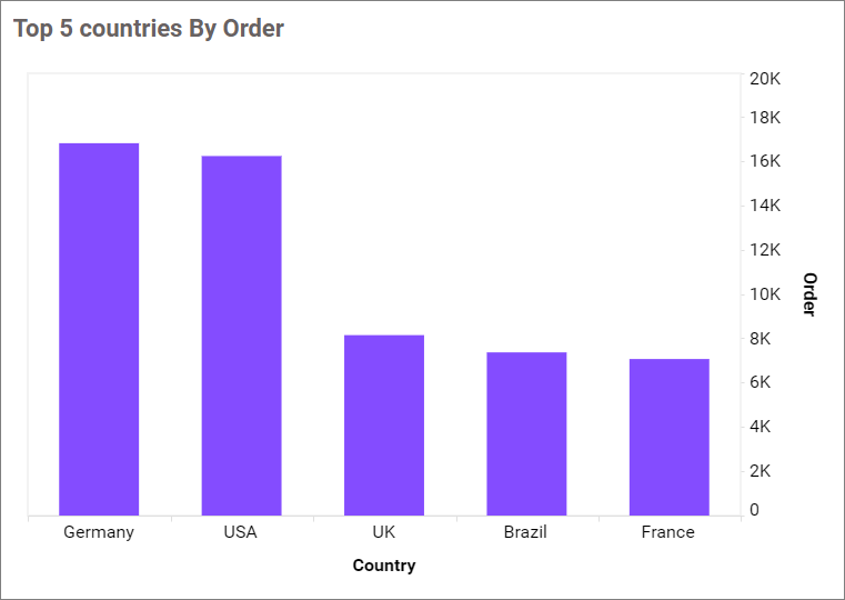
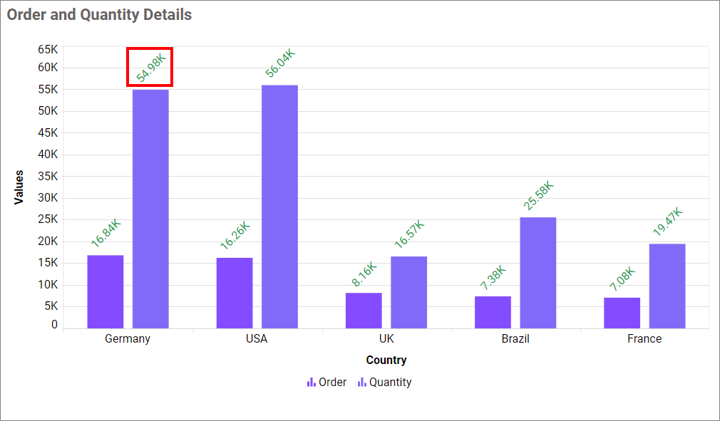
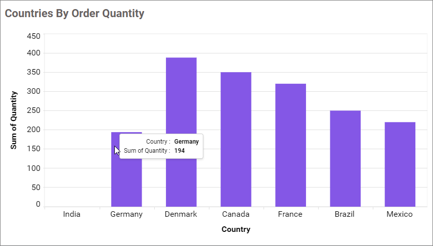
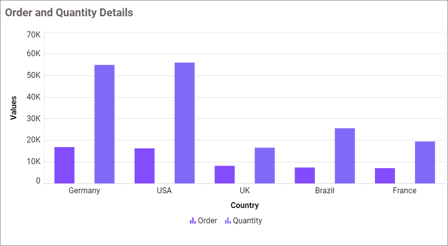
The chart will be displayed in this manner.
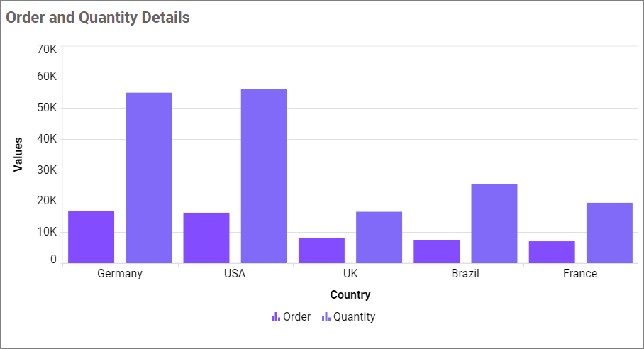
Similarly, you can add the Measures and Expression Columns into the column field.
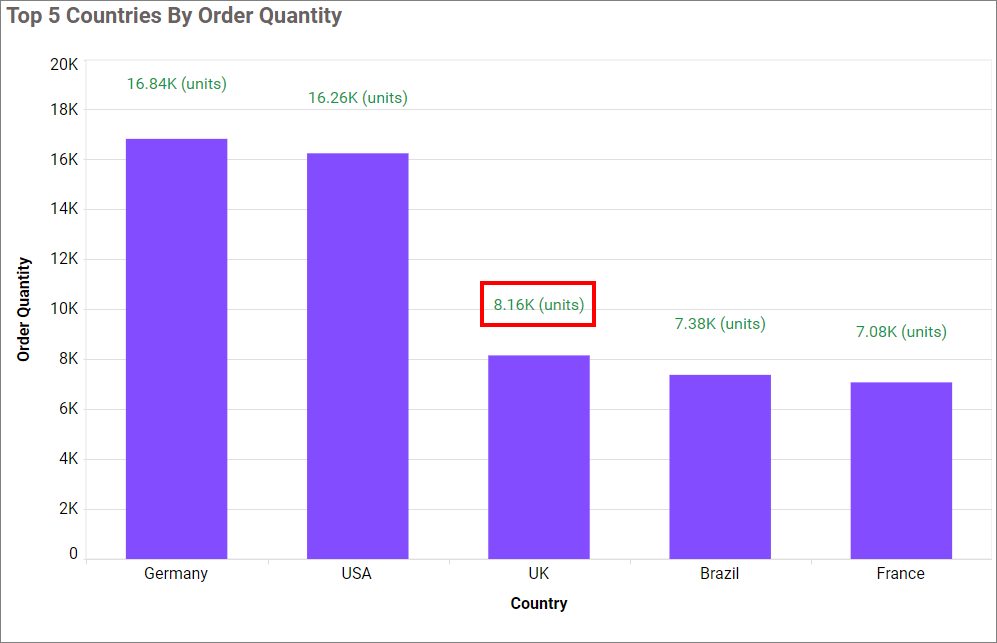
Drill down
When the second value is added to the Columns section, the alert message will be displayed.
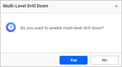
Click Yes to enable the option. If you click No, a single value will be added to the Columns section.
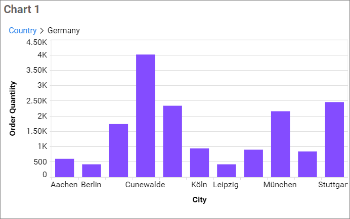
Figure: Chart with a drilled view of the selected region.
Drill up
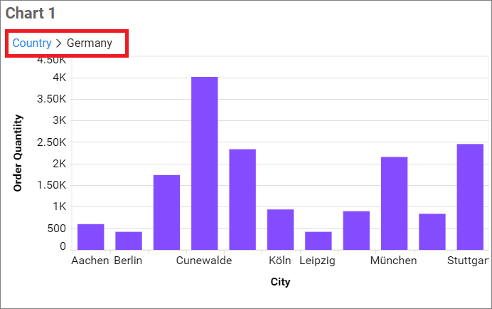
Once you’ve drilled down, you can drill up to the previous view using the breadcrumb navigator located at the top of the widget.
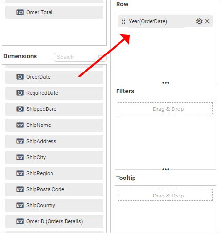
Adding fields to Row
Please drag and drop the elements from the sections to the Row.
Hidden Column
Hidden columns are useful in cases where we do not want the fields to participate in the visualization. Instead, we only want them to be used for linking, filtering and view data.
We can configure both measure and dimension fields into the hidden column. For measures, we will have all the settings we have for measure fields except formatting and filtering.
In the case of dimension fields, we will have the following options only: Rename. In Date fields, we will have all available types except sorting, relative date filter, settings, and filters.
Linking
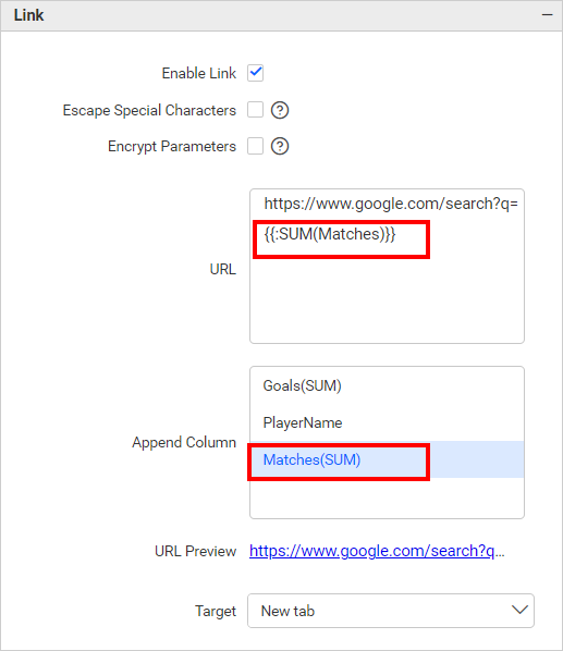
The primary use case for hidden columns is linking. When configuring hidden columns, we can observe that the fields configured in hidden columns are listed in the linking section. When configuring the column in linking, we can pass the corresponding column value in the linking parameter.
Measure Based Example: If we want to pass the number of matches played as a URL parameter but do not want it to affect the visualization, we can configure the matches in the hidden columns and include them in the link.
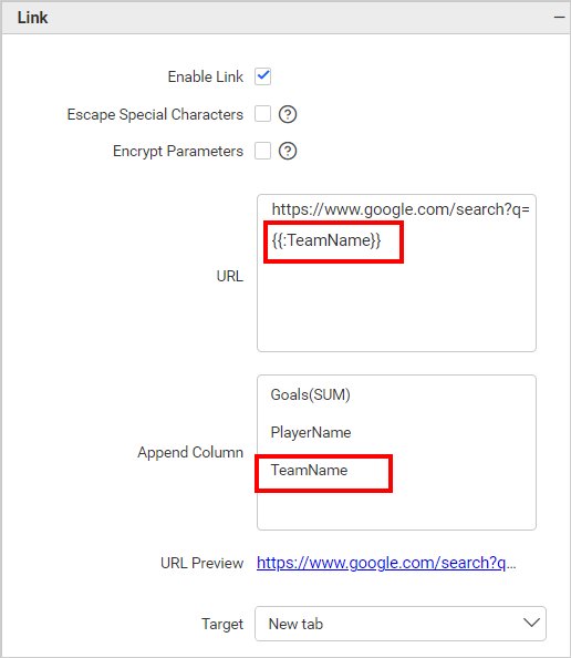
Dimension Based Example: If we want to pass the number of Team Name played as a URL parameter but do not want it to affect the visualization, we can configure the Team Name in the hidden columns and include them in the link.
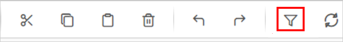
Filtering
You can use hidden columns to filter data in the visualizations. Configure hidden columns and click the filter icon below.
Please click the Custom button, which is highlighted in the filter configuration dialog image below. This will display a list of all the fields configured in the widget. Please keep the field that is configured in the hidden column and remove the other fields. Finally, click the Update button.
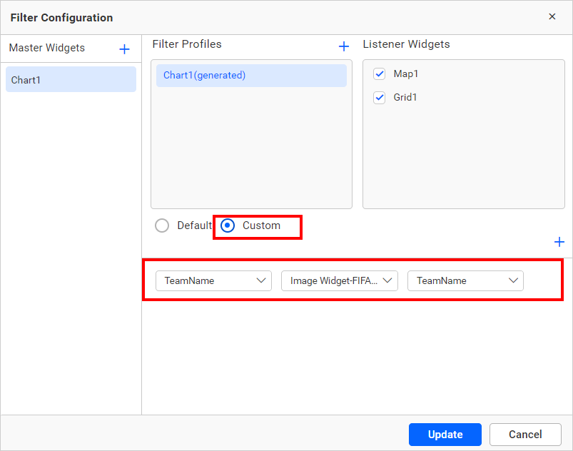
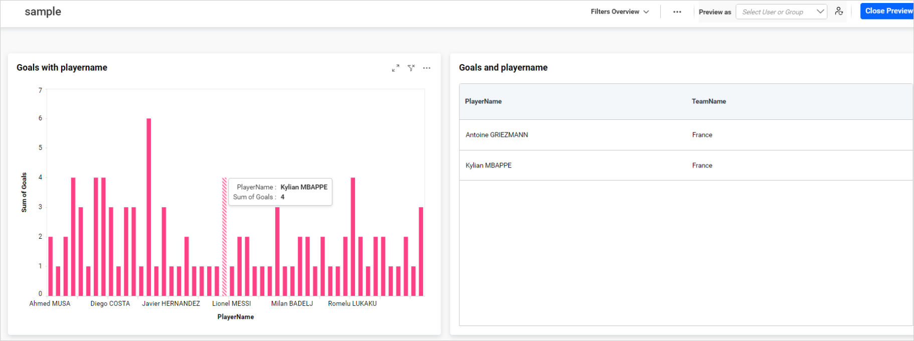
Now, we can see in the image below that the data is filtered based on the hidden column field instead of the actual column that we bound in the widget.
For more details about filtering the widget data, refer to the Cross Filter Configuration documentation.
View Data
You can view the data in the hidden columns in the underlying data view. This is useful for checking the data in more detail and can help you identify any issues with the data.
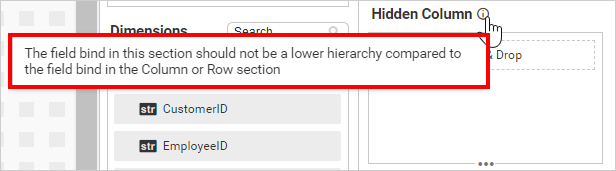
NOTE: We do not recommend configuring lower hierarchy data in hidden columns, as indicated by the information icon in the
Hidden Columnsection.
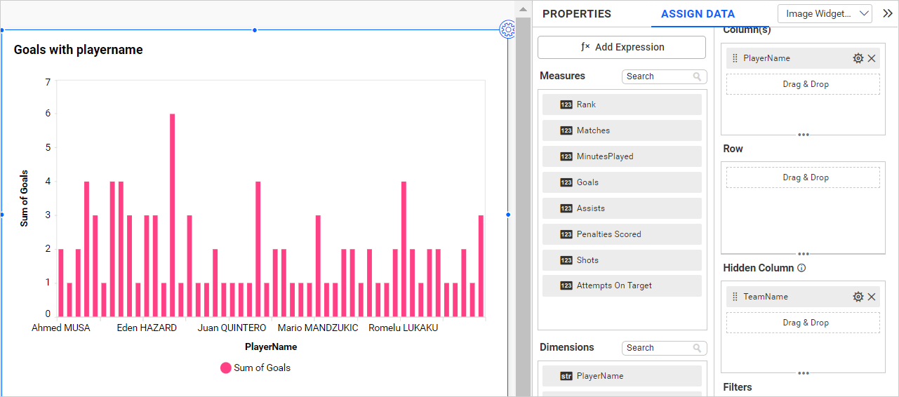
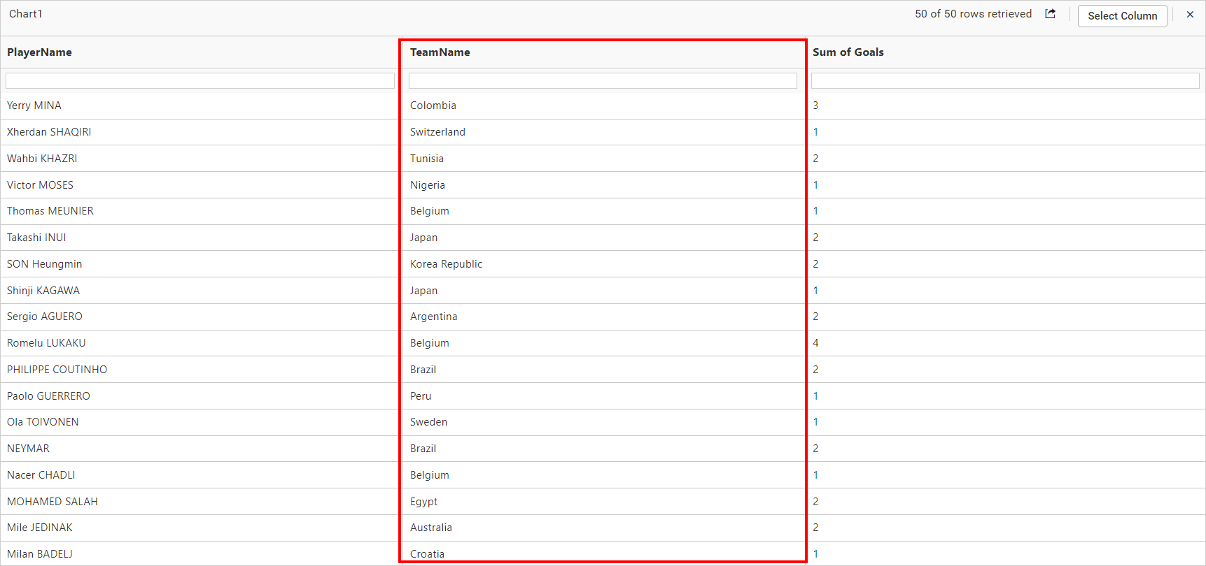
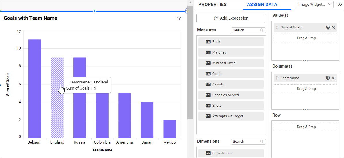
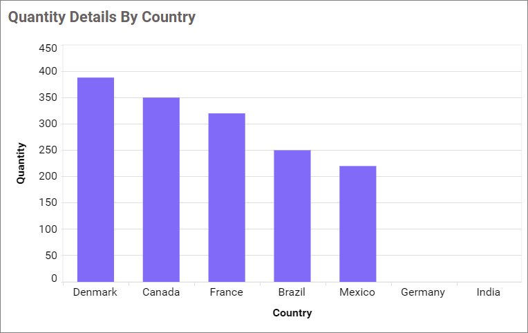
The chart below displays the goals scored by each team without any hidden columns.
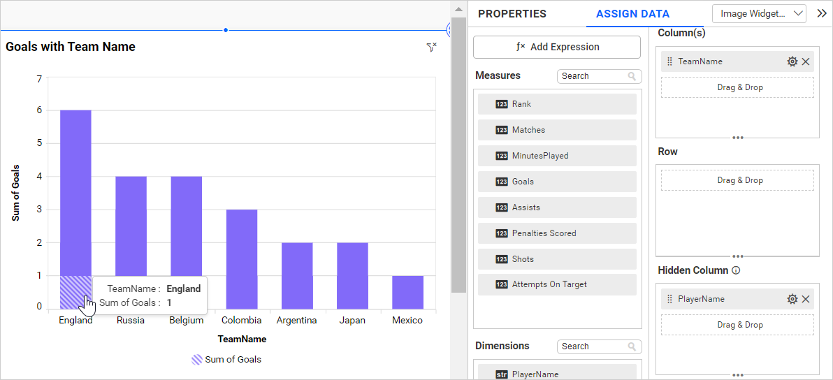
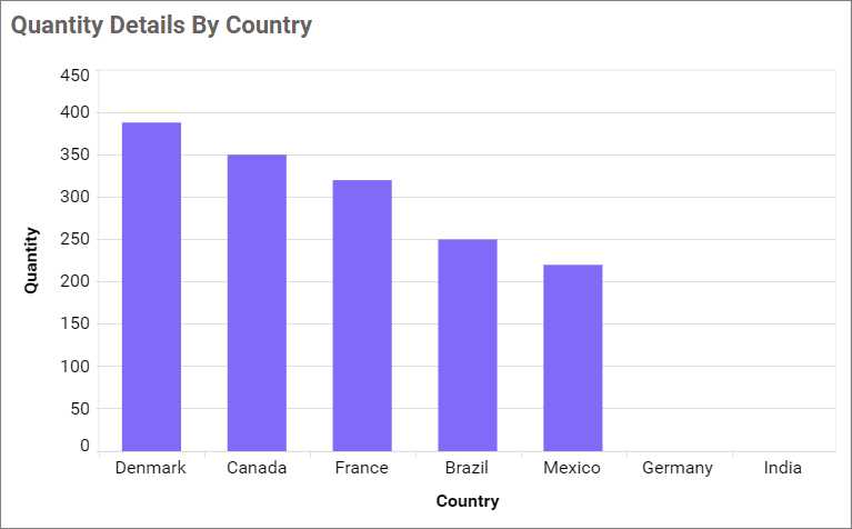
If we configure lower hierarchy data (Player Name) in hidden columns compared to column and Row field data, the data configured in the widgets gets duplicated, and each individual column is split based on the hidden column field. This affects the chart visualization, as shown in the image below.
Adding tooltip fields
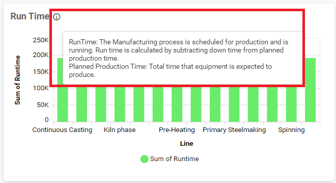
You can configure the tooltip section to display additional information in the widget’s tooltip without impacting the visualization. Please refer to this section for further details on how to configure the tooltip fields.
How to format column chart widget
You can format the column chart to better illustrate the view you require using the settings available in the Properties tab.
General settings
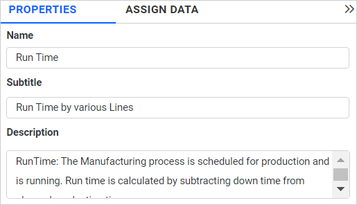
Name
This feature allows you to set the title for the column chart widget.
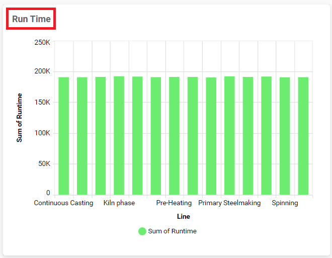
Subtitle
This allows you to set the subtitle for this column chart widget.
Description
This feature enables you to set a description for the column chart widget.
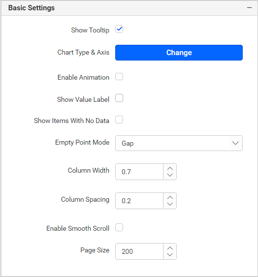
Basic settings
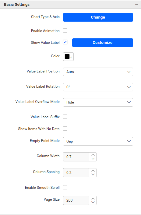
Chart type and axis
Click the Change button to open the Chart Type and Axis Settings dialog.
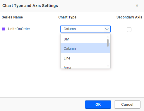
Chart Type: This allows you to switch the widget view from the current chart type to another convertible chart type.
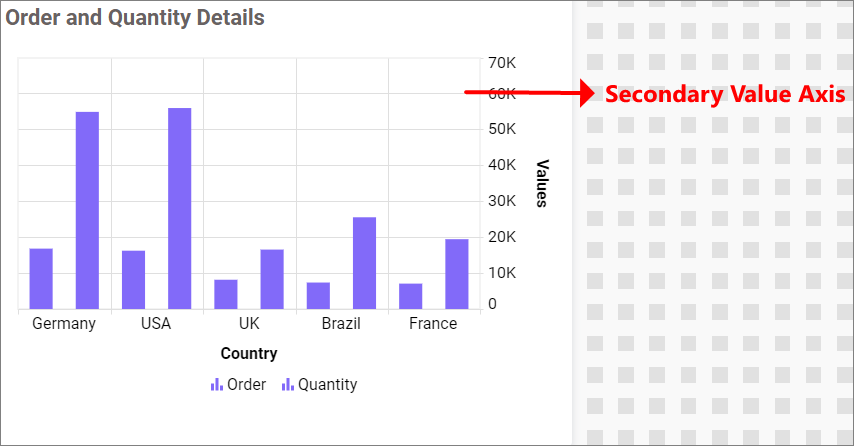
Secondary Axis: By default, the configured field is plotted as the primary axis. If you enable this option, the selected field will be plotted as the secondary axis.
Enable animation
It animates the measure values when you toggle the Enable Animation.
Show value labels
This feature enables you to toggle the visibility of value labels.
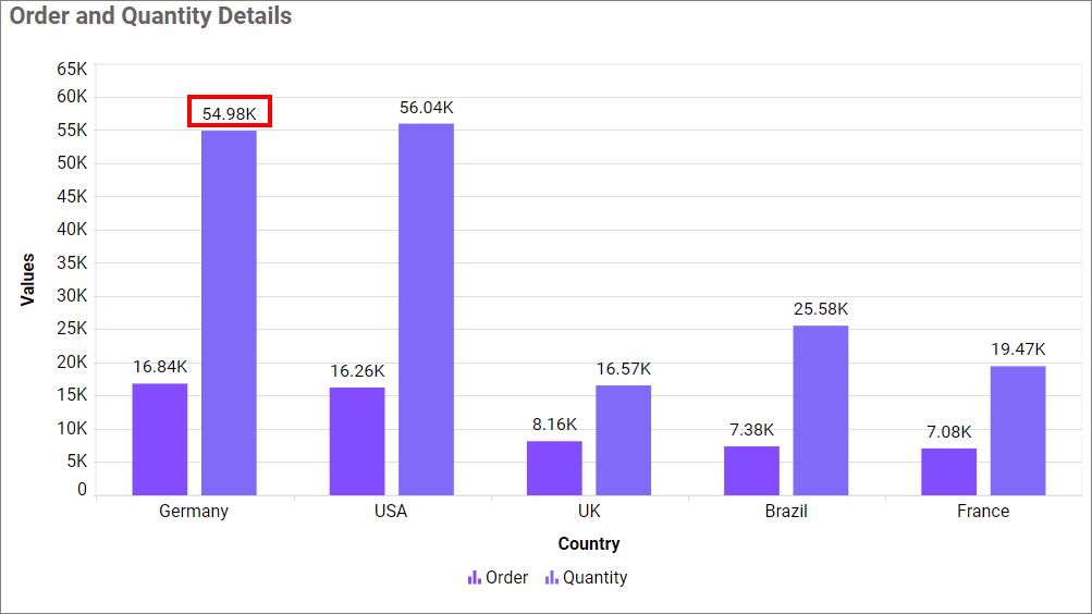
If you Disable Show Value Labels properties, the dependent properties, which are color, Value label position, Value label rotation and Value label suffix will be hidden.
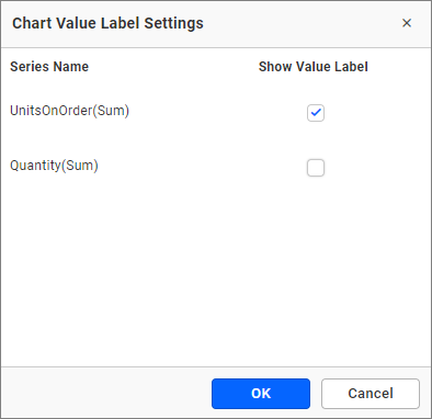
Customize
This feature enables you to customize the visibility of value labels in each series by toggling them.
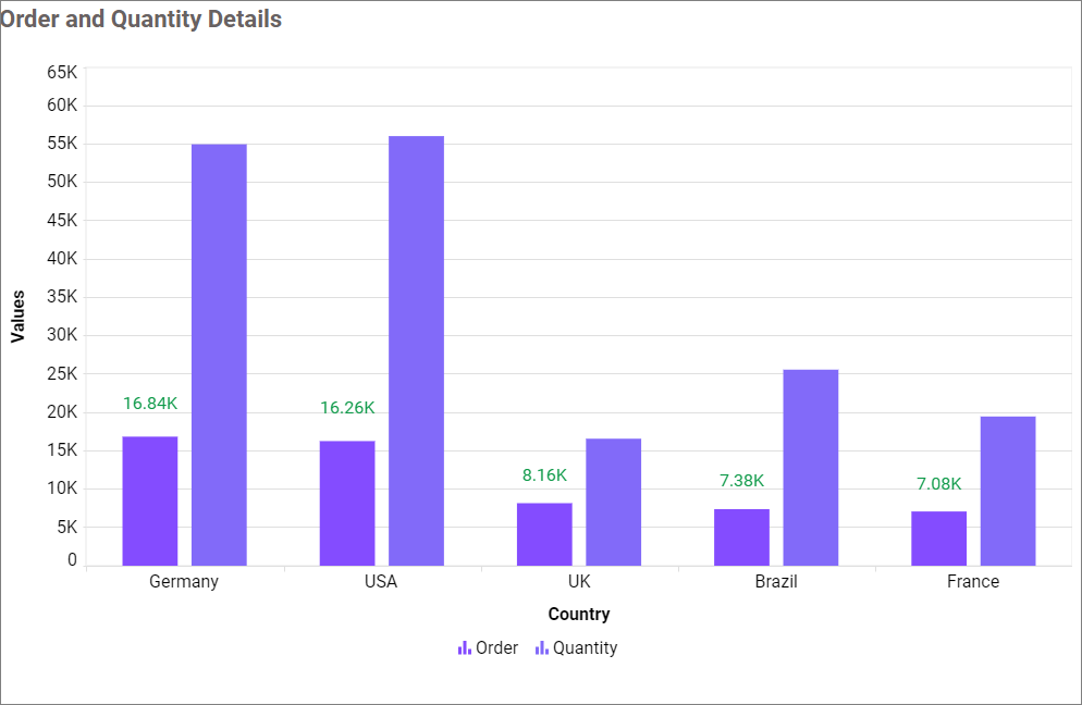
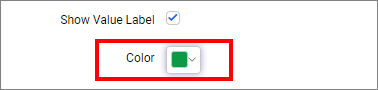
Value Label Color
This allows you to customize the color of the value label.
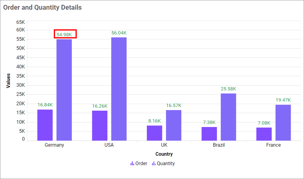
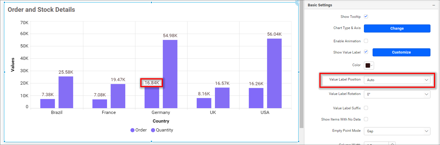
Value Label Position
This option allows you to customize the position of the value label in the chart. By default, it is set to ‘Auto,’ so the label position for the column chart will be set to the Top.
Value label rotation
This allows you to define the rotation angle for the value labels to be displayed.
Value label suffix
This feature enables you to display or conceal the suffix value of value labels.
Suffix Value
This allows you to customize the suffix value of the value labels.
Note: When I increased the height and number of data in the chart, the value label was hidden. I used the label rotation property to make the label visible.
Show items with no data
This allows you to display data for columns that do not have a value.
Empty Point Mode
This allows you to handle the display mode of the data point values when they are null or undefined, and Show Items With No Data is enabled.
Gap
This option allows you to display null or undefined values as gaps.
Zero
This option allows you to display the null or undefined values on the zero axis.
Average
This option displays the null or undefined values along with the average value.
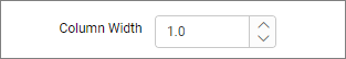
Column Width
This option allows you to increase or decrease the width of the column by using the Column Width.
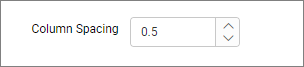
Column Spacing
This option allows you to increase or decrease the space between the columns by using the Column Spacing.
Enable Smooth Scroll
When this support is enabled, the size of the chart scroll bar thumb will be calculated based on the total number of records. This will allow you to view the last record by simply scrolling once.
Page Size
This option allows you to set the number of records that need to be fetched on initial load.
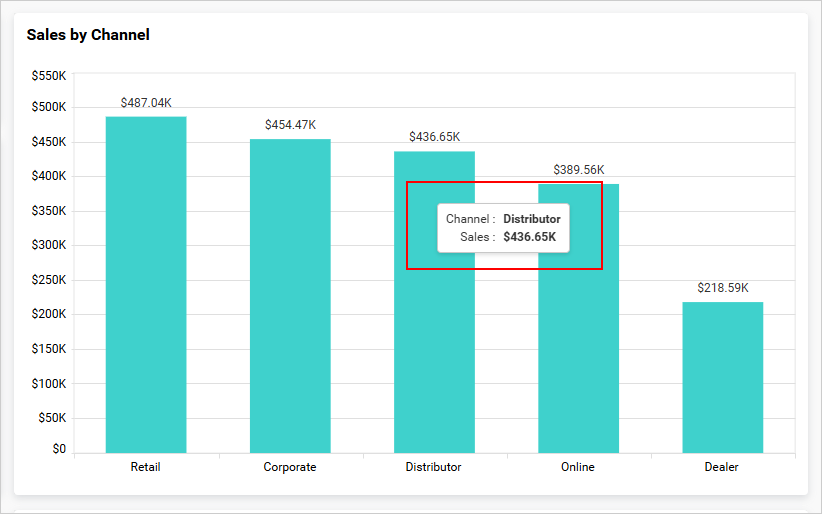
Tooltip Settings
The Tooltip Settings section allows you to customize the appearance and behavior of tooltips in widget visualizations.
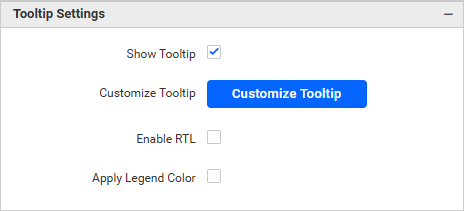
Show Tooltip
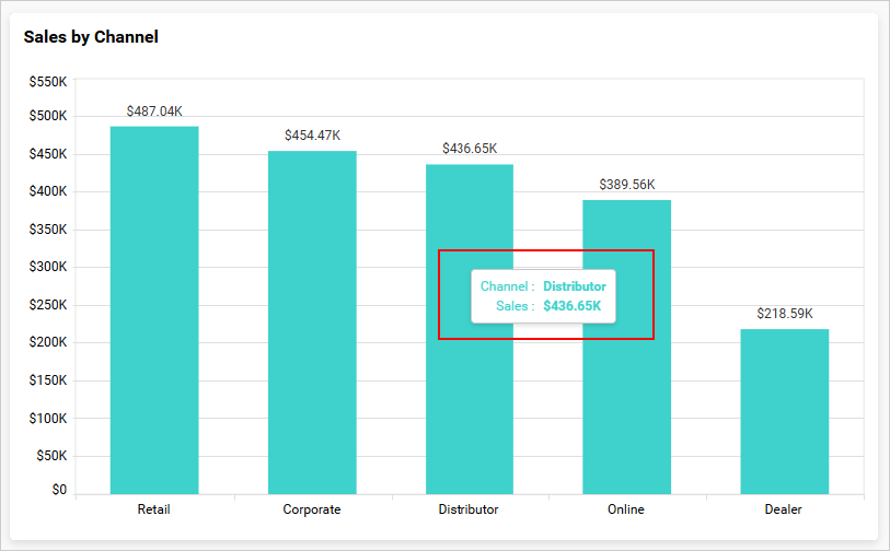
This option allows you to toggle the visibility of the tooltip in the chart.
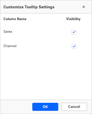
Customize Tooltip
This option allows you to customize which columns are visible in the chart’s tooltip.
Enable RTL
This option allows you to display fields and their data from right to left.

Apply Legend Color
This option allows you to display tooltip text and value colors that correspond with the legend colors.
Legend Settings
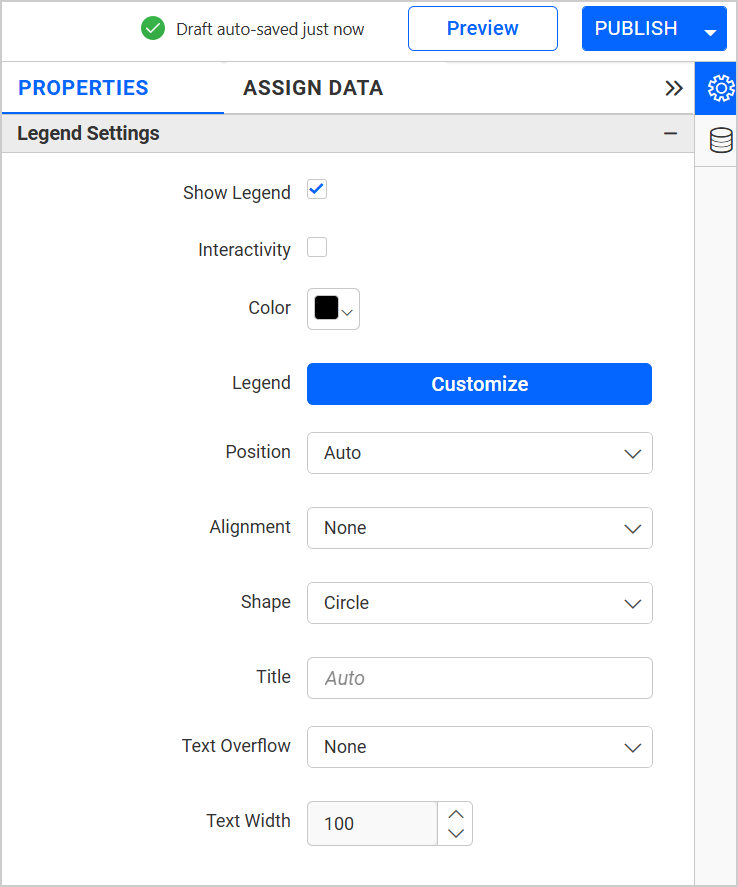
Show legend
A legend is a text used to describe the plotted data. This allows you to toggle the visibility of the legend in the chart and also change the position of the legend text by selecting through a combo box.
Enabling the Custom Legend Text option will allow you to define custom text (using the text area) to display for each legend series (selected through the combo box) in the chart.
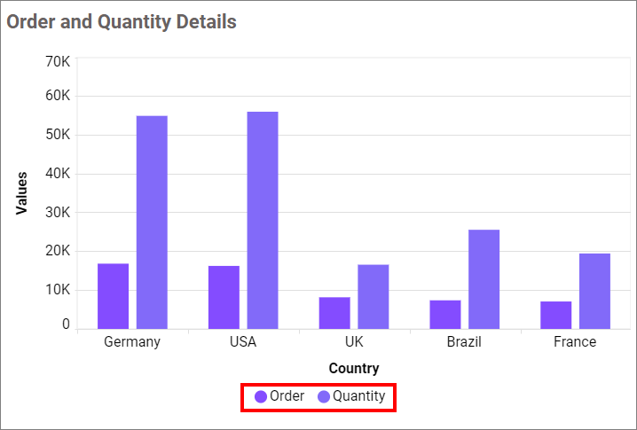
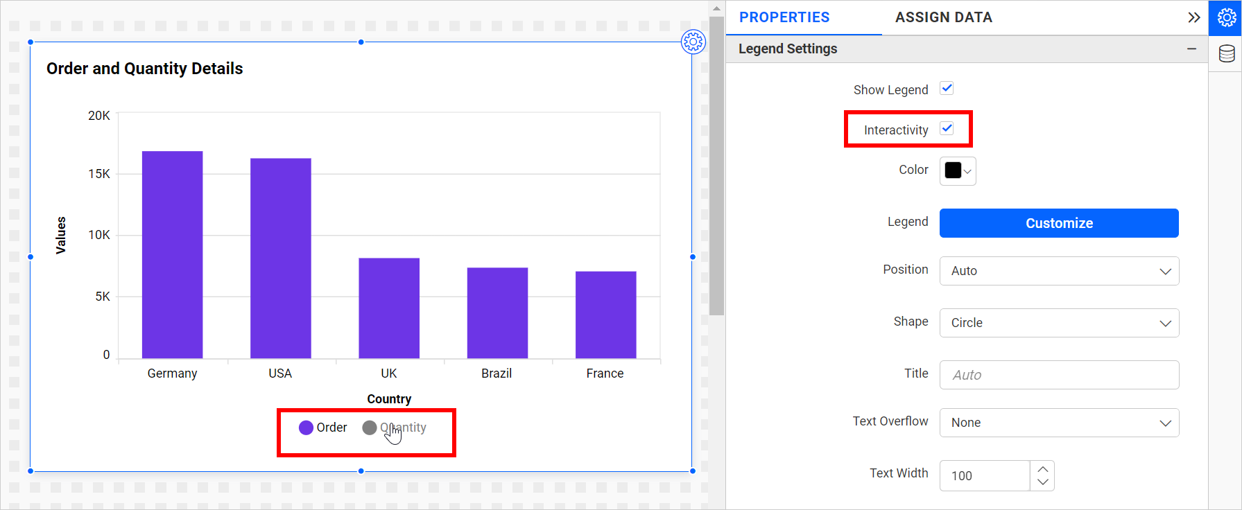
Legend Interactivity
The chart’s legend interactivity option allows you to control the behavior of the chart legends. This option provides the ability to make chart legends non-clickable, which can be particularly useful in situations where you do not want users to be able to hide or show series data by clicking on the legend. This feature might also be beneficial when presenting crucial data that should always be visible for accuracy and context.
Disabling the Interactivity feature in the Legend Settings category prevents you from clicking on the legends.
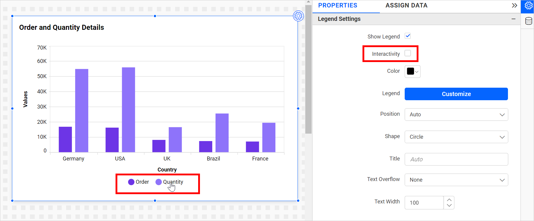 Enabling the Interactivity feature in the Legend Settings category allows you to click on the legends.
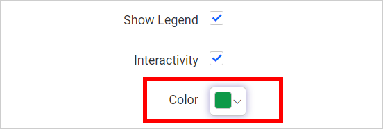
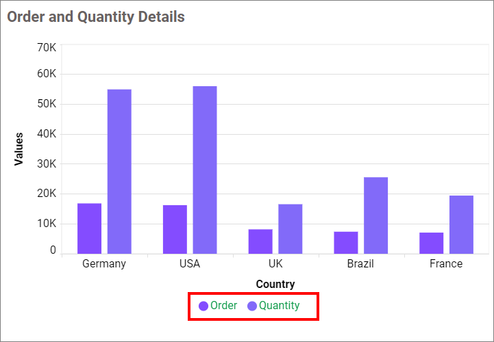
Legend Label Color
This allows you to change the chart legend title and label colors.
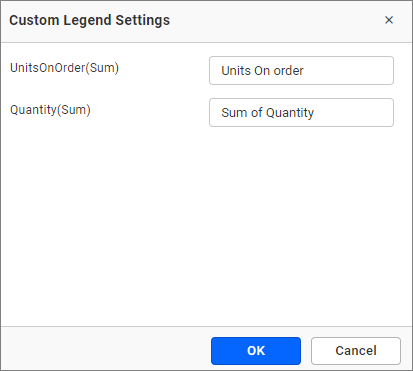
Customize
You can customize the legend text through the Custom Legend Settings dialog. This dialog will display the legend text list as labels on the left and a corresponding text area on the right. This allows you to add formatted text to be displayed instead.
Legend Position
A Legend is a text used to describe the data plotted. This option allows you to place the legend at the position of Left, Right, Top, and Bottom.
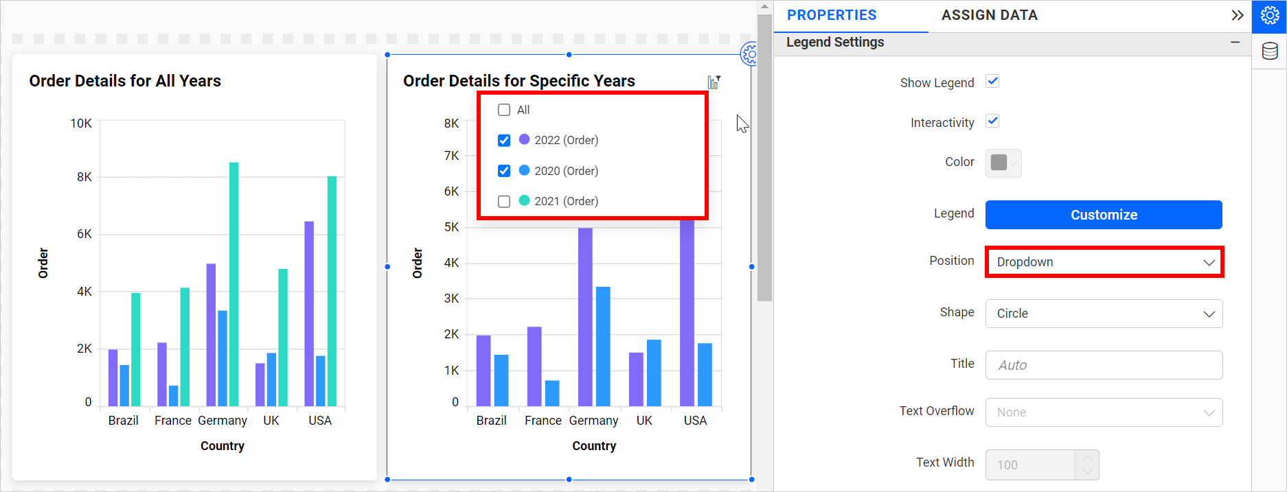
Legend Item as Dropdown
Legends can be displayed as a dropdown menu when the legend position is set to “dropdown.” When you hover over a chart, a legend icon appears. Clicking on this icon will bring up a legend dropdown. This feature allows you to toggle the visibility of the legend in the chart.
This option will hide the legends in the chart area, resulting in increased chart space and enhanced visibility.
The chart legend dropdown option can be used to simplify viewing complex charts with multiple data sources. For example, if you have a chart displaying sales data for the different years, you can use the legend dropdown to deselect all other years and focus only on a specific year.
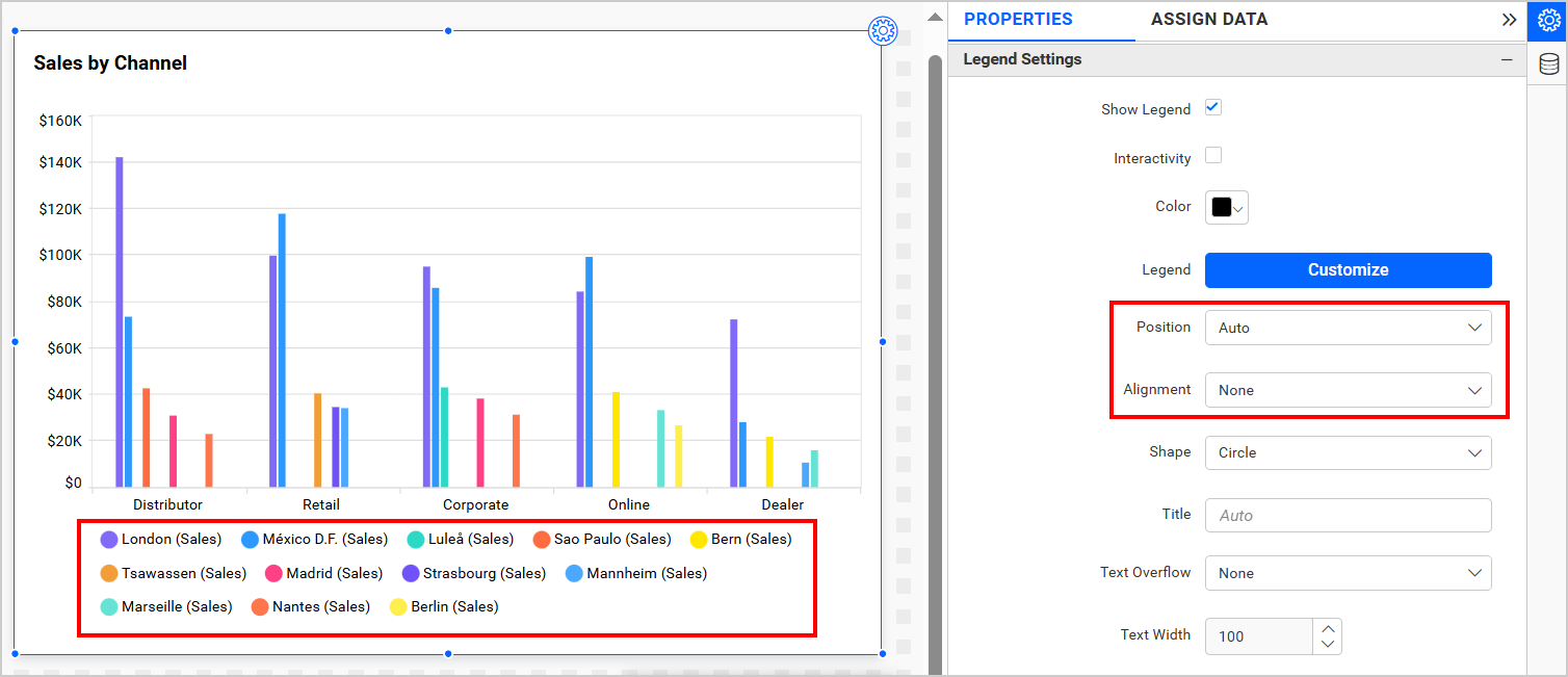
Legend Alignment
The Legend Alignment allows you to adjust the alignment of the legend within its designated area. You can choose from four alignment options: Near, Center, Far, and None.
For further legend’s placement details are in the below table.
| Alignment | Description |
| Near | Aligns the legend to the start (top or left, depending on position). |
| Center | Positions the legend in the middle of the available space. |
| Far | Aligns the legend to the end (bottom or right, depending on position). |
| None | Leaves the legend unaligned, allowing default rendering. |
This enhancement allows users to control both the position and alignment of the legend, providing greater flexibility in customizing the chart’s appearance to meet specific design or layout needs.
When Position is set to Auto and Alignment is set to None, the legend will be displayed as shown in the image below.
When Position is set to Top and Alignment is set to Near, the legend will be displayed as shown in the image below.
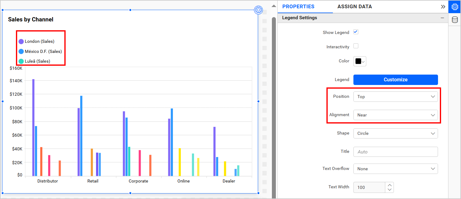
You can similarly customize position and alignment in various scenarios.
Legend Shape
This allows you to change the shape of the legend.
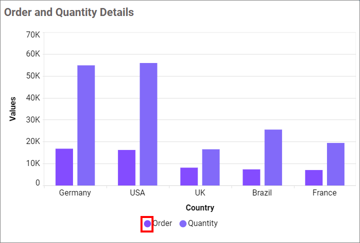
Circle
This option allows you to change the shape of the legend to a Circle.
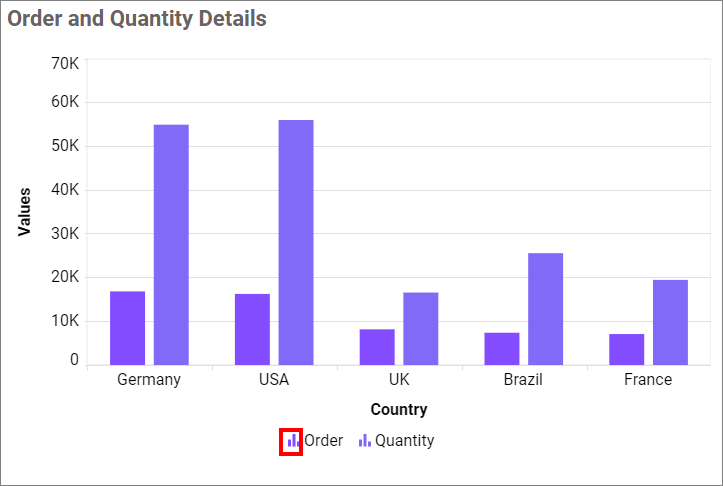
Series Type
This option allows you to change the shape of the legend in Series.
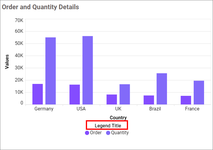
Legend Title
This allows you to add the legend title for the chart, which will be reflected with the Show Legend option.
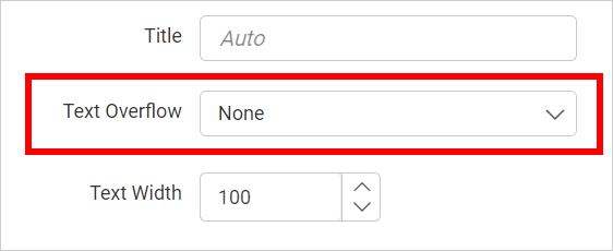
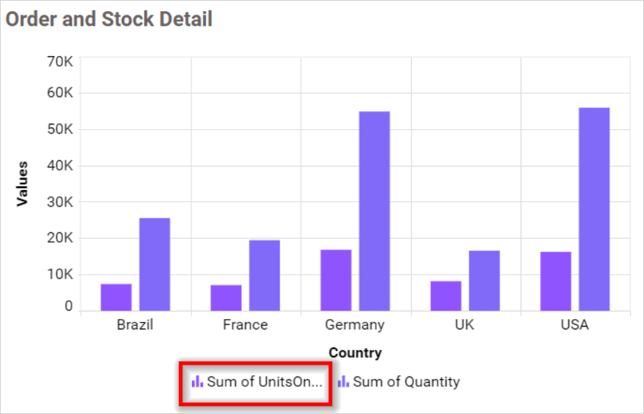
Text Overflow
This option allows you to customize the legend text based on the value of the Text Width property.
None
This option allows you to render legend items without wrapping or trimming them.
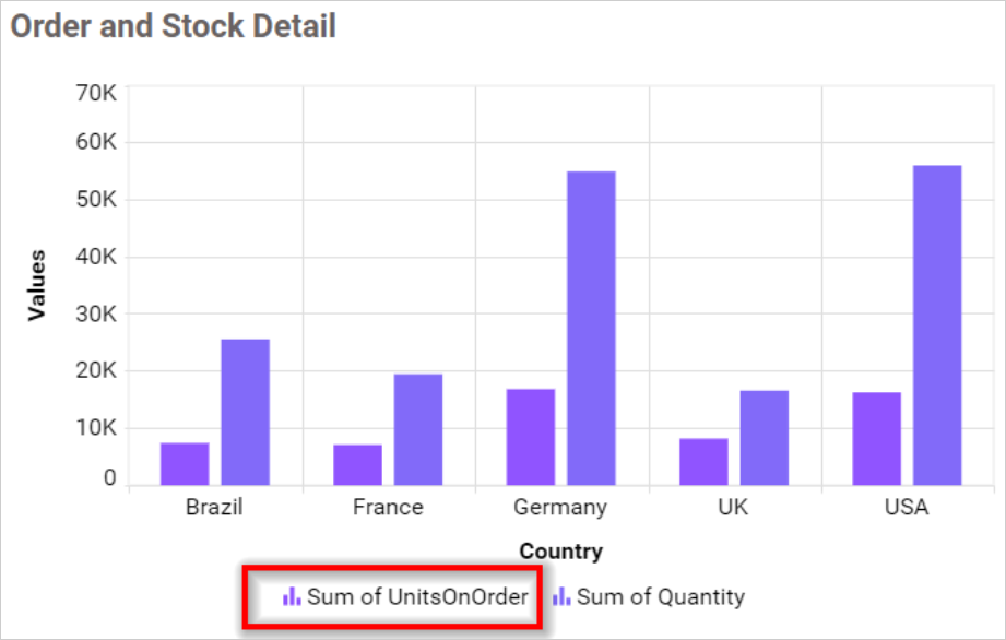
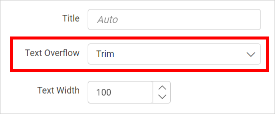
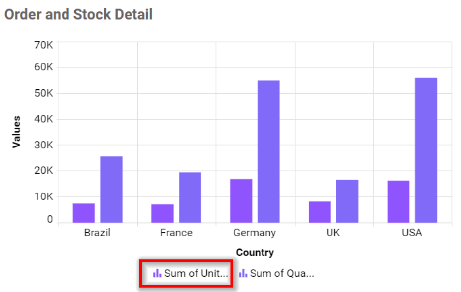
Trim
This option allows you to trim the legend items if their legend exceeds the value of Text Width.
Wrap
This option enables you to wrap legend items according to the value of Text Width.
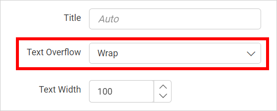
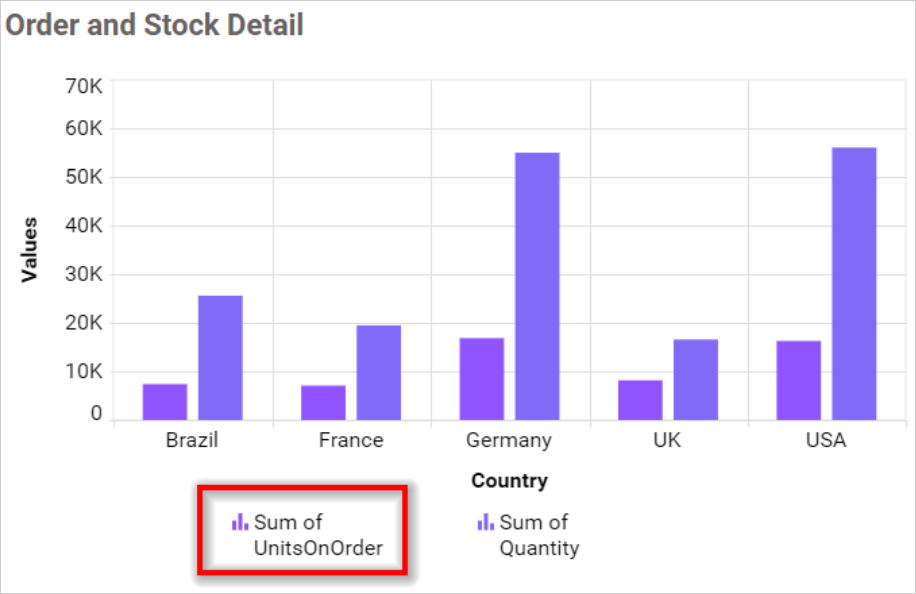
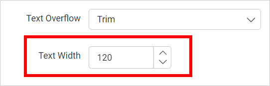
Text Width
This option allows you to set the maximum width for the Legend Items, and it is applicable only if text-overflow is set to Trim or Wrap.
If you uncheck the Show Legend property in the property panel, the dependent properties, which are Legend color, Legend position, customization button and Legend title are also hidden.
NOTE: In a single series, the legend will not be visible.
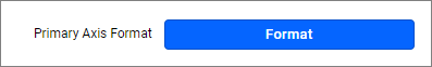
Axis Format
This option enables you to format the values of the primary and secondary axes using the provided formatting details accessed through the Format button. For more information, please refer to this measure format.
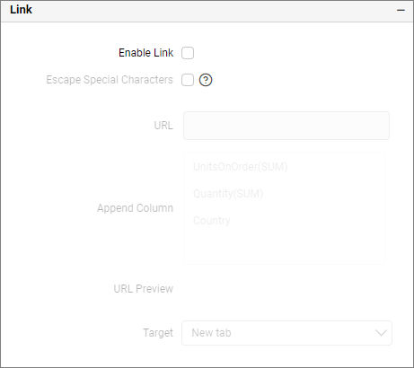
Link
To configure the linking to a URL or dashboard with the widget, use its settings. For more details, refer to the section on Linking.
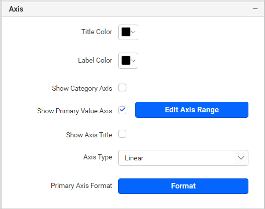
Axis settings
This section allows you to customize the axis settings in the chart.
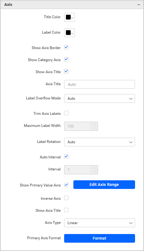
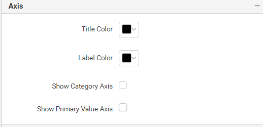
Title color
This enables you to personalize the color of the axis title.
Label color
This feature allows you to customize the color of the axis labels.
Show Axis Border
This option allows you to enable or disable the axis border of the chart.
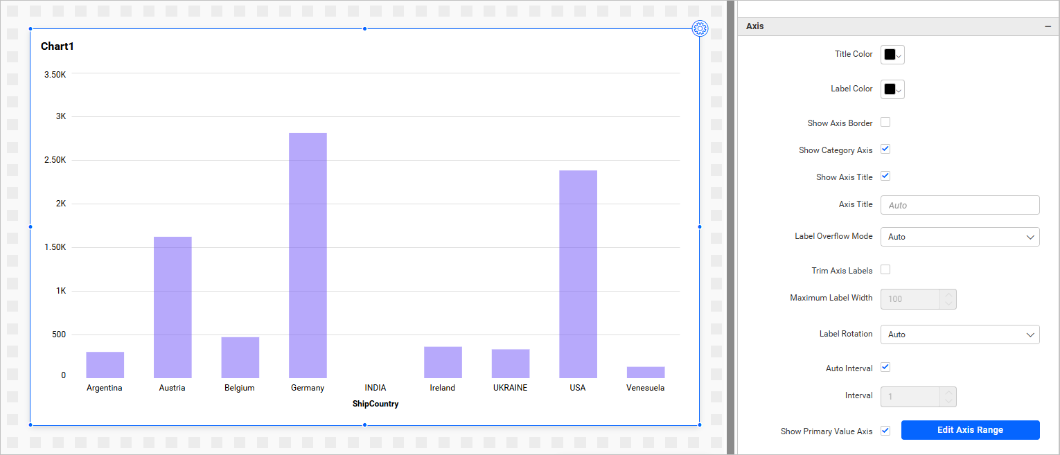
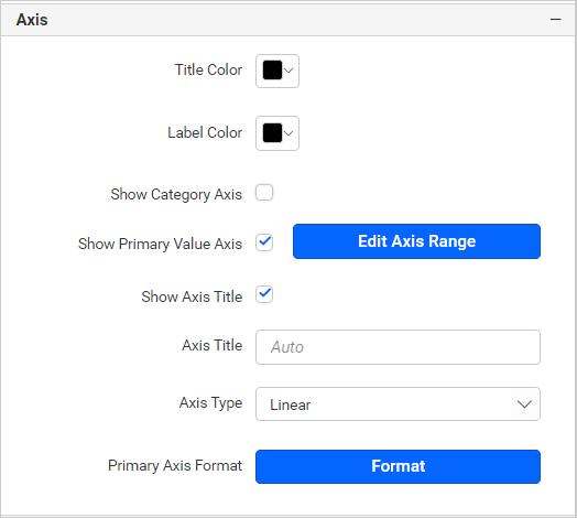
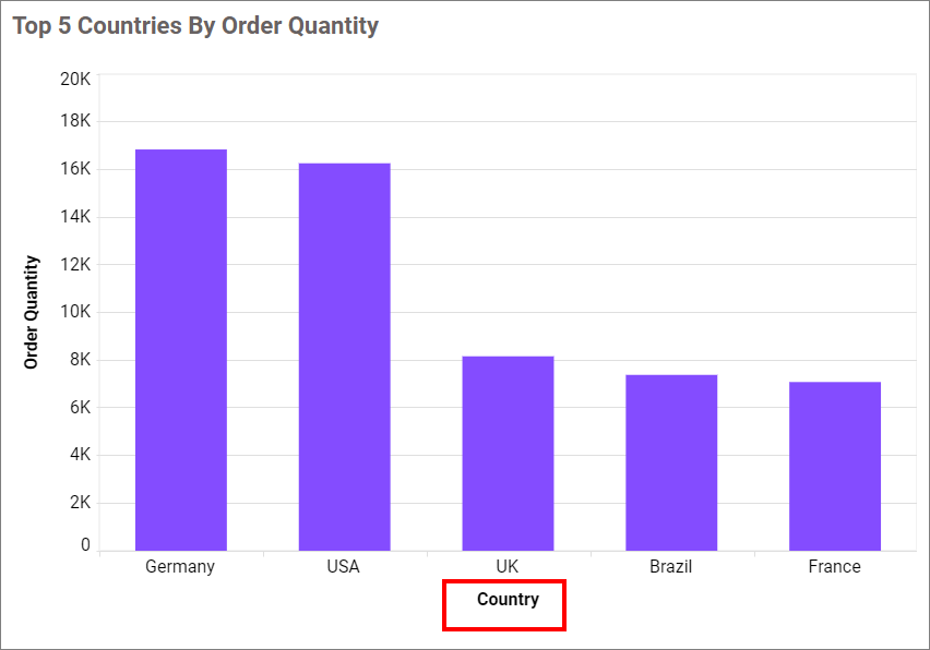
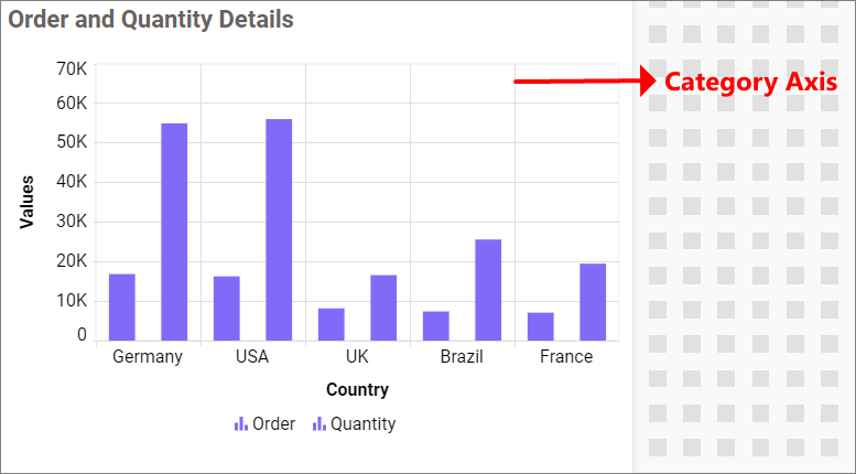
Show category axis
This feature allows you to toggle the visibility of the category axis.
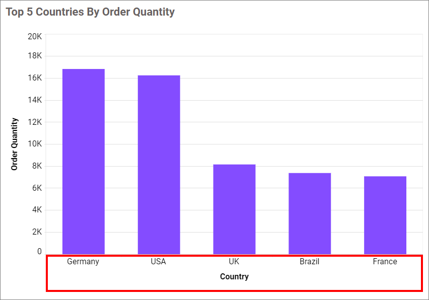
If you disable the Show Category Axis option, dependencies properties, which are Show axis title, Axis title text, Trim overflow mode, Trim axis labels, Label Rotation and Auto Interval option, will be hidden.
Show category axis title
This feature enables you to toggle the visibility of the category axis title.
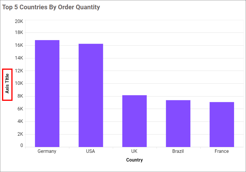
Category axis title
This allows you to edit the category axis title for chart. It will reflect in x-axis name of chart.

If we uncheck the Show Axis Title property, the property for the Axis title text box will be hidden.
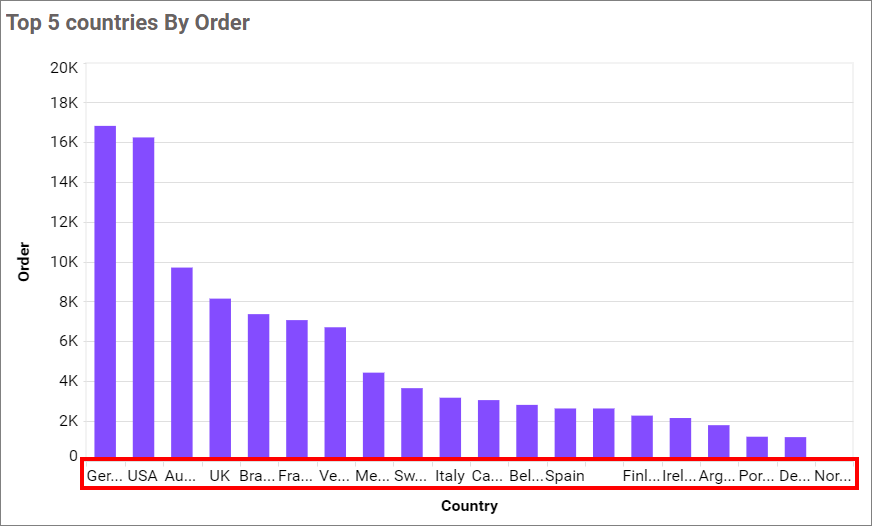
Label overflow mode
This feature enables you to manage the display mode of the overlapping labels on the category axis.
Trim
This option trims the end of the overlapping label on the axis.
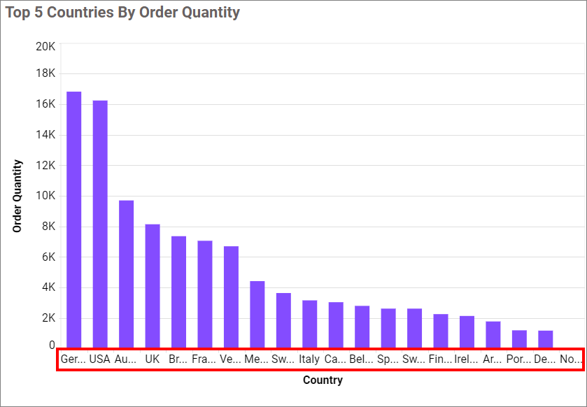
Hide
This option trims the end of the overlapping label on the axis.
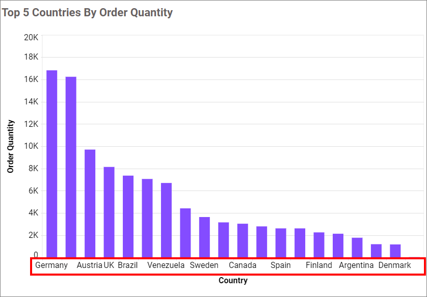
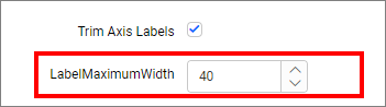
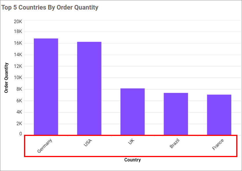
Trim Axis Labels
This option allows you to trim the axis labels based on the value of the Maximum Label Width property.
Label Maximum Width
This option allows you to set a maximum width for the axis labels, and it can also be customized when the trim axis label option is enabled.
Category axis label rotation
This allows you to define the rotation angle for displaying the category axis labels.
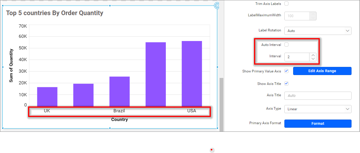
Auto Interval and Interval
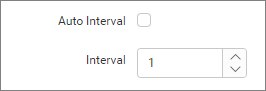
By default, the Auto Interval property is enabled. The Auto Interval property is used to automatically set intervals based on the number of data points for category axis labels. If the user wants to customize the interval, they need to disable the auto interval and set the desired interval.
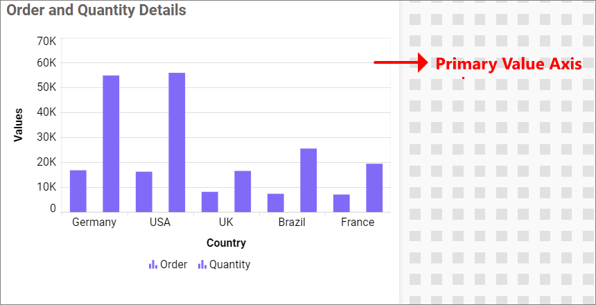
Primary value axis
This allows you to enable the primary value axis for the chart.
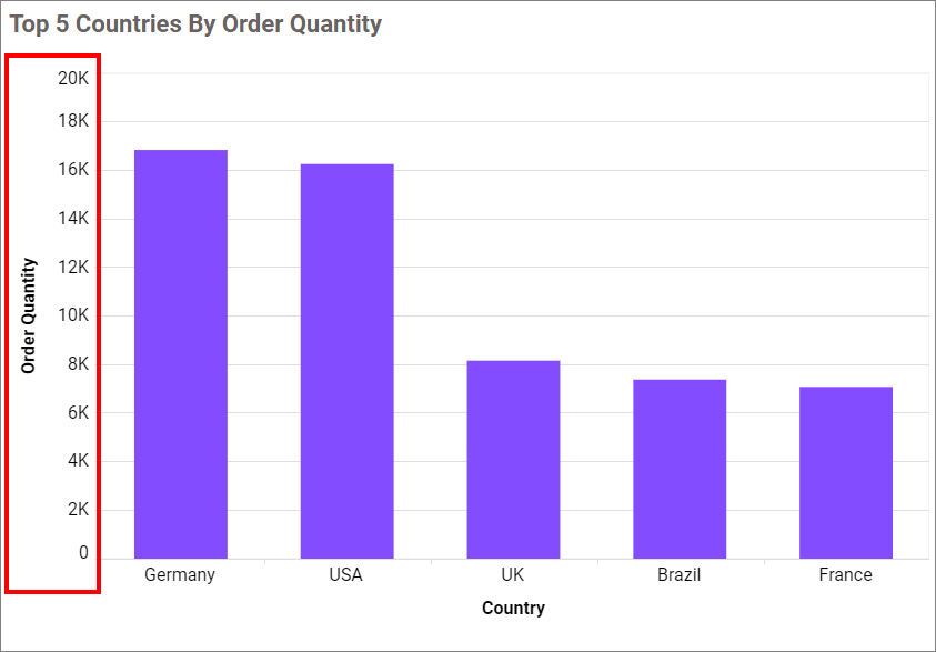
If you disable the Show Primary Axis option, dependencies properties, which are Axis title, Axis title text, Axis type and Axis Format properties will be hidden.
Show primary axis title
This feature allows you to enable the visibility of the primary value axis title on the chart.

Primary axis title value
This allows you to edit the title of the primary value axis, which will be reflected as the name of the y-axis in the chart.
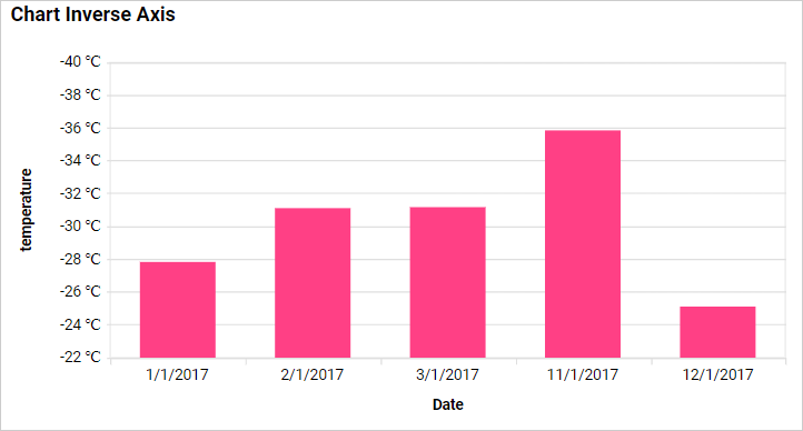
Inverse Axis
By default, the chart axis shows positive values at the top and negative values at the bottom. However, there are times when we need to invert the axis and display the negative values at the top and positive values at the bottom. For example, when we bind temperature data to the chart and want to display the negative values at the top, we can utilize this property.
Enabling this property will result in the display of negative values at the top of the chart and positive values at the bottom.
Axis Type
This enables you to modify the axis type in the column chart.
Linear
This option enables you to set the type of axis as linear.
Logarithmic
This option allows you to handle the logarithmic axis that uses a logarithmic scale, which is very useful in visualizing data with values of both lower and higher orders of magnitude (e.g., 10-6 and 106).
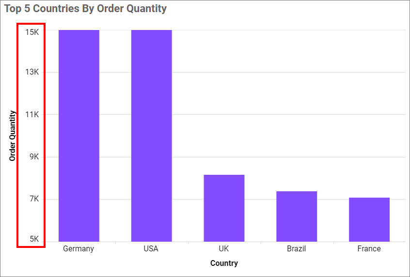
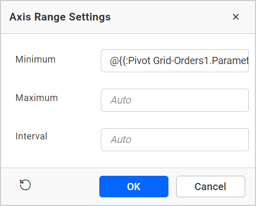
Axis range settings
This allows you to manually set the minimum, maximum, and interval values of the primary value axis through the Axis Range Settings dialog.
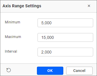
It will be reflected in the primary value axis of the chart.
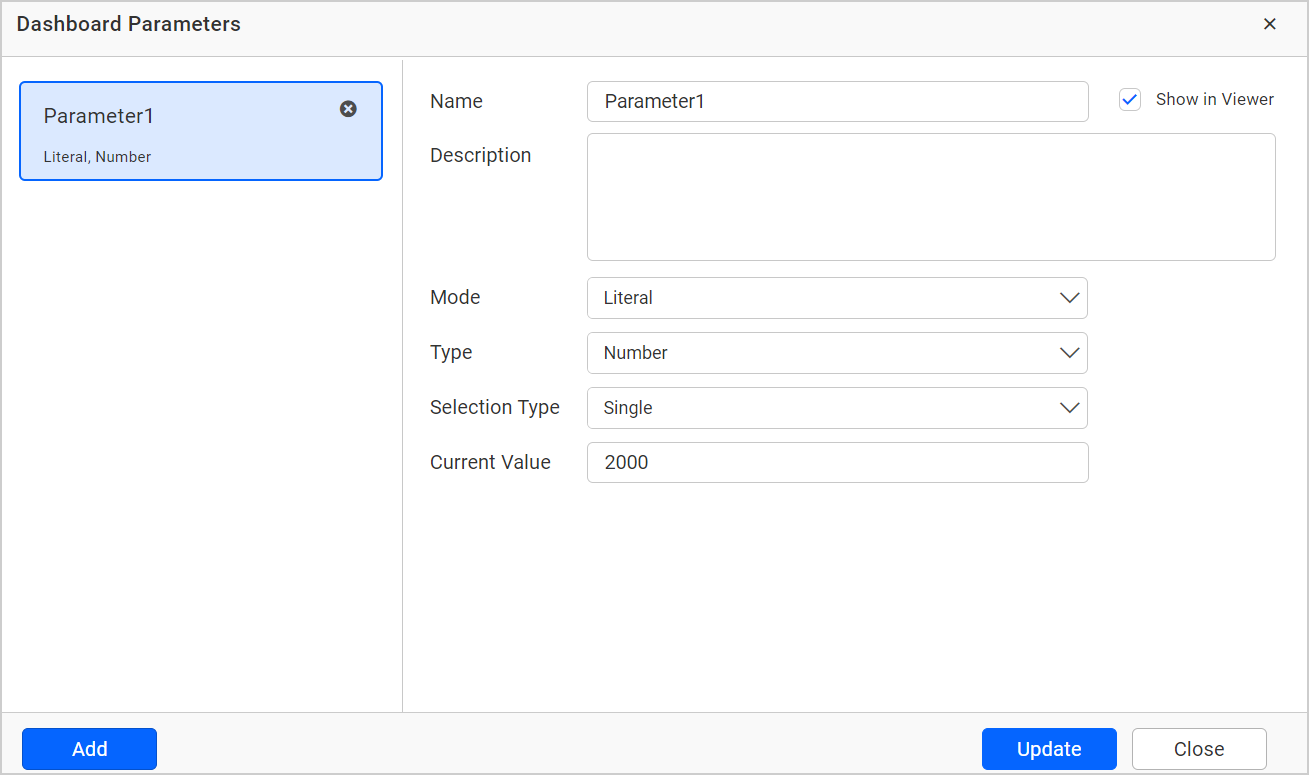
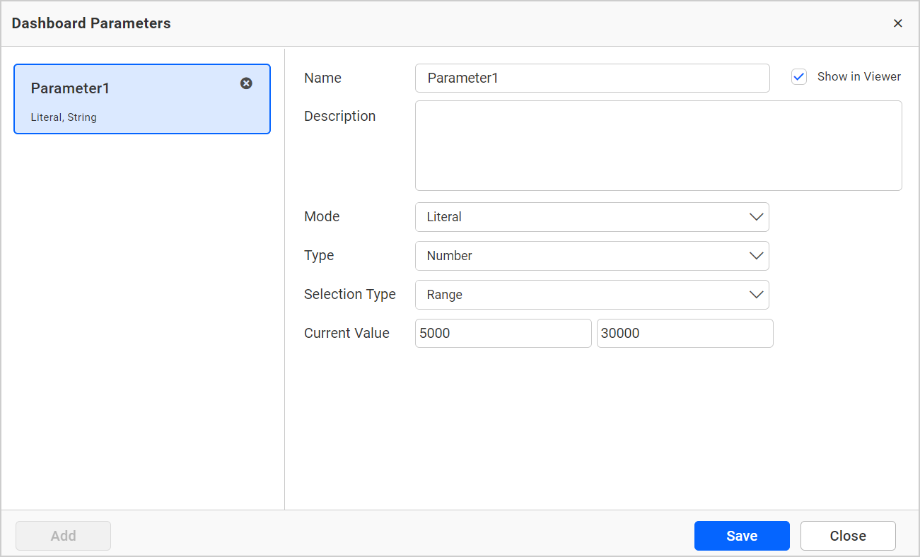
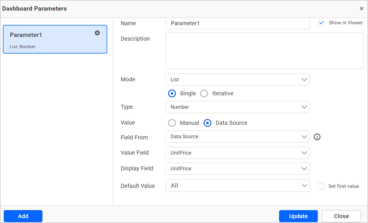
Parameter Support in Axis range:
This feature enables you to dynamically set the minimum, maximum, and interval values of the primary value axis through the Axis Range Settings dialog, using the dashboard parameter values. Only number-type dashboard parameter values are permitted in the axis range properties. It is possible to create multiple types of dashboard parameters.
- Single parameter value.
- Range parameter value.
- Data source field based parameter values.
For more details about dashboard parameter, refer to the Dashboard parameter documentation.
Single Parameter Value:
A single value is stored in this type of parameter.
- Create a dashboard parameter in the number type as shown below.
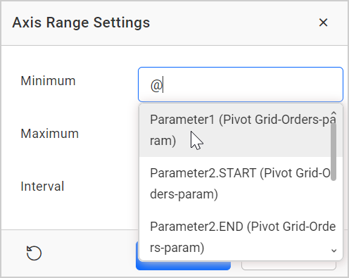
Click the axis range settings dialog and enter @ in the textbox. Select the parameter value (Numeric parameter values are only allowed in the minimum, maximum, and interval).
Now, the parameter value is reflected on the chart axis.
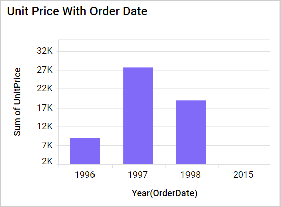
Range Parameter Value:
If you want to set the same ranges in multiple cases, create the parameter value of type range. This type of parameter includes the start and end values.
- Create a parameter of the range type.
- Click the axis range settings dialog and enter
@in any textbox (minimum, maximum, and interval). The range parameter is split into start and end parameters. The value from the first textbox is stored in the start parameter, and the value from the second textbox is stored in the end parameter. Select the parameter value (only number type parameter values allowed).
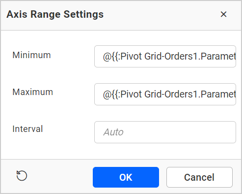
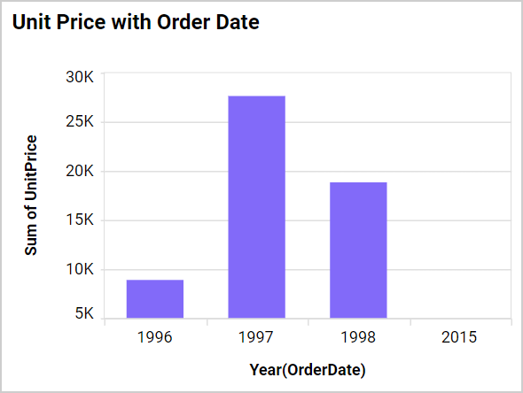
- The parameter value is reflected in the chart axis.
Data Source Field Based Parameter Value:
- Create a parameter in the data source type where you can choose any field. The value of the parameter will be based on the selected field value.
- Click the axis range settings dialog and enter
@in any textbox(minimum, maximum and interval). Select the parameter value.
- The value of the parameter is reflected in the axis of the chart.
Axis Format
This option allows you to format the values for the primary and secondary axes using the formatting details provided through the Format button. For more information, please refer to the measure format.
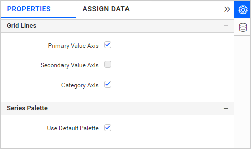
Gridlines
You can toggle the visibility of each axis gridlines using the property.
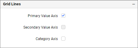
Primary Value Axis
This enables you to enable the gridlines for the Primary Value Axis in the column chart.
Secondary value Axis
This allows you to enable the gridlines for the Secondary Value Axis in the column chart.
Category Axis
This allows you to enable the gridlines for the category axis in the column chart.
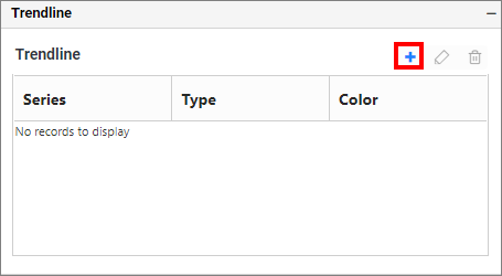
Trendline
You can add more than one trendline to Cartesian charts, except for bar-type series (Line, Column, Area, Spline) and stacked types of charts. You can add, edit, and delete trendlines.
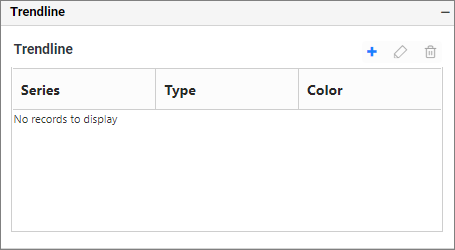
Add Trendline and Edit Trendline
To add the trendline, click on the highlighted button.
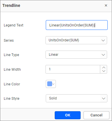
Now, the dialogue will open as follows.
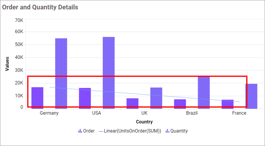
Click the OK button to add a trendline in a column chart. Now, the chart is rendered as follows.
To edit the trendline, select the one that needs to be edited and click the highlighted button.
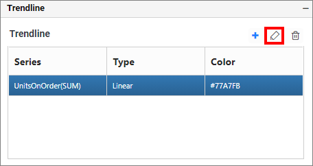
Once again, the trendline dialog window is now open.
Legend Text
You can edit the trendline legend by the Legend Text text box. By default, the Legend Text renders are based on the Line type and Series name.
Series
You can change the series for which the trendline needs to be displayed by using the Series dropdown option.
Line Type
You can select the line type from the Line Type dropdown option, which includes Linear, Exponential, Logarithmic, Power, and Polynomial.
Line Color
You can change the color of the trendline using the Line Color color picker.
Line Style
You can change the style of the trendline by selecting the Line Style drop-down option, which includes Solid, Dot, Dash, DotDash, LongDash, and LongDashDotDot.
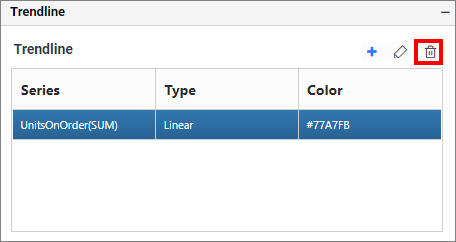
Delete Trendline
To delete the trendline, select the one you want to delete and click the highlighted button.
Formatting
IMPORTANT: The
Formatting sectionwill be enabled when the widget is configured, and it will be hidden if the row field is configured.
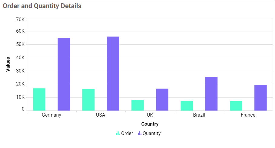
This feature enables you to change the color for the column chart.
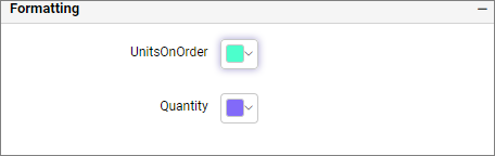
It will be reflected in the column chart.
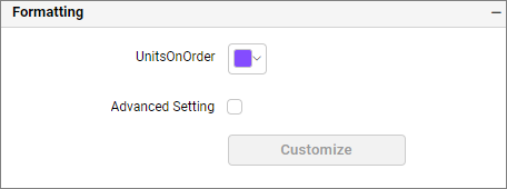
Advance settings
The Advance setting option will be enabled when only one column and one row are configured. You can refer to more details from this section
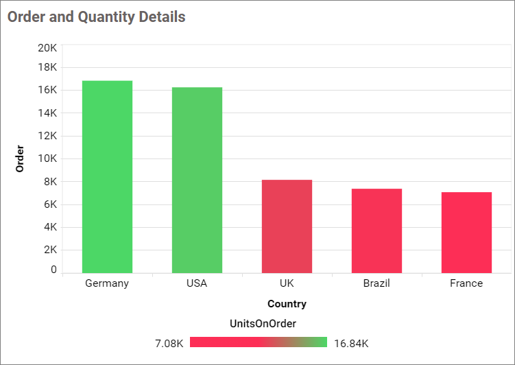
How to apply conditional formatting
The color in the column chart widget can be customized using the color settings available in the properties section. This will allow users to improve the visualization in the column chart and distinguish the data based on conditional range values, enabling the visualizer to understand what is shown in the data.
How to enable advanced formatting
-
In the
propertiespane, under theFormattingsection, please ensure that you check theAdvanced Settingcheck box. -
By doing so, the
Conditional Formattingdialog will be opened.
- Please select the mode and enter the required conditions, then click the
savebutton to apply.
- Now, the widget visualization will be updated according to the conditions.
Please refer to the following sections for detailed steps on using the Gradient, Rule and individual modes.
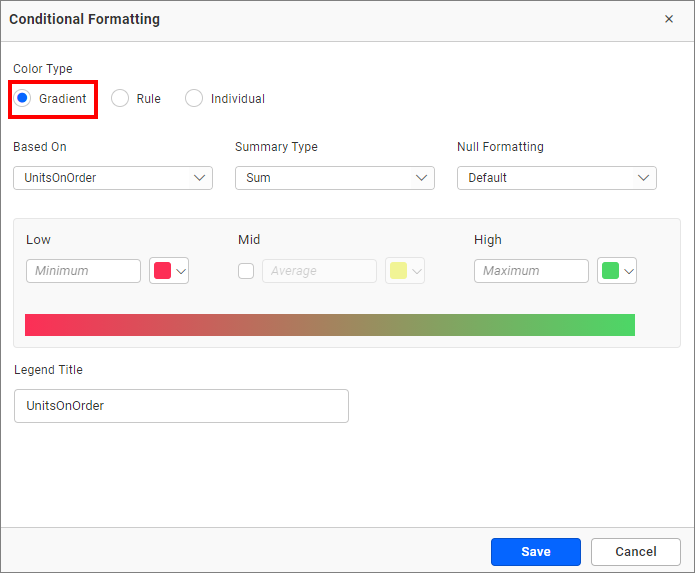
Gradient mode
You can customize the fill color of the column chart using the gradient-based conditional formatting. This is the default mode.
Based on field
You can select any field from the Based-On section to apply the conditions from the drop-down menu.
Summary type
You can choose the type of summary for the measure field that has been selected.
Low, mid, and high values
You can define your range by entering the low, mid, and high values.
NOTE: It is optional. If no value is entered, then the ranges will be automatically calculated based on the minimum and maximum values from the data source.
Legend title
You can enter the title for the column chart legends.
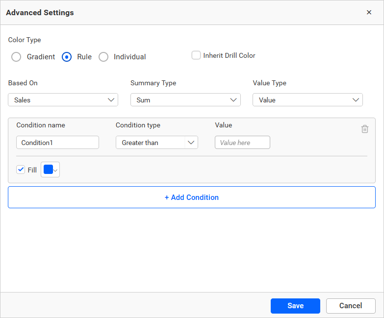
Rule based condition mode
This feature enables you to customize the fill color of the column chart based on one or more numerical/text conditions.
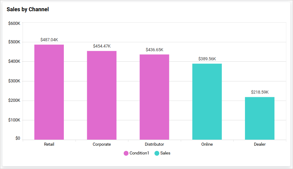
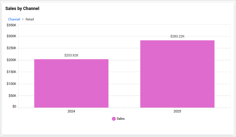
Inherit Drill down color
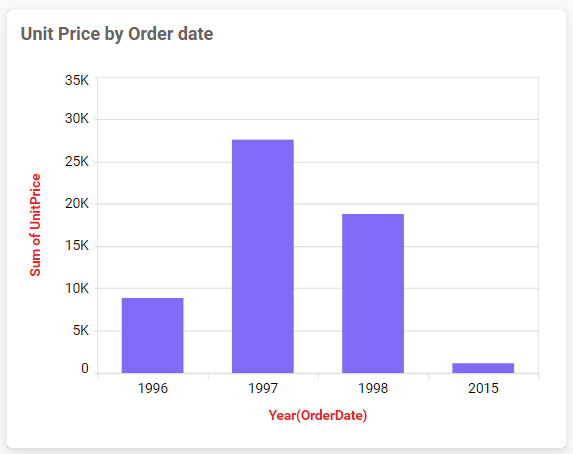
Enabling this option allows series at subsequent levels to inherit colors from the first level during drill-down, as illustrated in the image below.
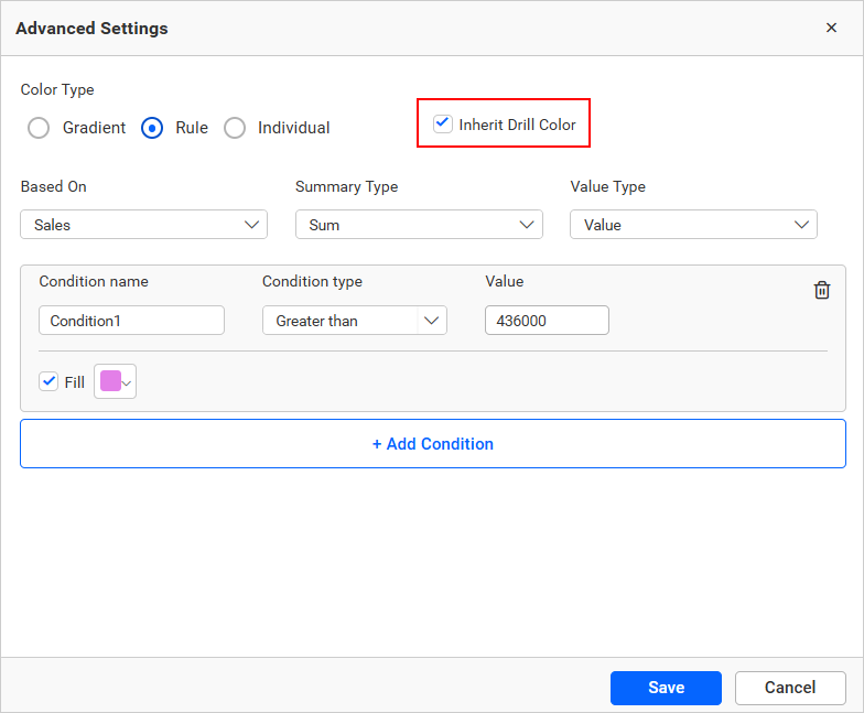
For example, when drilling down on a ‘Retail’ point, the next level of series will inherit the ‘Retail’ point’s color as shown in the following image.
Value type
The value type drop-down allows you to choose whether you are going to apply the direct value (a specific number like 3 goals or order ID 10248) or a percentage (values above 30% or 50%).
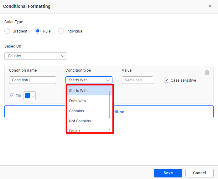
Condition name
You can assign a meaningful name to the applied conditions.
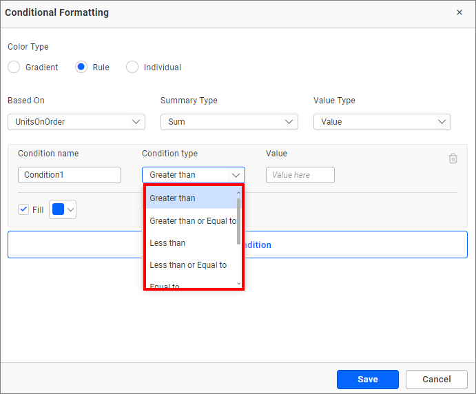
Condition type
Please select the condition for the measure field from the highlighted options.
If you have selected the dimension as a based-on field and wish to use a text condition, the following text-based conditions are available.
The text-based condition type will only be enabled when the selected dimension is used as the based-on field.
Value
You can mention the value of the condition.
Case sensitive
The case sensitive option is provided for choosing whether the entered value is case sensitive or not when considering the dimensions.
Fill color
Please select the fill color for that condition using the color picker.
Add condition
Click add condition to specify a new condition.
Delete condition
Click the delete button to remove the existing condition.
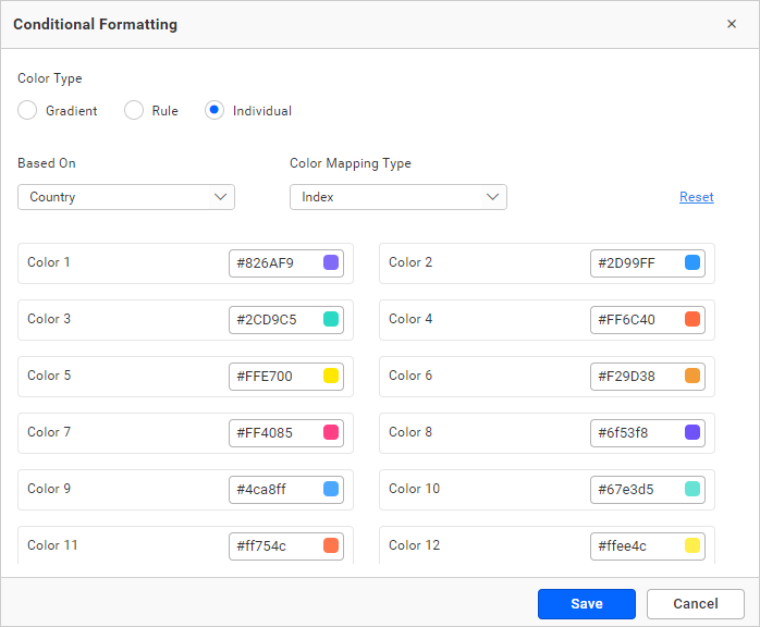
Individual mode
Using the individual mode, you can specify a color for each record.
IMPORTANT: Only top 100 records will be listed in the dialog.
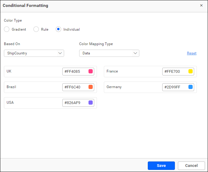
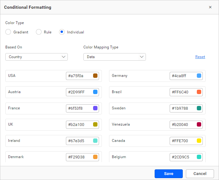
Color Mapping Type
By utilizing the Color Mapping type, you have the ability to apply colors to the series, whether it be based on data or index.
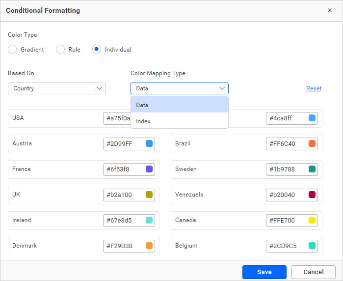
Data
It allows you to apply color to chart series based on data. If you want to apply a specific color to specific data, you can use data-based color mapping. By default, the color mapping type will be Data.
Index
It allows you to apply color to chart series based on the Index, ensuring that the colors remain consistent even if the data is changed. A maximum of 15 different colors can be displayed, after which the colors will repeat from the ones used above.
For example, if you are displaying the countries based on the increasing order of the case count, then index-based color mapping will be useful to set the colors based on the rank. For instance, assigning the color red to the top-ranked country, the red color will be maintained for the country with the largest case count.
Note: We prefer to use index-based color customization only for minimal data (up to 15 series).
Color
You can choose the color for the record using the color picker nearby.
Reset
To undo all the changes, click reset.
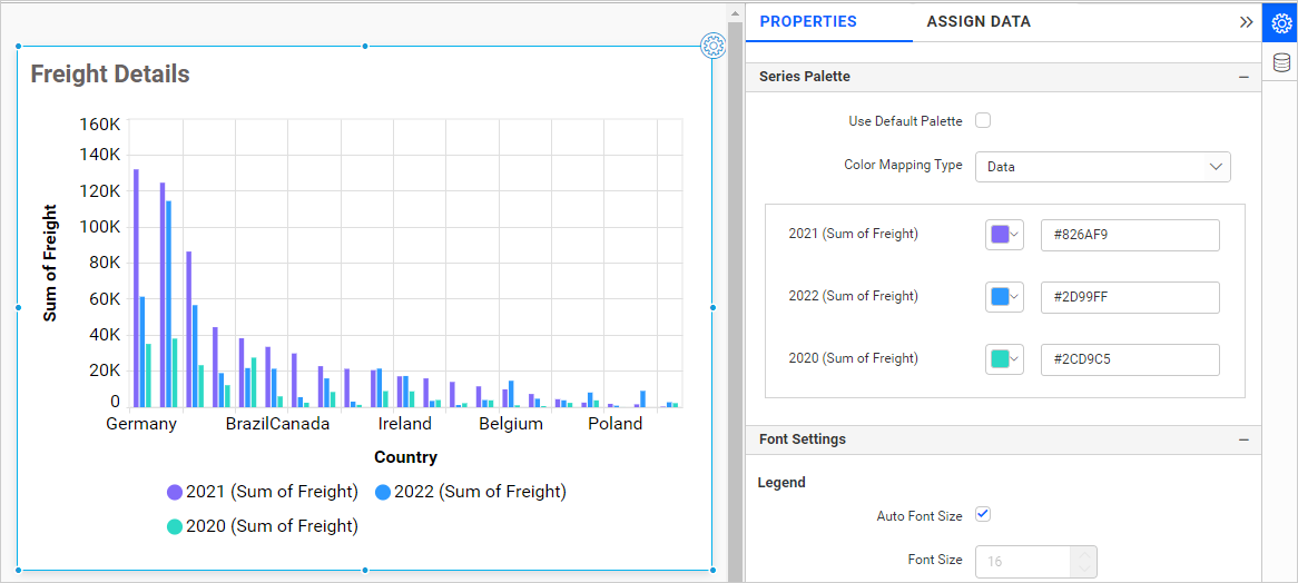
Series Palette
This allows you to apply color to chart series by using either a default palette or a custom color palette. By default, the colors will be applied using the default palette. This series of settings will only be visible if you have configured the row section in the chart.
Use Default Palette
This Option allows you to apply default color for chart series.
By toggle off the Use Default Palette option, the Color Mapping Type will be shown.
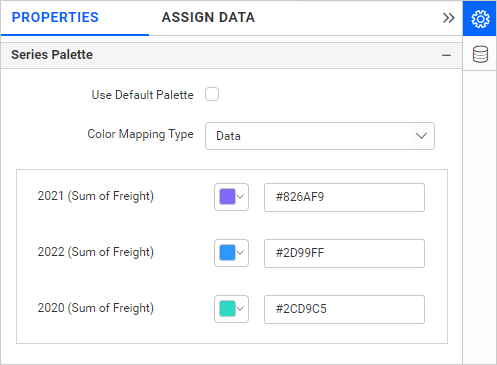
Color Mapping Type
Using the Color Mapping type, you can apply colors to the series either based on data or index.
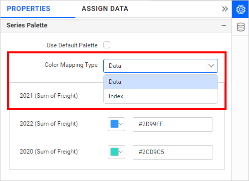
Data
It enables you to assign colors to chart series based on data. If you wish to assign a specific color to certain data points (e.g., Violet for 2021, Sky Blue for 2022, and green for 2020), you can utilize Data-based color mapping. The default setting for the Color Mapping Type is Data.
Index
It enables you to apply color to chart series based on the Index, ensuring that the colors remain consistent even if the data is modified. It displays a maximum of 15 distinct colors, after which the colors will repeat from the earlier set.
For example, if you are displaying the countries based on the increasing order of the case count, then index-based color mapping will be useful to set the colors based on the rank. For instance, assigning the color red to the top-ranked country will ensure that the red color is maintained for the country with the largest case count.
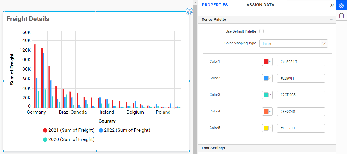
Note: We prefer to use index-based color customization only for a minimum amount of data (up to 15 series).
Font settings
This section enables you to personalize the font size of chart elements.
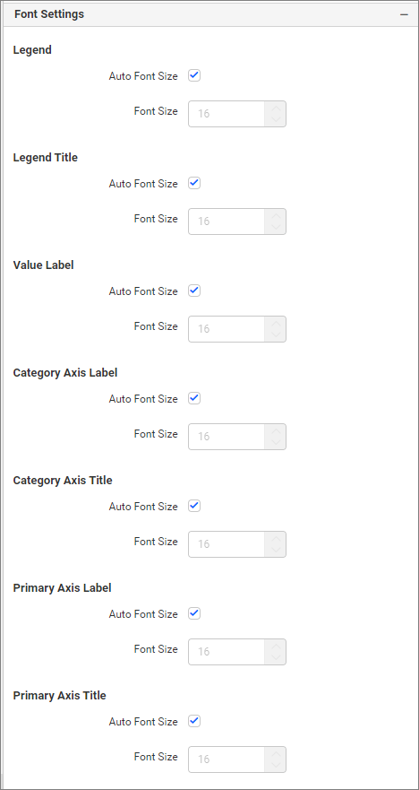
Auto font Size and font size
By default, the Auto Font Size property is enabled. The Auto font size property is used to set the font size based on the resolution of the client machine viewing the dashboard. If the user wants to customize or set a fixed font size, then the user needs to disable the auto font size and set the required font size.
Filter
This section enables you to manage the filter action for the spline area chart widget.
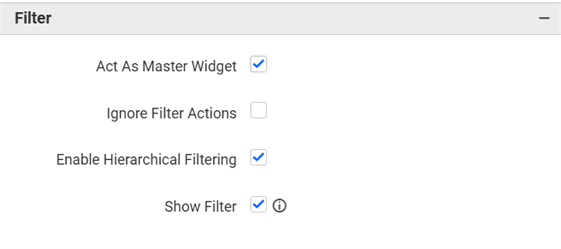
Act as master widget
This allows you to define the column chart widget as a master widget so that other widgets in the dashboard can listen to its filter action.
Ignore filter actions
This allows you to define the column chart widget to ignore its response to filter actions applied on other widgets in the dashboard.
Hierarchical filter
This option allows you to enable or disable hierarchical top N filtering. When applying the Top N filter with multiple dimension columns, you can customize the returned data based on whether the filtering should be done in a flat manner or based on the hierarchy of the dimension columns added.
When the Hierarchical Filter option is enabled, the Top N will be applied to each individual column separately, based on the number set for each column.
Show Filter
This feature allows you to toggle the visibility of the Filter icon for the column chart widget when the Act as Master Widget option is enabled.
Container Appearance
This sections allows you to customize the Container Appearance for the column chart widget.
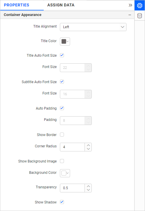
Title Alignment
This allows you to handle the alignment of widget title to either left, center, or right.
Title Color
This allows you to apply the text color to the widget title.
Title Auto Font Size
By enabling Auto Font Size, the title’s font size will be adjusted automatically depending on the screen resolution.
Font Size
This allows you to apply the specified font size to the widget title if the Title Auto Font Size is disabled. The value can be between 10 and 44.
Subtitle Auto Font Size
When Auto Font Size is enabled, the subtitle’s font size will be automatically adjusted according to the screen resolution.
Font Size
This allows you to apply the specified font size to the widget title if the Subtitle Auto Font Size is disabled. The value can be between 10 and 32.
Auto Padding
When Auto Padding is enabled, the padding of the widget container will be automatically adjusted if the size of the widget varies.
Padding
This allows you to customize the padding of the widget container if the Auto Padding is disabled. The value can range from 0 to 25.
Show Border
This feature allows you to toggle the visibility of the border surrounding the widget.
Corner Radius
This allows you to apply the specified radius to the widget corners if the Show Border is enabled. Value can be between 0 and 100.
Show Background Image
This feature allows you to set the background image for the column chart widget.
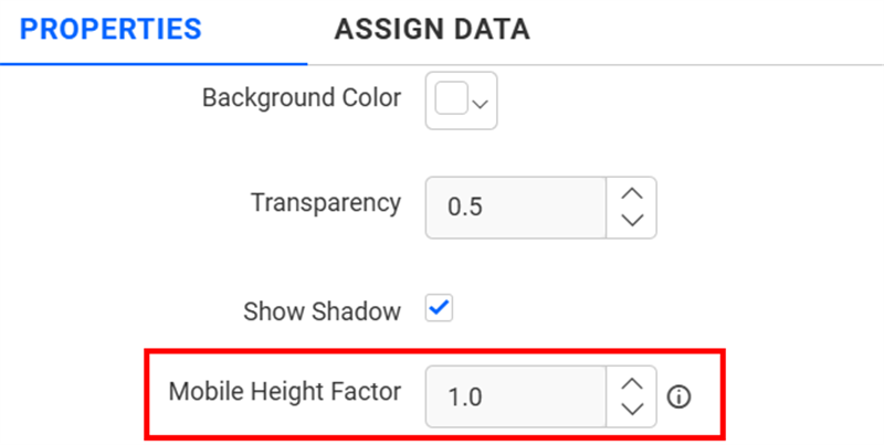
Background Color
This allows you to set the background color to the column chart widget.
Transparency
This property allows you to specifies the transparency for the background color.
Show Shadow
This feature allows you to switch the visibility of the shadow surrounding the widget.
Mobile Height Factor
This option allows you to resize widgets specifically for mobile view.
Container actions
This section allows you to customize the container actions for the column chart widget.
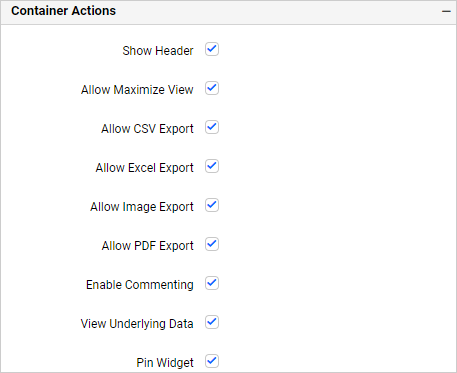
Show Header
This allows you to enable or disable the widget title of the column chart.
Allow Maximize View
This allows you to enable or disable the maximized mode of the column chart widget. The visibility of the maximize icon in the widget header will be defined based on the setting in the viewer.
Allow CSV Export
This allows you to enable or disable the CSV export option for the column chart widget. Enabling this allows you to export the summarized data of the widget view to CSV format in the viewer.
Allow Excel Export
This allows you to enable or disable the Excel export option for the column chart widget. Enabling this allows you to export the summarized data of the widget view to (.xlsx or .xls) format in the viewer.
Allow Image Export
This allows you to enable or disable the Image export option for the column chart widget. Enabling this allows you to export the view of the widget to image format (.jpg), (.png), or (.bmp) in the viewer.
Allow PDF Export
This allows you to enable or disable the PDF export option for the column chart widget. Enabling this allows you to export the view of the widget to pdf format in the viewer.
Enable Comments
This allows you to enable or disable comment for the dashboard widget. For more details, refer to the Commenting Widget.
Allow View Underlying Data
This allows you to visualize the raw data associated with a widget at runtime.
To learn more about viewing the underlying widget data, refer to the view data documentation.
Pin widget
This allows you to pin the widget.
Responsive Behavior
We hide the widget elements based on the size of the widget for better readability.
When the chart has been placed with less than 7 columns chart Y-axis labels, Y-axis titles will be hidden.
When the chart has been placed with less than 6 rows, chart X-axis labels, X-axis titles and gridlines will be hidden.